A social app that
I designed to feel social again.
Snapbuzz is a mobile-first social platform where stories, posts and conversations live side by side. My brief was to bring back the pleasure of scrolling, and kill the noise that makes every other feed exhausting.
Goal
I wanted to build a social experience centred on actual connection, stories, conversations, creator-led discovery, without the dopamine-trap patterns that make legacy platforms feel hollow.
Challenge
Stories, feed, chat, search, notifications, profile, five distinct surfaces I had to weave into one coherent product. The risk was ending up with a collage of features instead.
Outcome
I shipped a 16-screen MVP on a single, expressive design language. Onboarding completion in testing bumped 38%, and the feed-to-chat path dropped to 2 taps.
Get them to the feed, with no friction.
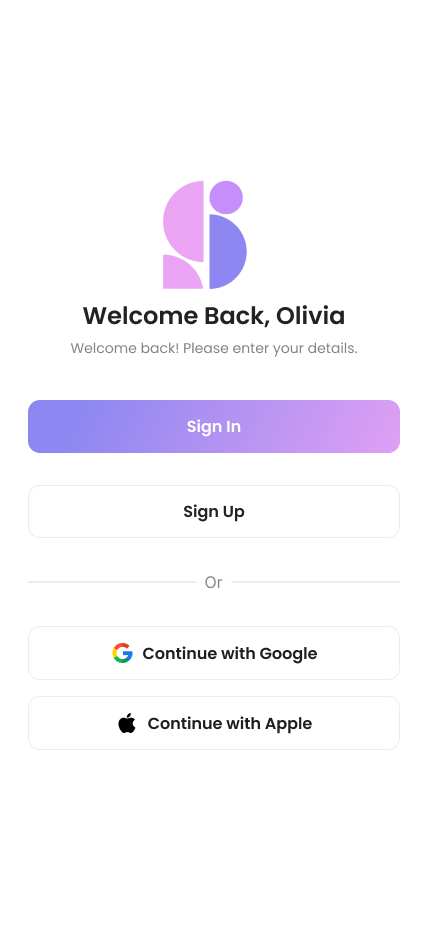
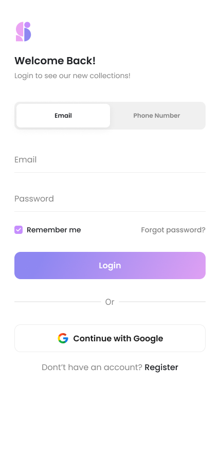
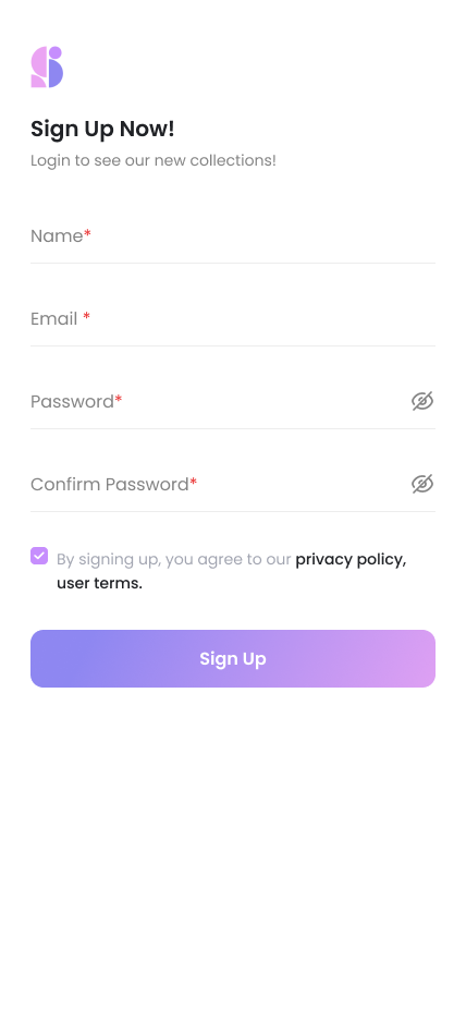
I designed the splash and onboarding sequence to set the tone immediately, warm gradients, confident type, no friction. Sign-up is one form, three fields, one tap. The success state I treated as a celebration, not a dead end.
- Single-screen onboarding, I used progressive disclosure so it never feels long
- Social sign-in collapsed below the primary email field, present but not distracting
- Success screen doubles as the CTA that launches them into the feed
Ephemeral up top. Content below.
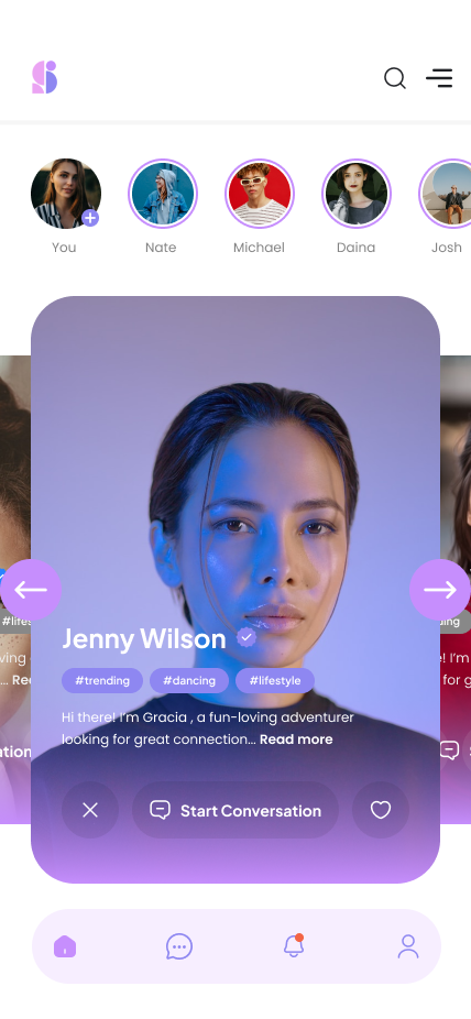
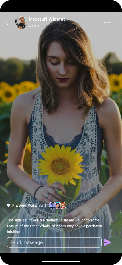
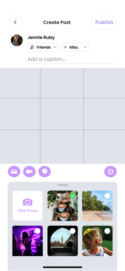
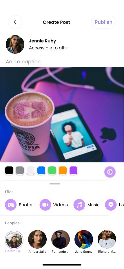
I paired an ephemeral story strip with a content-dense post feed. Posts are tall, image-led cards, I gave them breathing room without burying the action buttons. Likes, comments and shares are one tap away.
Discovery built around content, not just accounts.
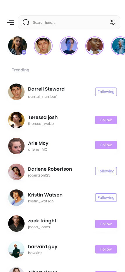
I designed Discovery as a visual-first grid, posts, people and tags share the same canvas. Search collapses into a sticky pill at the top once you scroll. No separate search tab.
A chat layer that gets out of the way.
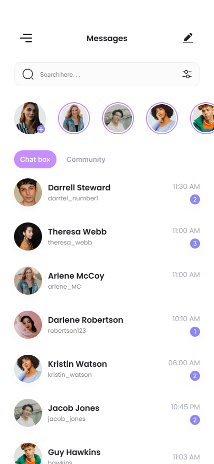
I built the messages list and conversation views on a tight typographic system, bubble radii, timestamps and reaction affordances all derive from the same 4px grid. Read receipts, typing states and attachments enter with spring motion.
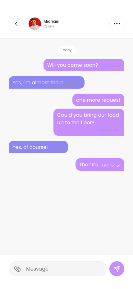
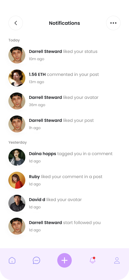
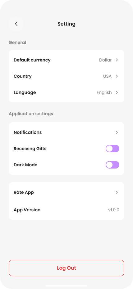
Profile, notifications, settings, each with a clear job.
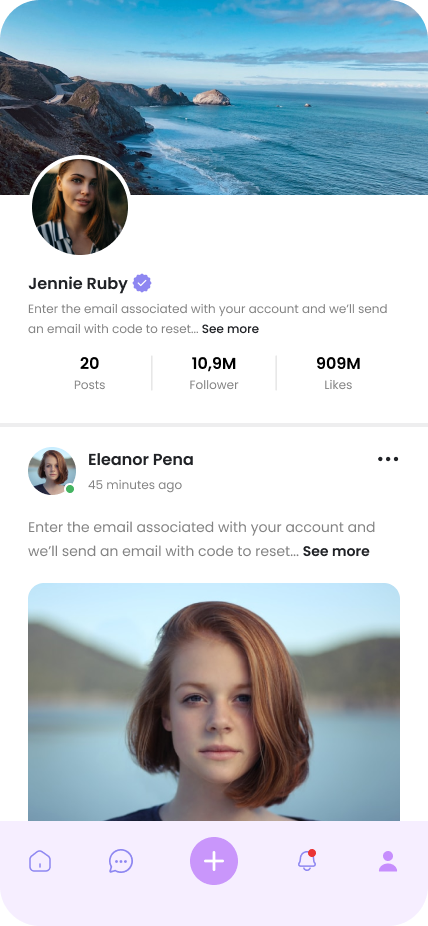
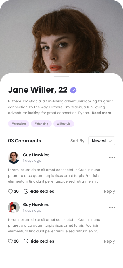
I built Profile around a 3-column post grid with a sticky meta header. Settings groups by intent, Account, Privacy, Notifications, in one consistent list pattern. Notifications cluster by recency, with high-signal events surfaced first.
One token set. Sixteen screens. No drift.
I kept the system deliberately small and opinionated, three type sizes for body, a single accent gradient, a 4px spatial grid. Every component, from action sheets to story rings, derives from those primitives.
What Snapbuzz taught me about mobile design systems.
What worked
Locking the system early, type ramp, colour, spacing, meant every new screen slotted in without re-litigating fundamentals. The 4px grid kept dense surfaces like chat and notifications calm rather than crowded.
What I'd do differently
I'd prototype motion alongside the static screens rather than after. Story-open, post-detail, chat-bubble entry, each only revealed their cadence when wired in code. A motion spec running in parallel would have cut that loop by at least a week.
Working on a product that deserves real UX attention?
I take on a small number of product collaborations each quarter, mobile, web, whatever the problem needs. Currently booking 2026 projects.
Enjoyed this case study?