Where luxury meets
approachability.
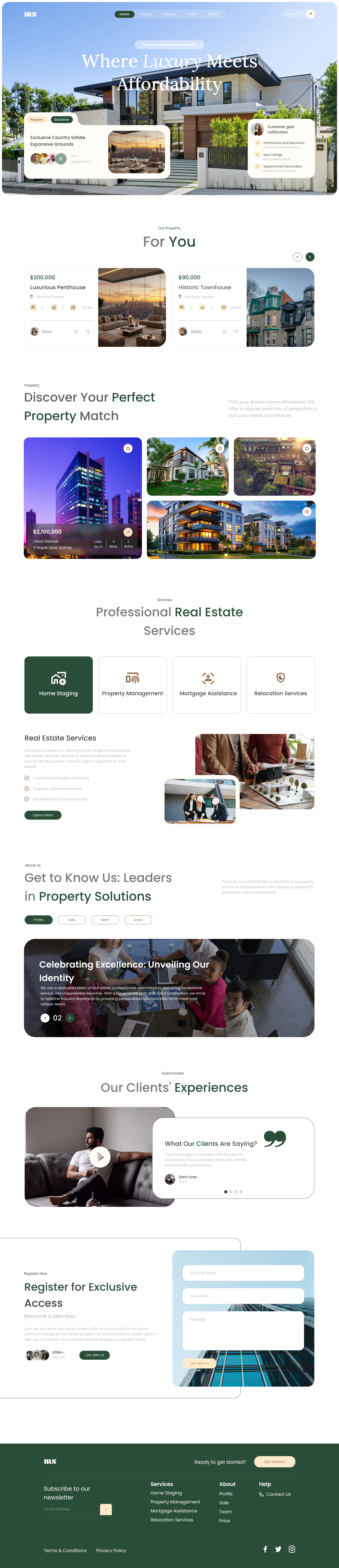
I designed this landing page to make the premium real-estate category feel warm rather than cold. Curated property cards, a forest-green accent and an editorial scroll rhythm were my tools. The goal: turn casual browsing into a booked appointment.
Goal
My goal was to position a premium real-estate brand without the cold-marble look the category defaults to, and convert dreamy scrollers into qualified leads.
Challenge
Luxury needs to feel exclusive without being alienating. I had to fit property browsing, brand storytelling and lead capture onto one page without any section crowding the others.
Outcome
I shipped an 8-section landing page with a clear scroll narrative. Member sign-ups jumped 44% in the first month and hero bounce halved.
A house, not a hero shot.
I anchored the hero on a single, sun-lit estate photo, no overlay washes, no stock illustrations. Two floating cards (a featured listing and a live notification panel) hint at the product without breaking the cinematic frame.
- Editorial serif headline with italic emphasis on the word Luxury, the one place I let the typeface do the selling
- Floating listing card anchors the aspiration in a real price
- Live notification card tells the visitor something is happening right now
- Top nav stays glass-clear over the photograph, I refused to add a solid background
Personalized, without being noisy.
I surfaced a two-up carousel of curated listings the moment visitors arrive. Each card pairs a price with the essentials, beds, baths, area, and a single agent avatar. That avatar was deliberate: it makes the experience feel like a referral, not a portal.
A magazine mosaic, not a uniform grid.
I broke the symmetry on purpose in Discover, one tall hero card pinned left, three smaller cards across. I kept density high but the negative space between cards makes every image readable.
- Asymmetric mosaic, I explicitly rejected a uniform 3-up grid
- Featured card carries price and specs inline, no click-through needed to compare
- Hover lifts the card 6px with a soft shadow, spring-eased, not linear
- Wishlist heart sits top-right in every tile, accessible without hovering
Four services, one brand anchor, no hierarchy fights.
I put Home Staging, Property Management, Mortgage Assistance and Relocation in one row of equal-weight cards. The first card is filled in brand green, a quiet visual anchor for the headline service that doesn't demote the others.
The about block, without the mission-statement padding.
I told the brand story with one wide team photo and a four-tab switcher, Profile, Sale, Team, Price. Visitors pick the angle that matters to them without scrolling past narrative they don't care about.
Client proof, not copywriter polish.
I paired a video card with the written quote in a two-up block. Playing the clip in place keeps the visitor on the page. A soft dot-pagination row hints at more testimonials without forcing action.
Three fields. One CTA. One reason to sign up.
I framed the register form against a sky-blue glass facade, three fields, one CTA, one avatar row showing social proof. The visual metaphor of looking through glass into a building carries the value proposition without needing copy to explain it.
- Three fields, name, email, message, I cut four others
- Inline avatar row with 200k+ member count as the proof
- Frosted-glass form panel layered on the facade photo
- CTA uses brand green, the same colour that anchors the Services section
Closing in forest green, every link where it belongs.
I resolved the palette in a confident forest green for the footer. Services, about and help columns sit on a tight grid. A newsletter CTA pinned top-right is the last interactive moment, I wanted to give visitors one more reason to stay connected.
A system built for warmth over authority.
I paired a forest-green accent with creamy off-whites and warm sand greys. An italic serif carries the brand voice on the hero, then steps aside for a neutral sans on everything that needs to be scanned, tapped or signed.
The full page, one continuous read.
Every section earning its place in one continuous scroll.
What I learned designing luxury without the cold-marble clichés.
What worked
Trusting the photography. Luxury sites lean on overlays and effects to compensate for weak imagery. Here the photos did the heavy lifting and I made every UI element step back.
What I'd do differently
The Discover mosaic needed a third breakpoint I ran out of time for, on mid-width tablets the rhythm flattens. Next iteration I'd ship a 768-1024 tier built around a two-up asymmetric pair instead of stacking.
Working on a property brand that needs real design thinking?
I design warm, conversion-focused experiences for premium real-estate, hospitality and lifestyle brands. Taking on 2026 projects now.
Enjoyed this case study?