The whole property journey,
in one calm app.
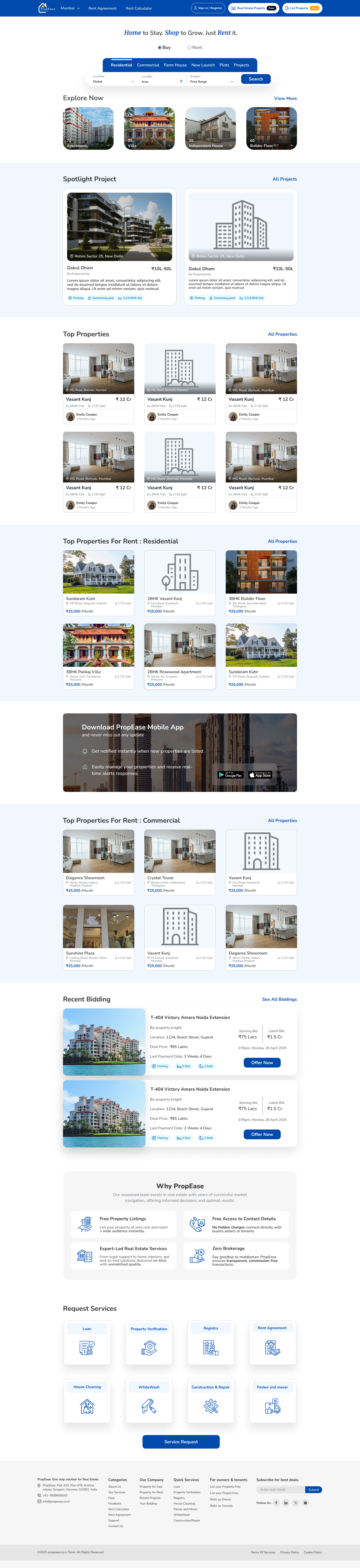
I designed Propease as a complete real-estate platform, home discovery, property listing, rent calculation, agreement signing, and quick services. One product that covers every step without needing a second app.
Goal
I set out to replace the half-dozen apps people juggle when buying, renting or listing property, building one cohesive product that takes a user from first browse to signed agreement without jumping between tools.
Challenge
Five user types, buyer, renter, owner, agent, service-pro, sharing 70+ screens. My job was making each flow feel purpose-built for that person, not appended to someone else's journey.
Outcome
I shipped a 70-screen MVP organised around five hub journeys. Time to first contact with an owner dropped from 9 to 3 taps; listing-creation completion hit 71%.
Get in fast, verify gently.
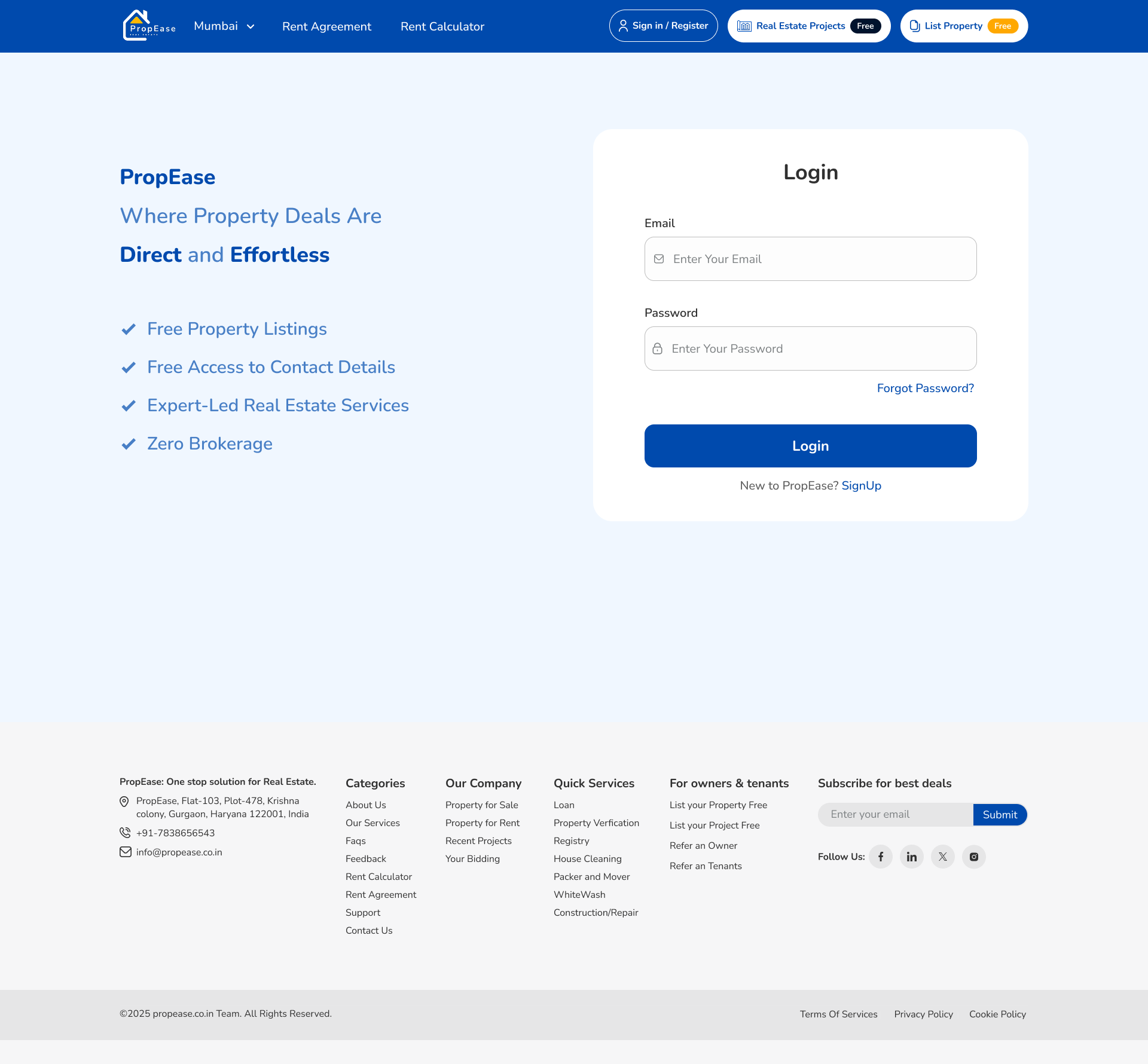
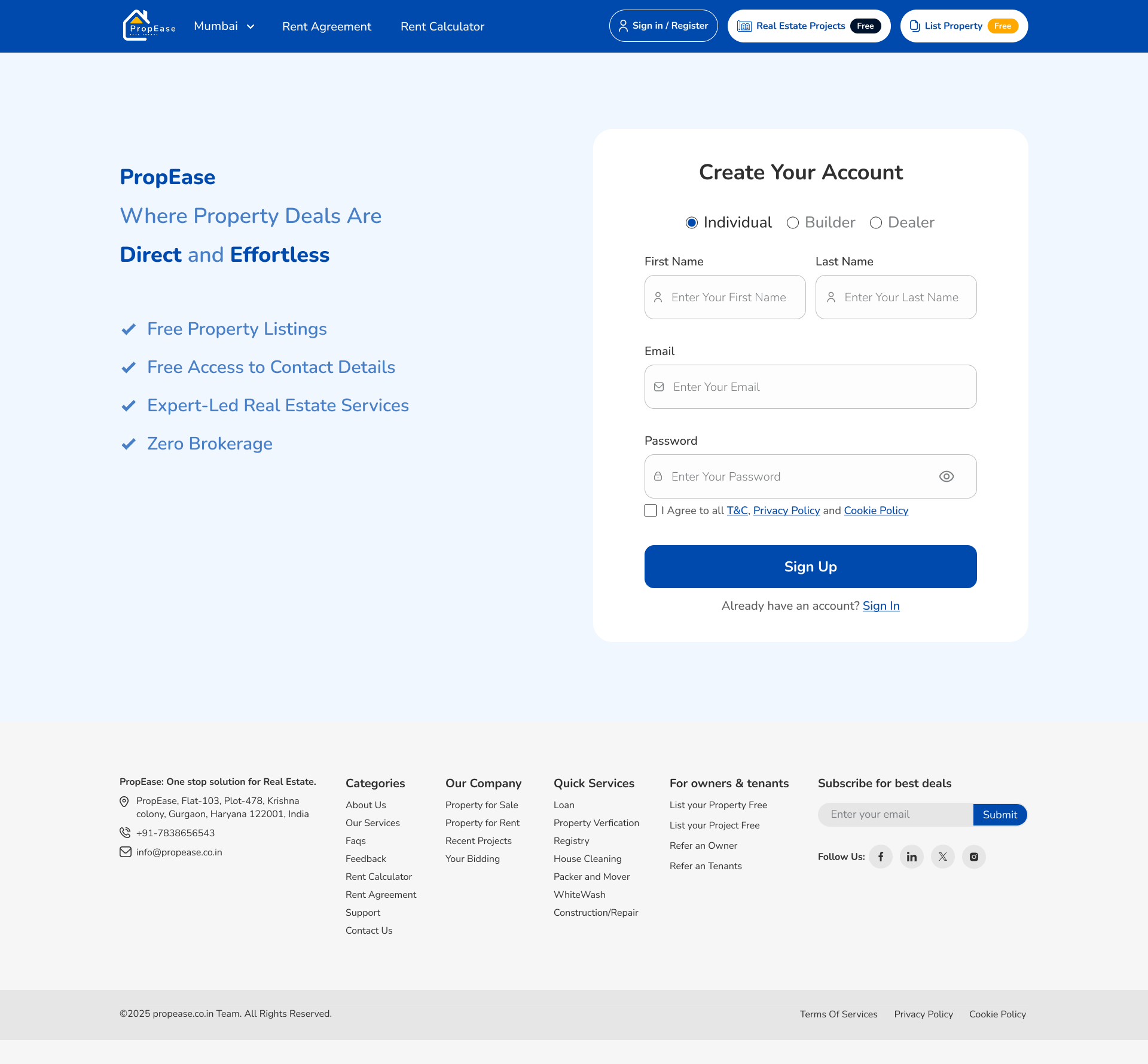
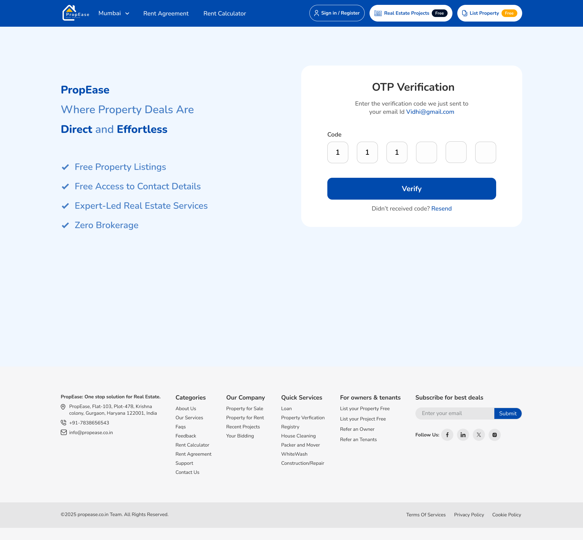
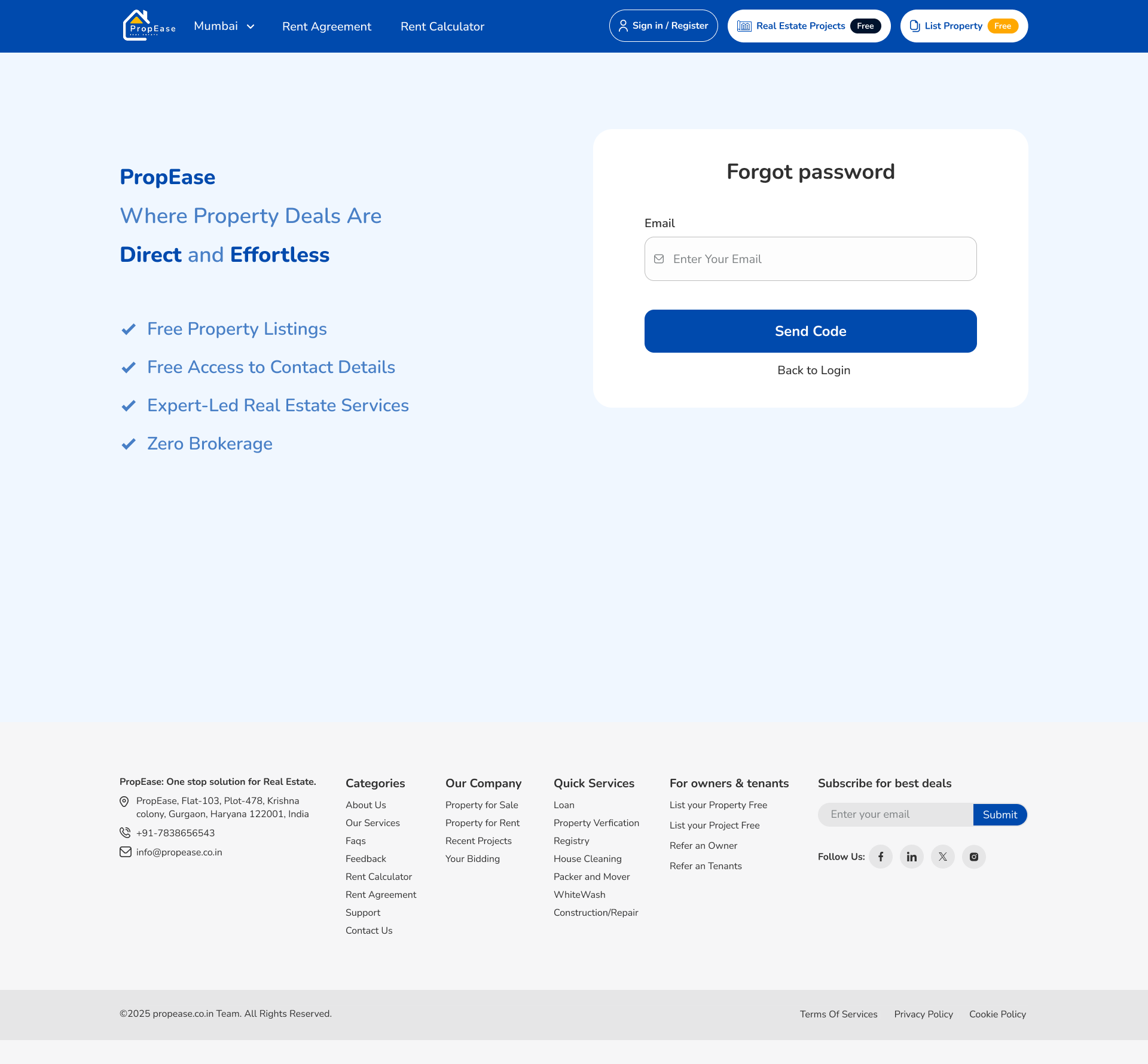
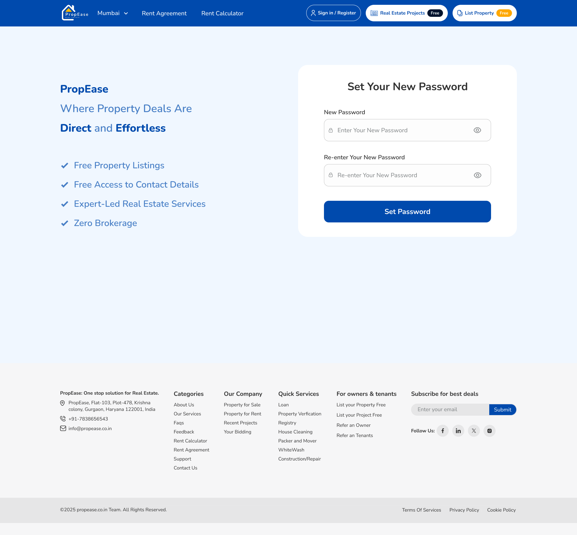
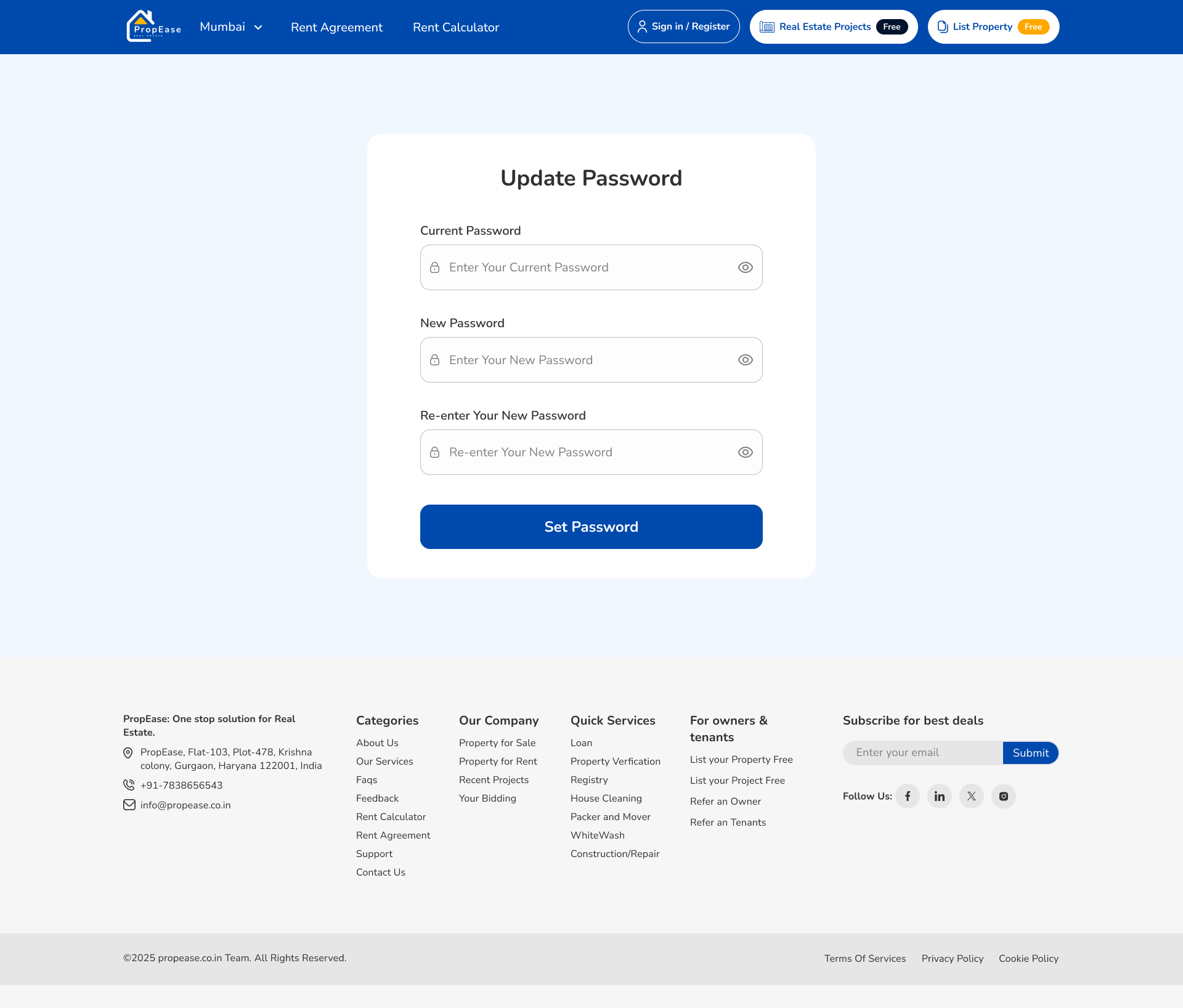
Most property apps demand KYC before showing you anything useful. I flipped that, browse freely, authenticate only when you act. Sign-up, OTP, password recovery and reset all share one rhythmic, four-step pattern.
- Browse first, sign up only at the moment of real intent
- OTP verification with auto-paste and resend timer
- Forget → Reset → Update password as one unified flow
- Single registration popup, contextual triggers

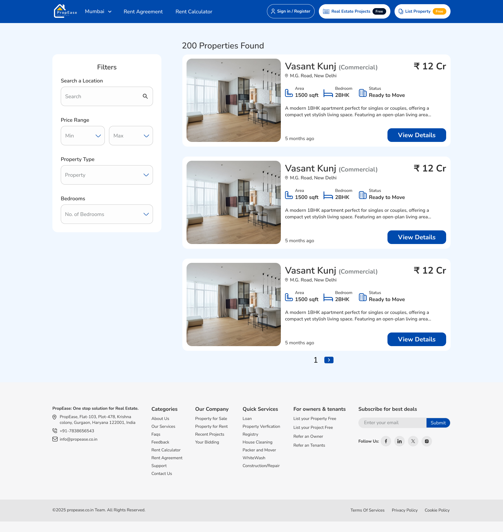
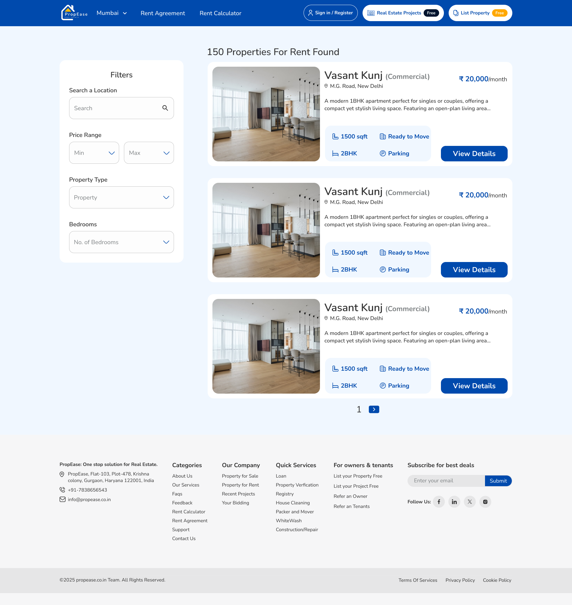
Home, with a map in your pocket.
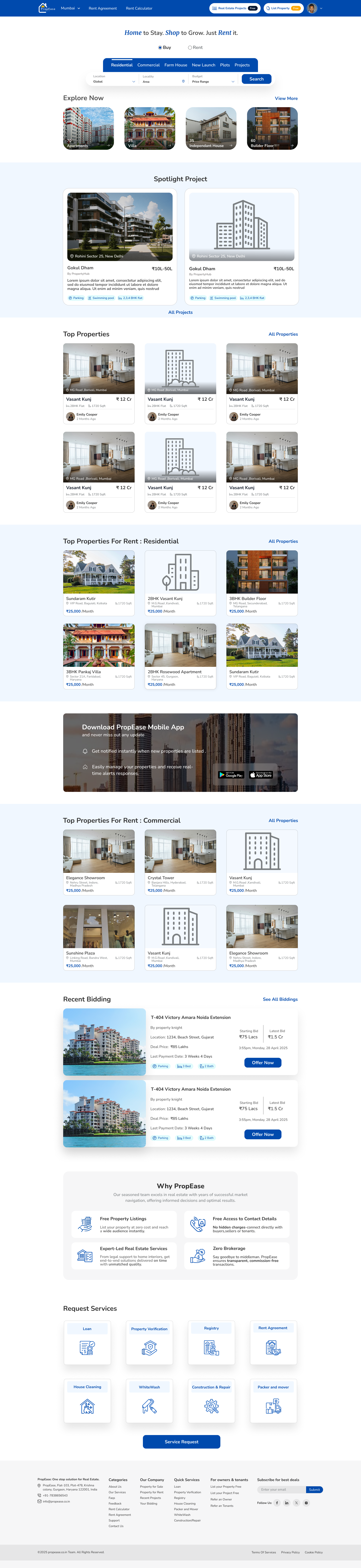
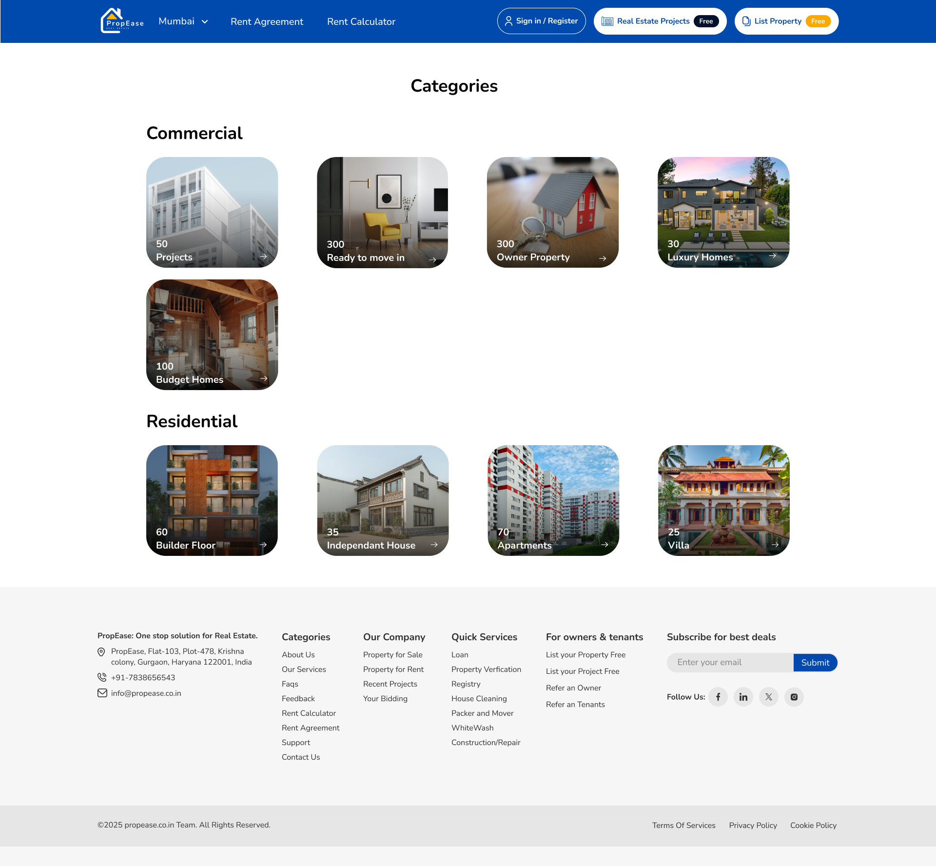
I built the home surface around three layers: hero categories for immediate intent, curated collections for inspiration, and a location-aware bar that drops the user into the right city without a manual search. Listing cards lead with image, price, and the facts a buyer actually scans before tapping through.
Everything you'd ask before visiting, answered upfront.
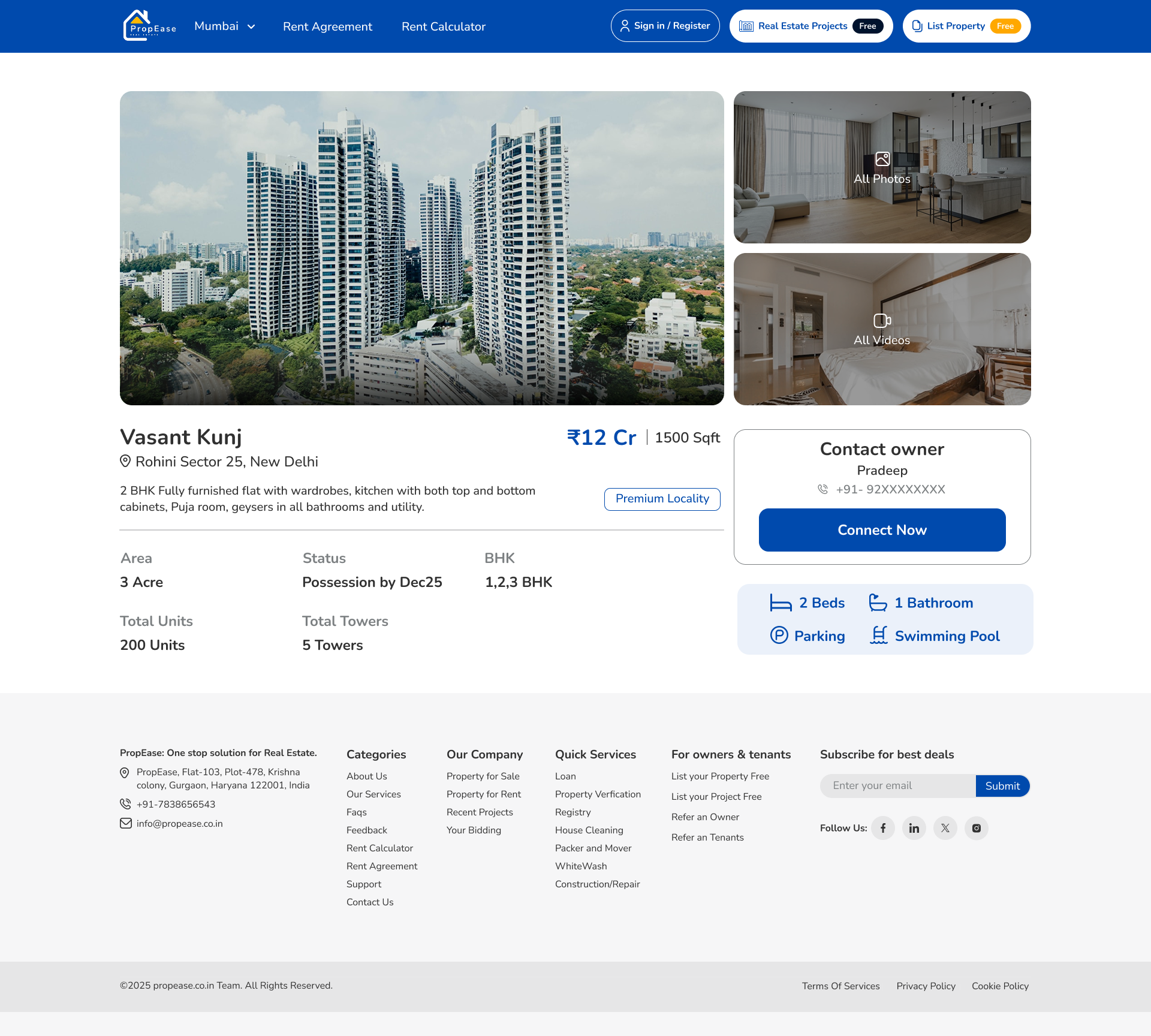
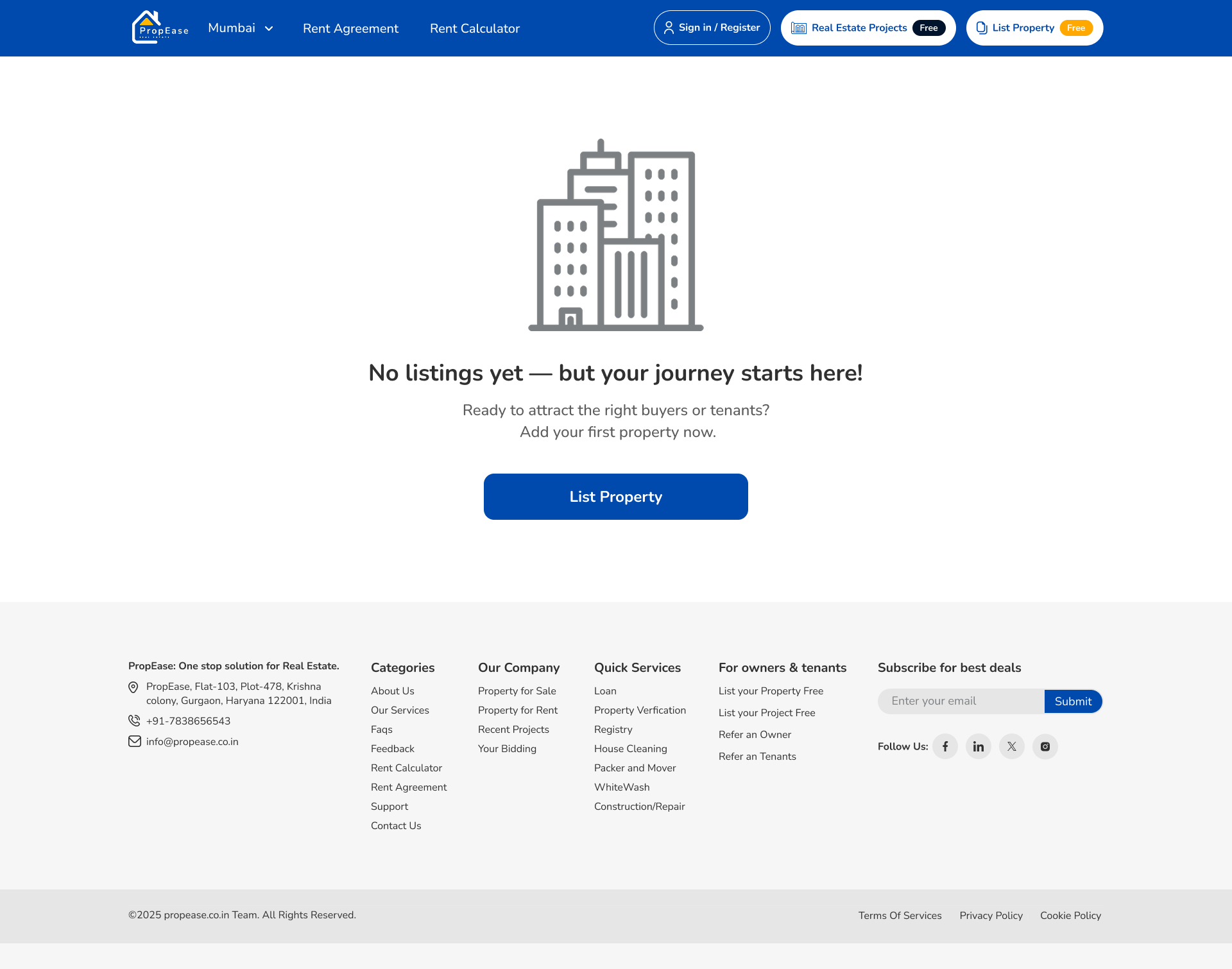
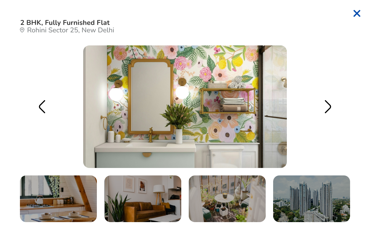
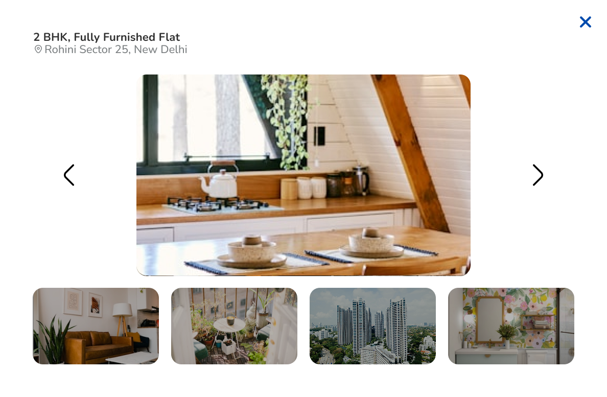
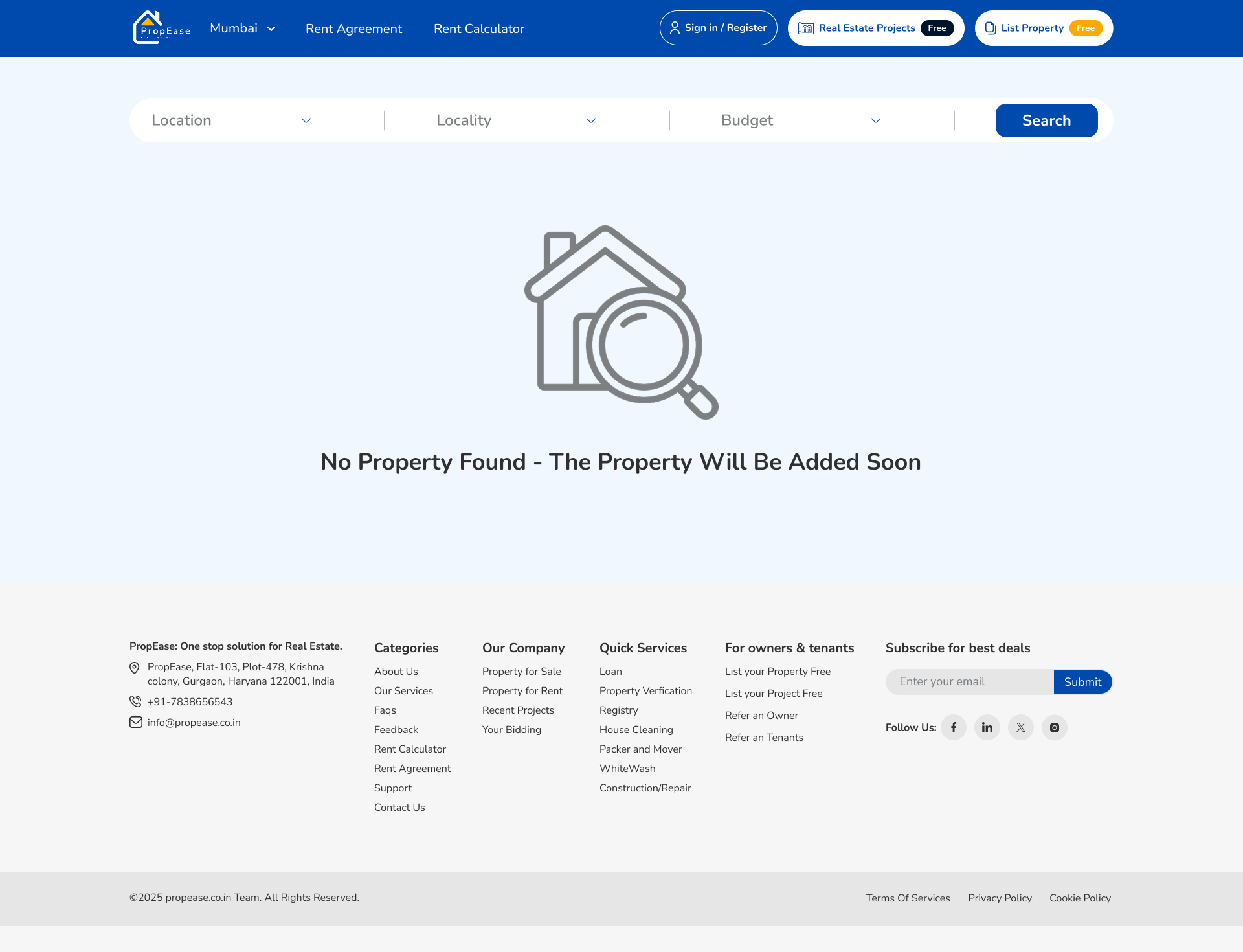
I structured the detail screen as a long, scannable read, hero gallery up top, then key specs, amenities, and neighbourhood context, with a sticky CTA that follows you down the page. Photos and videos open into full lightboxes. When a property has no photos yet, the empty state says why rather than leaving a blank hole.
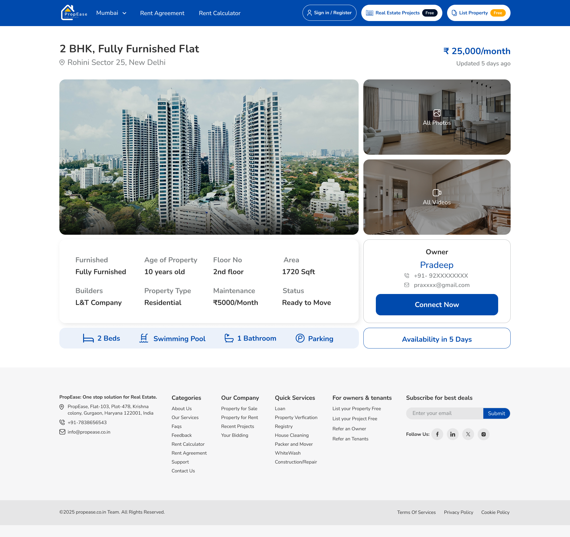
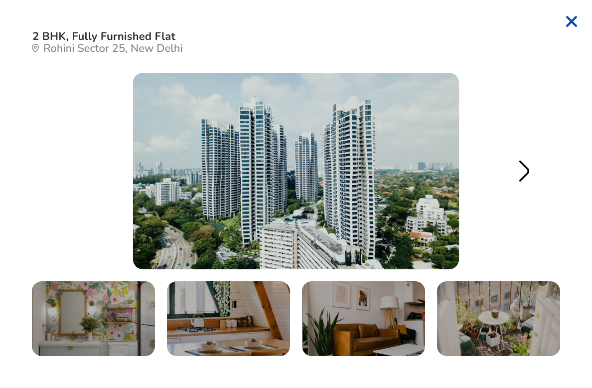
A long form that doesn't feel long.
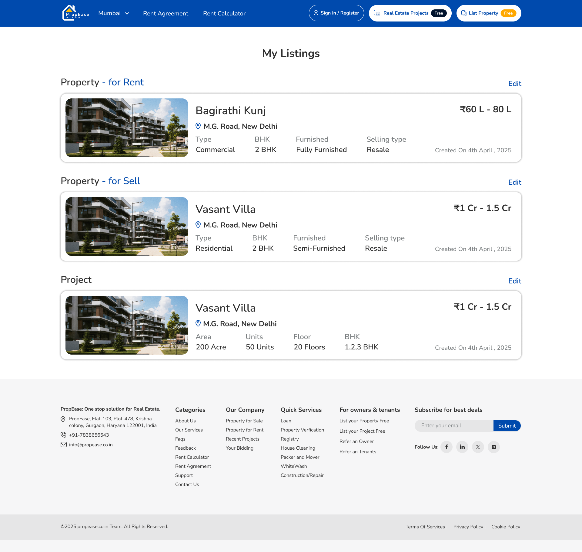
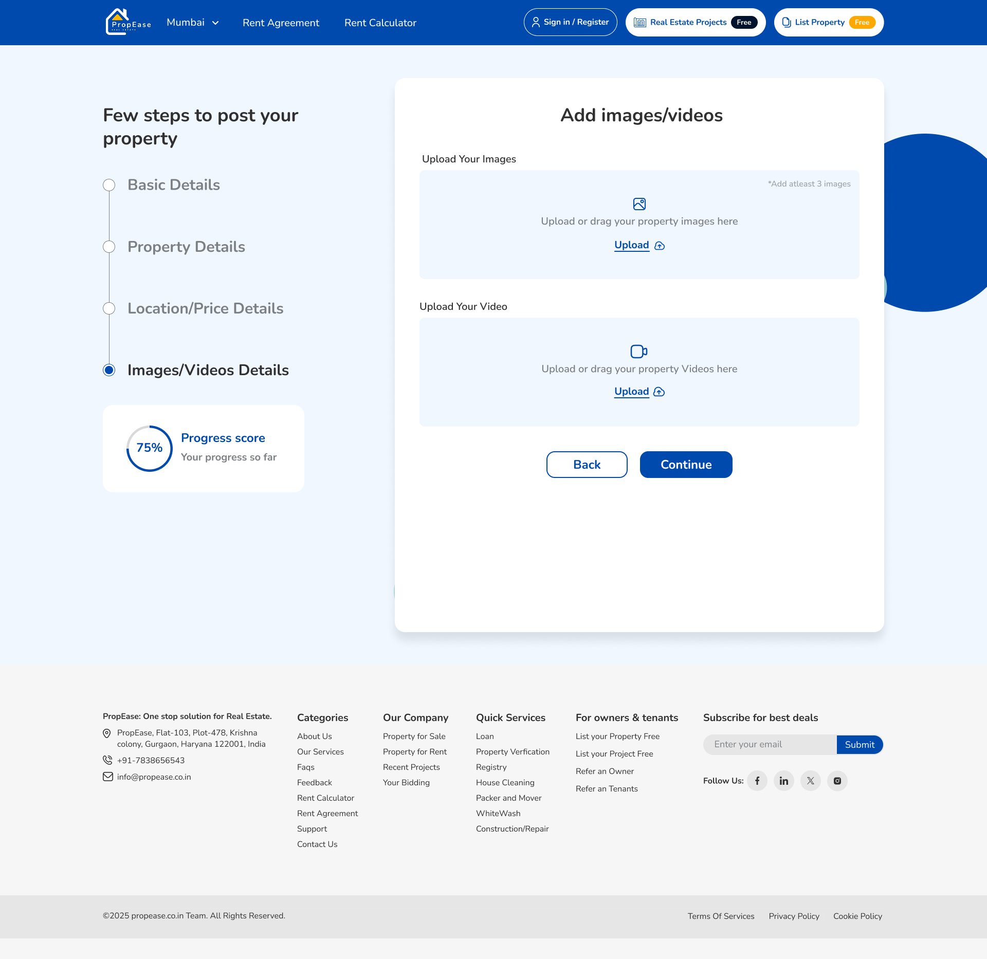
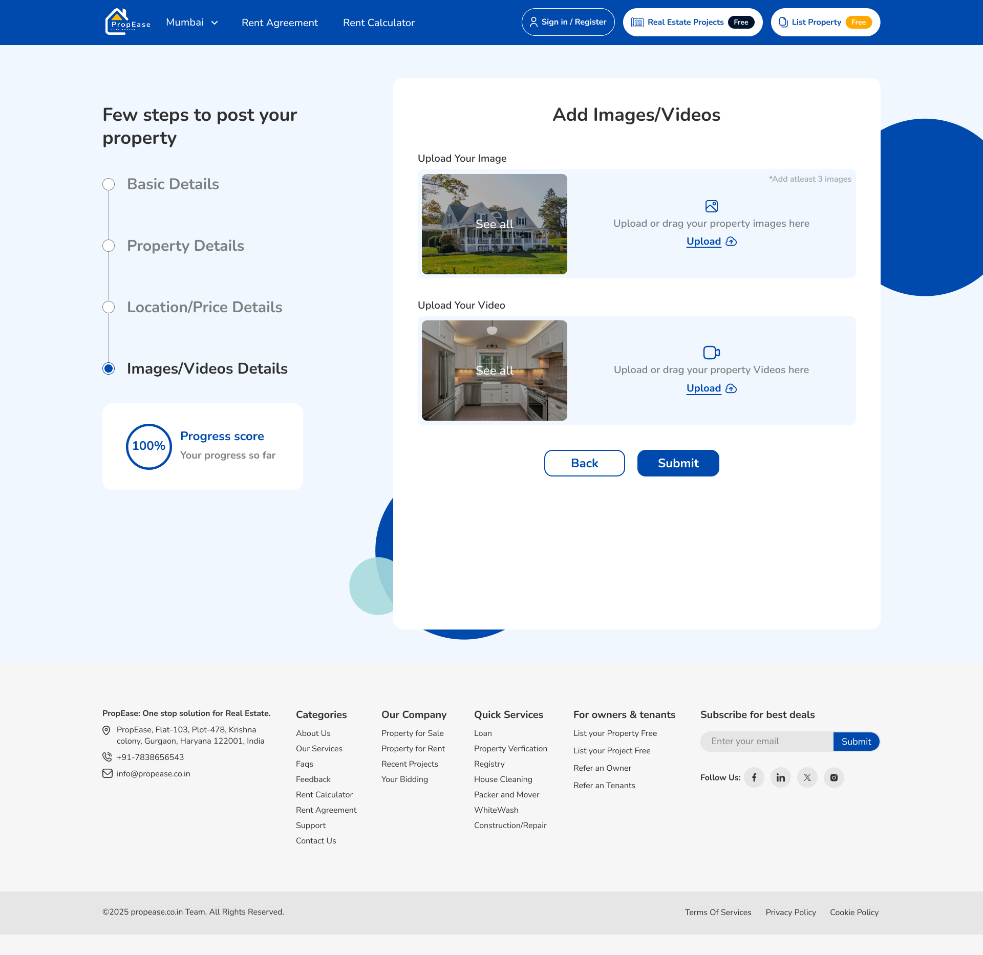
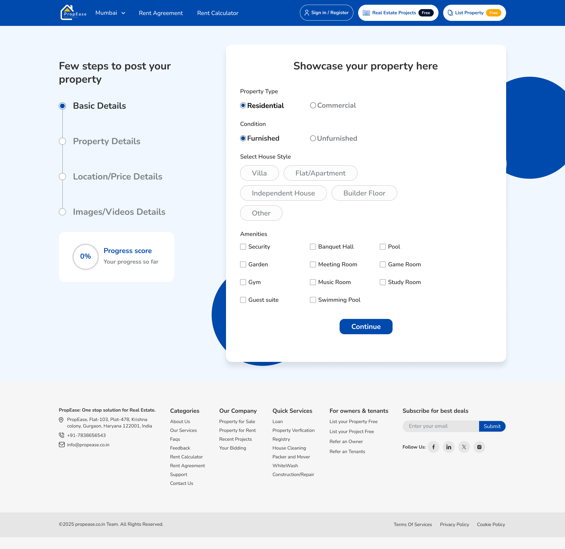
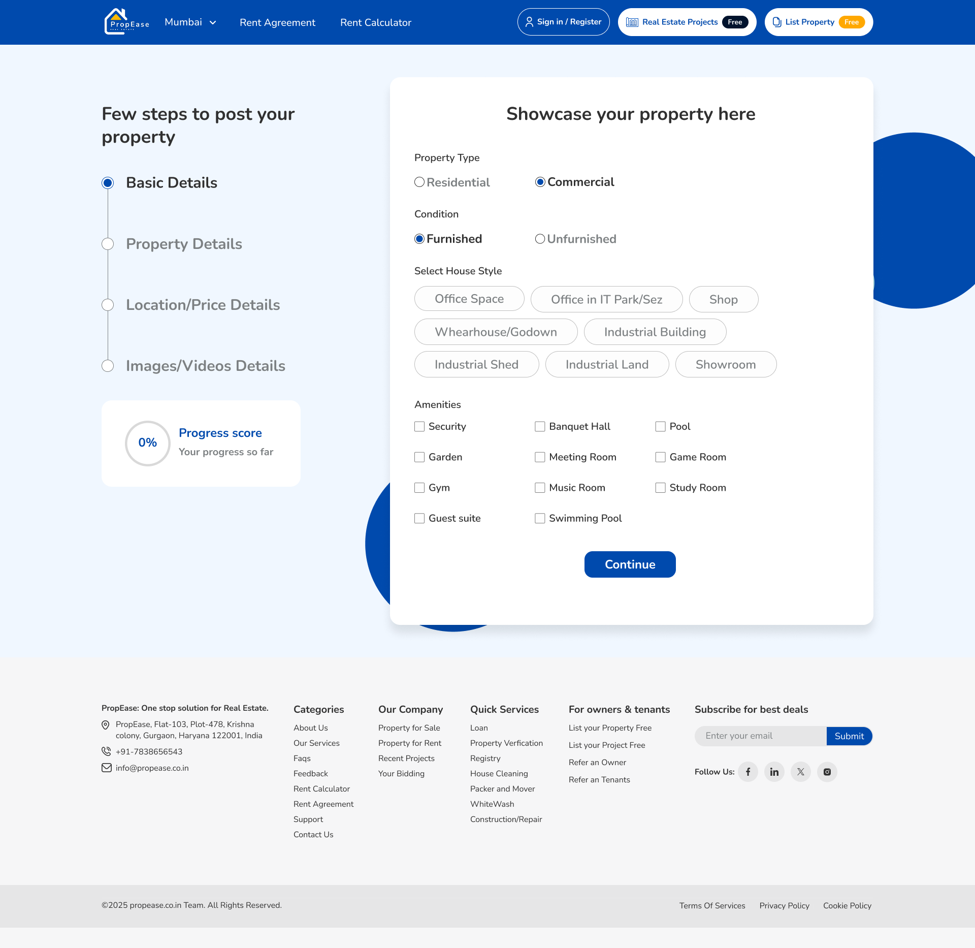
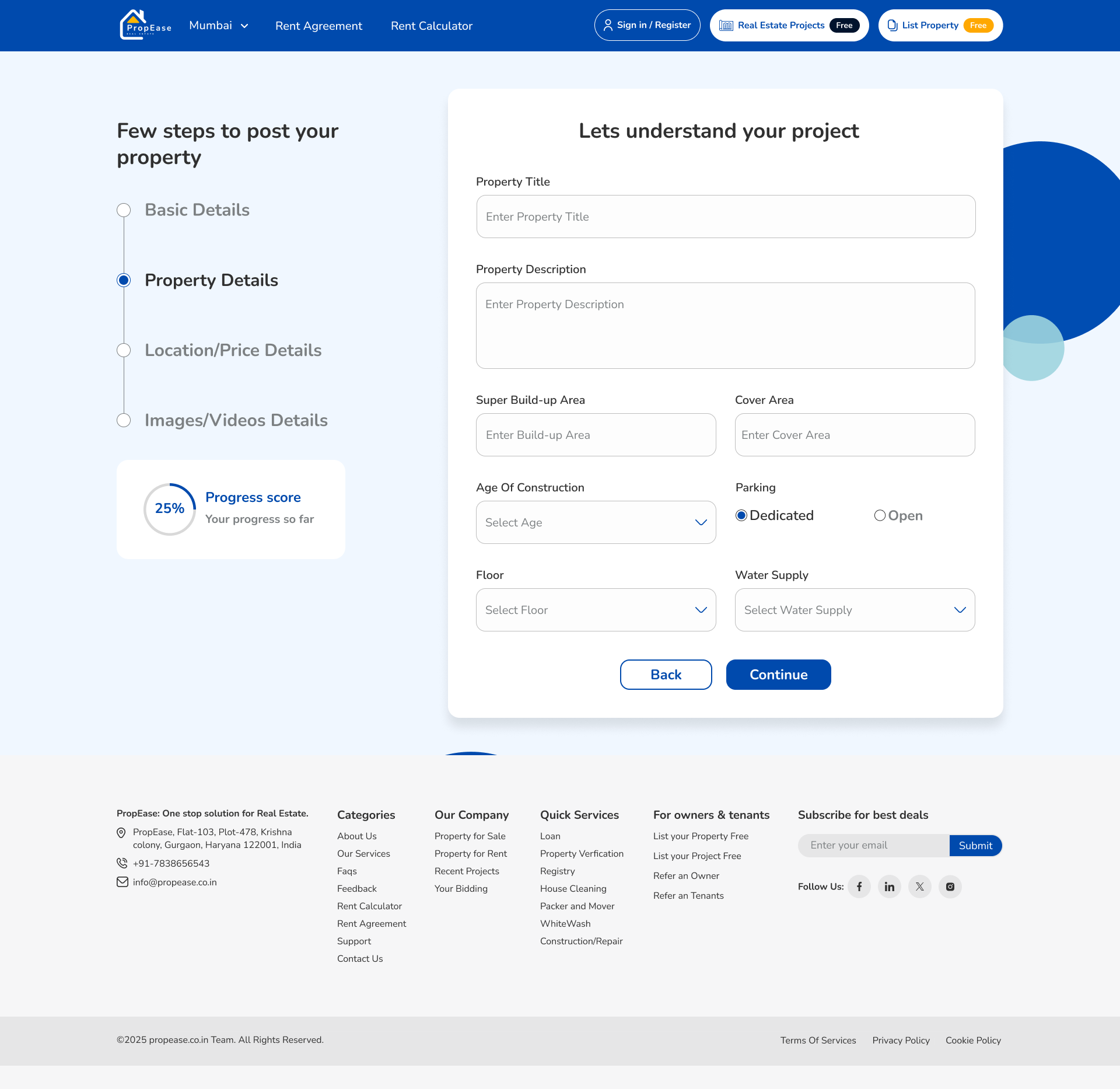
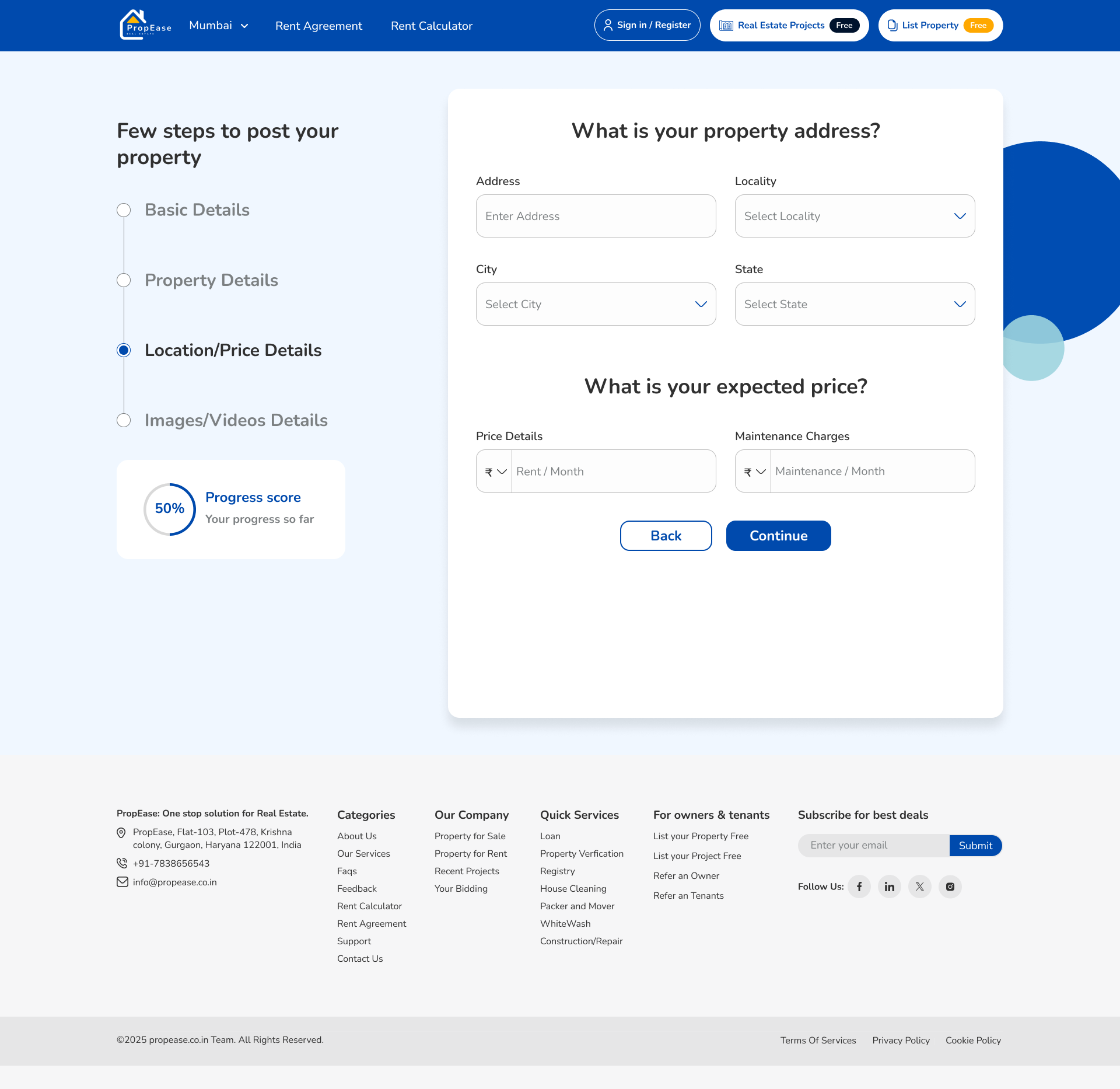
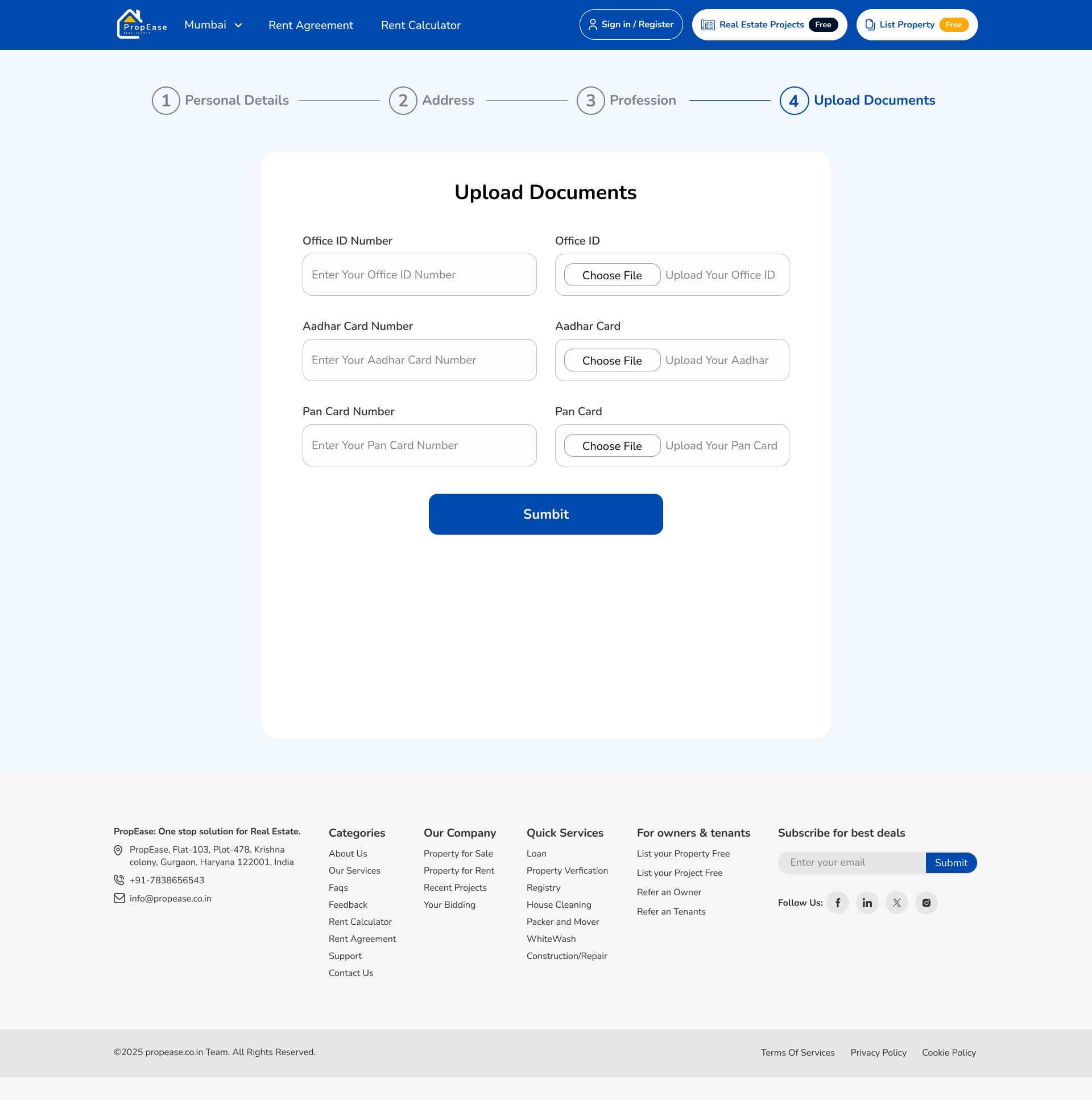
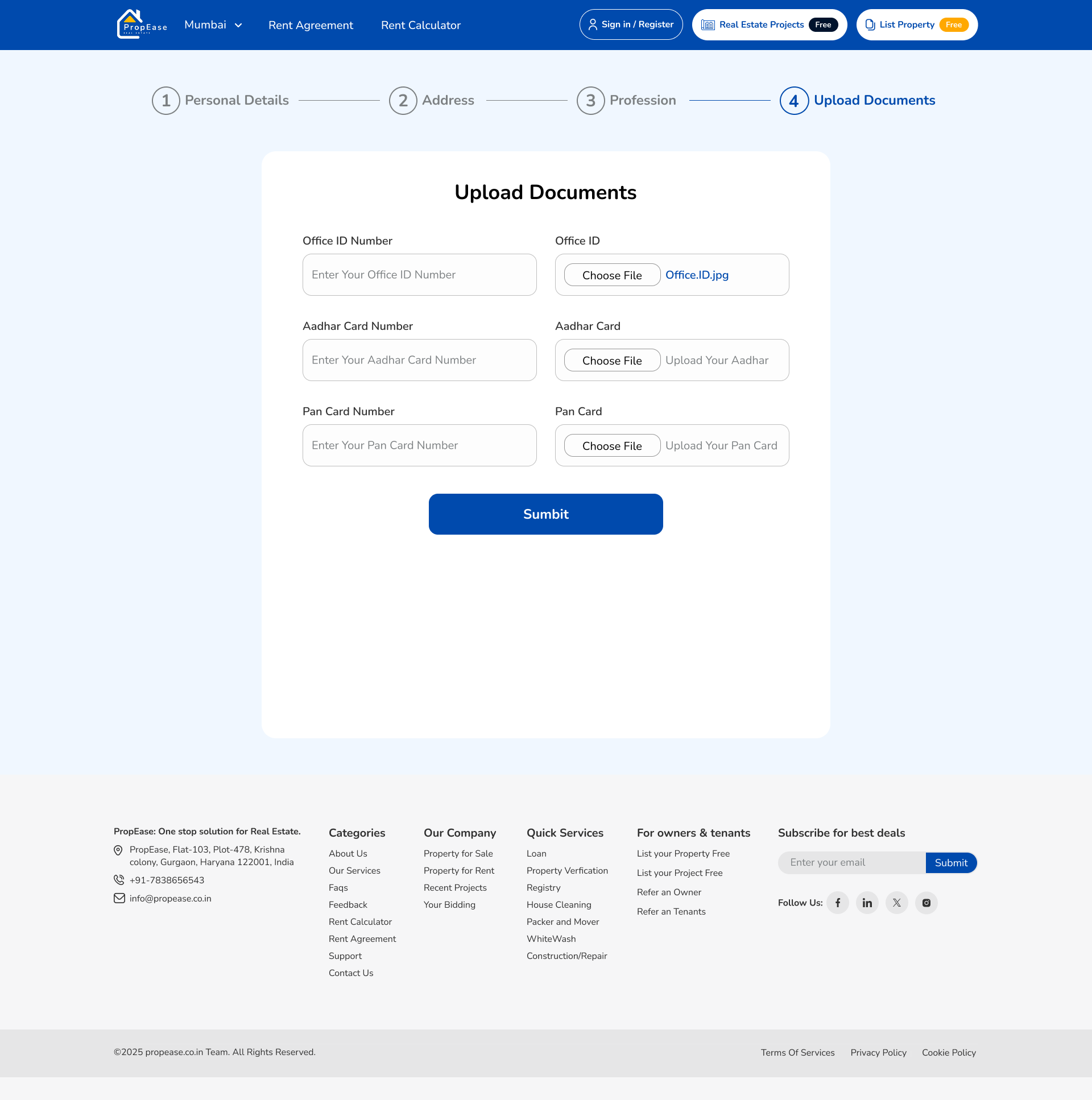
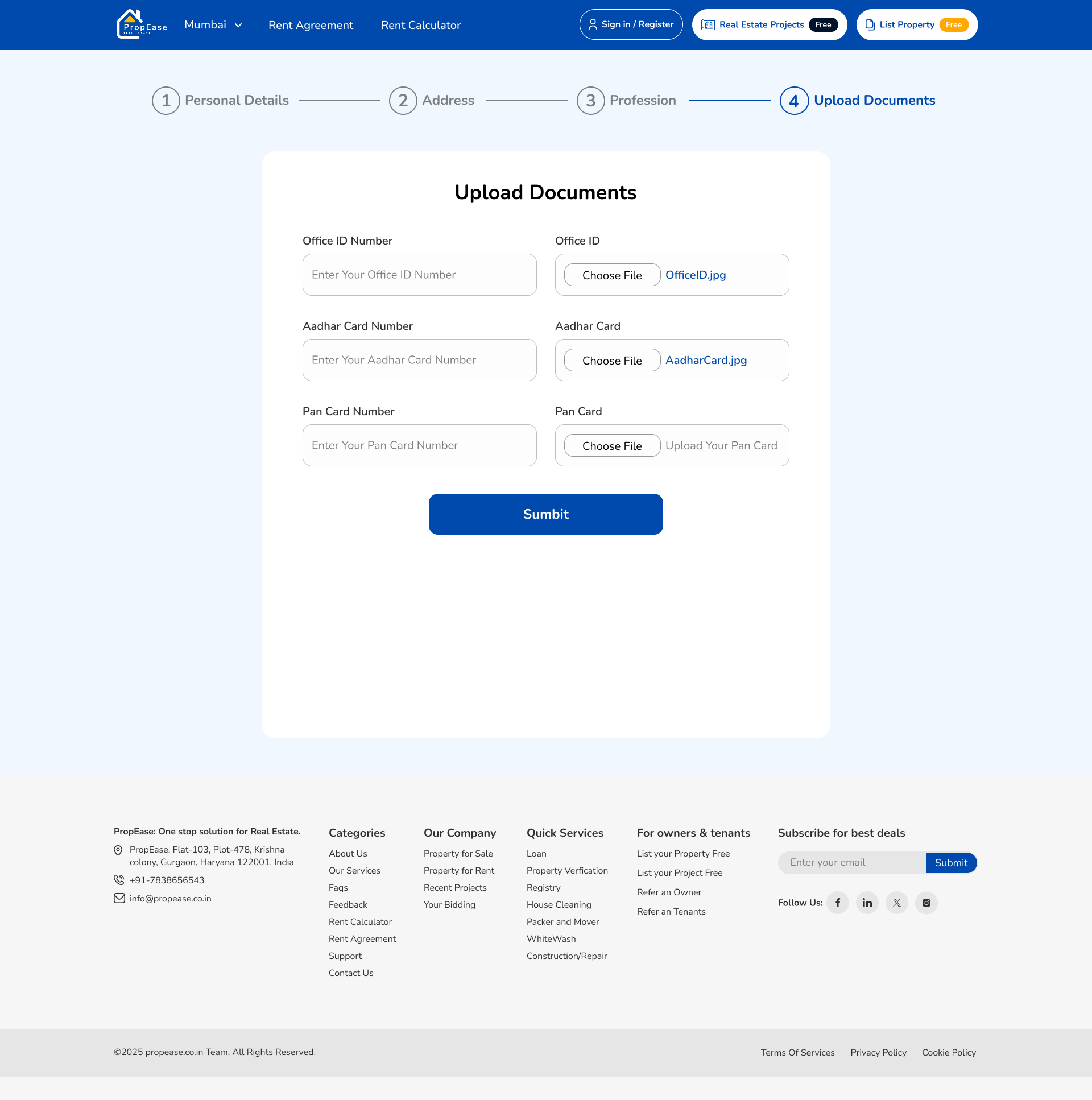
I split listing into five bite-sized steps, basics, features, location, media, documents, each gated by a clear progress indicator. Drafts save automatically. An owner can publish in one sitting or return the next morning and pick up exactly where they left off.

Tools that turn intent into decision.
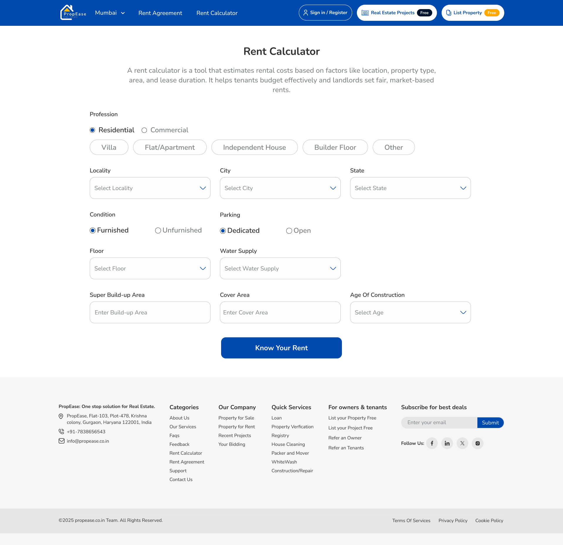
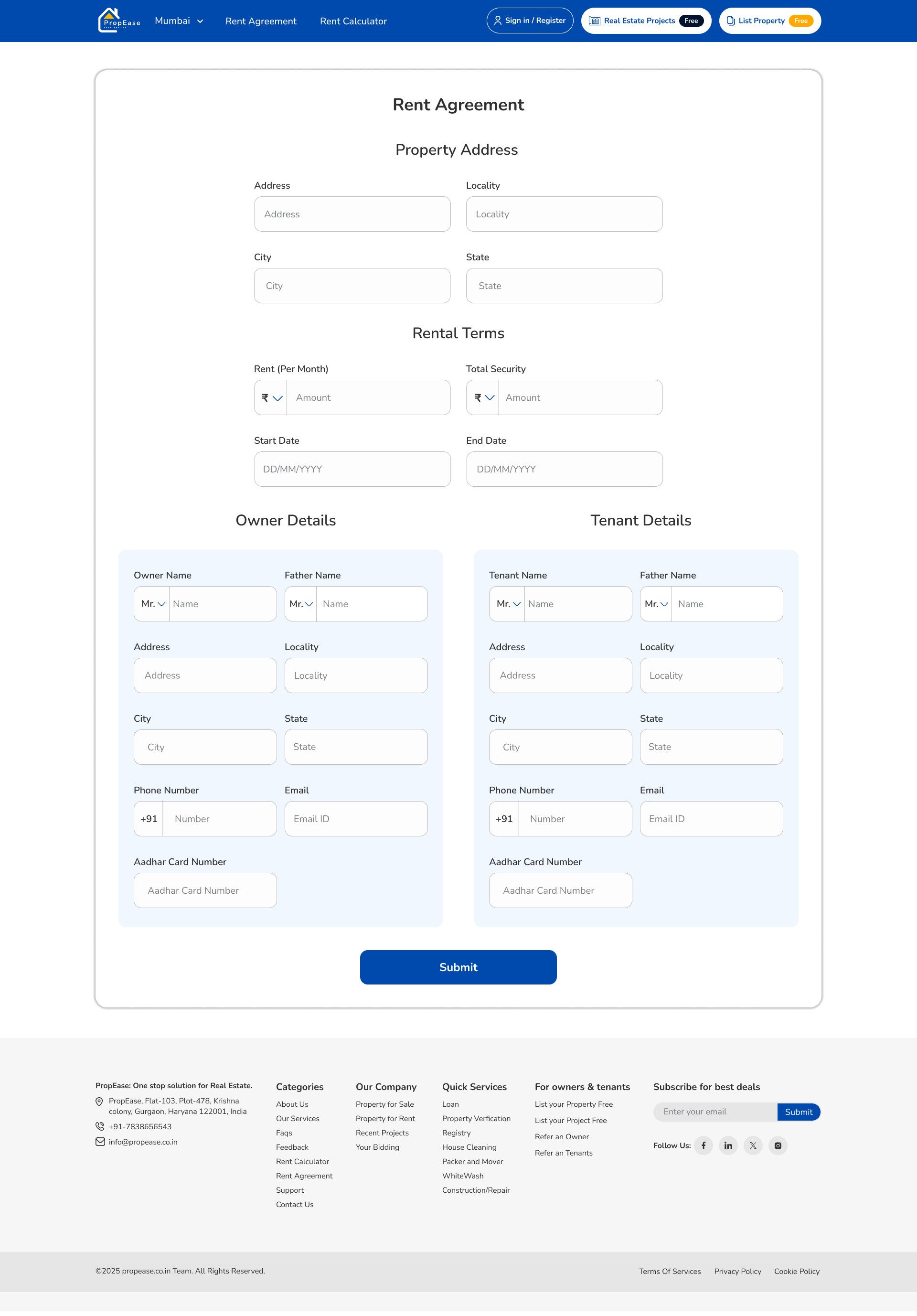
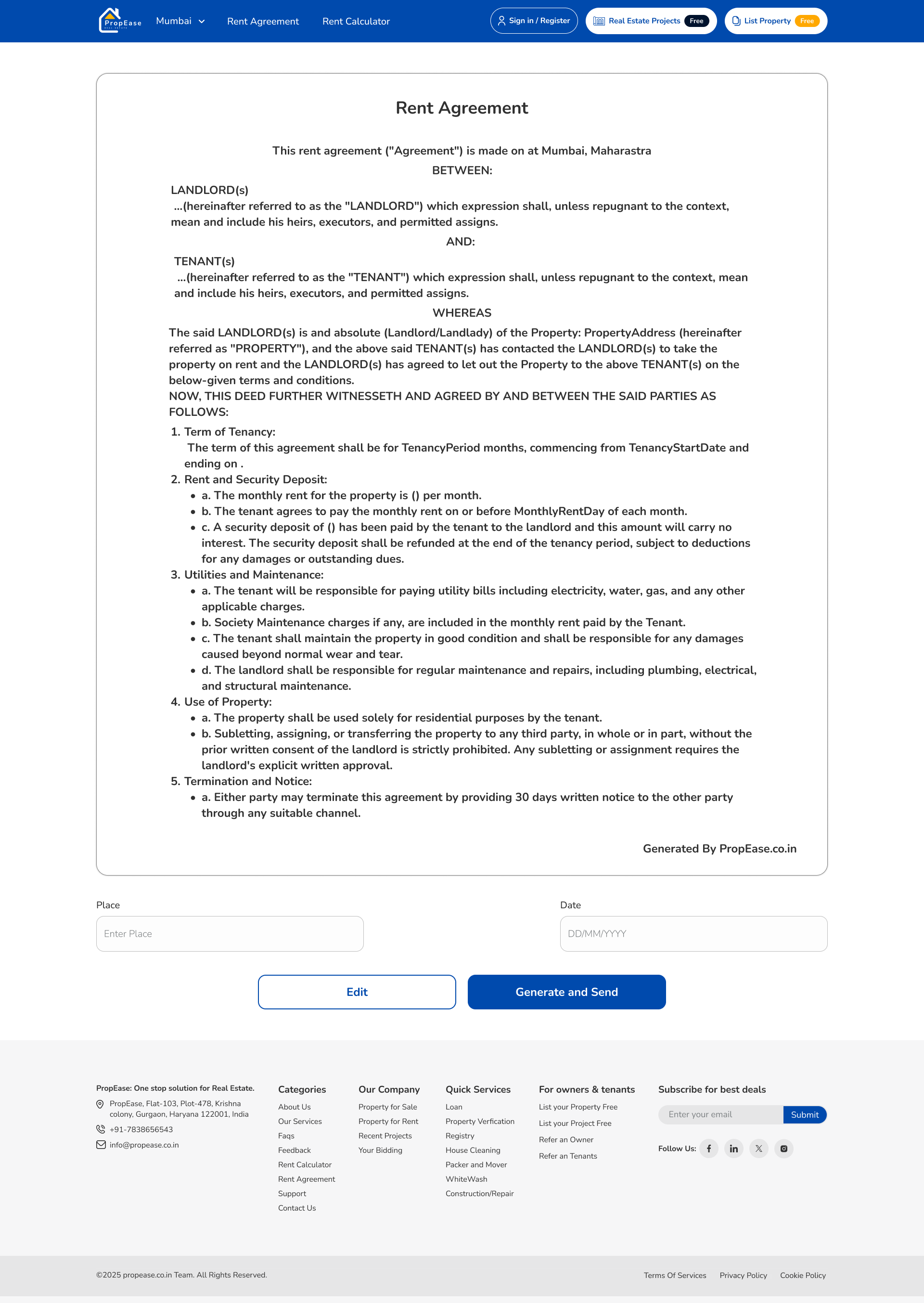
I built a rent calculator so tenants can plan their budget before shortlisting, and an agreement builder that generates a clean draft straight from the listing, preview it in-app, adjust the details, sign. No PDFs bouncing around over email.
- Rent calculator with monthly breakdown
- One-tap agreement generation, pulls details from the listing automatically
- In-app preview before signing
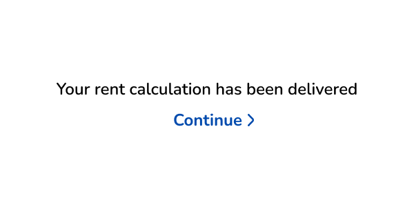
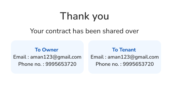
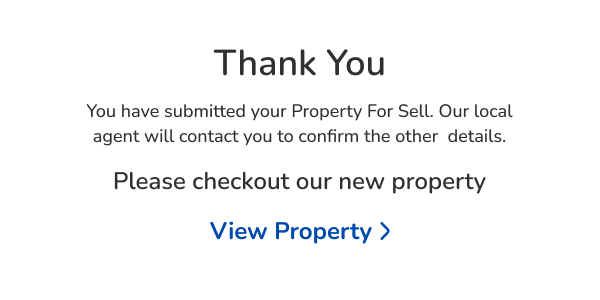
- Confirmation screen that treats the milestone as worth celebrating

Beyond a transaction, a relationship.
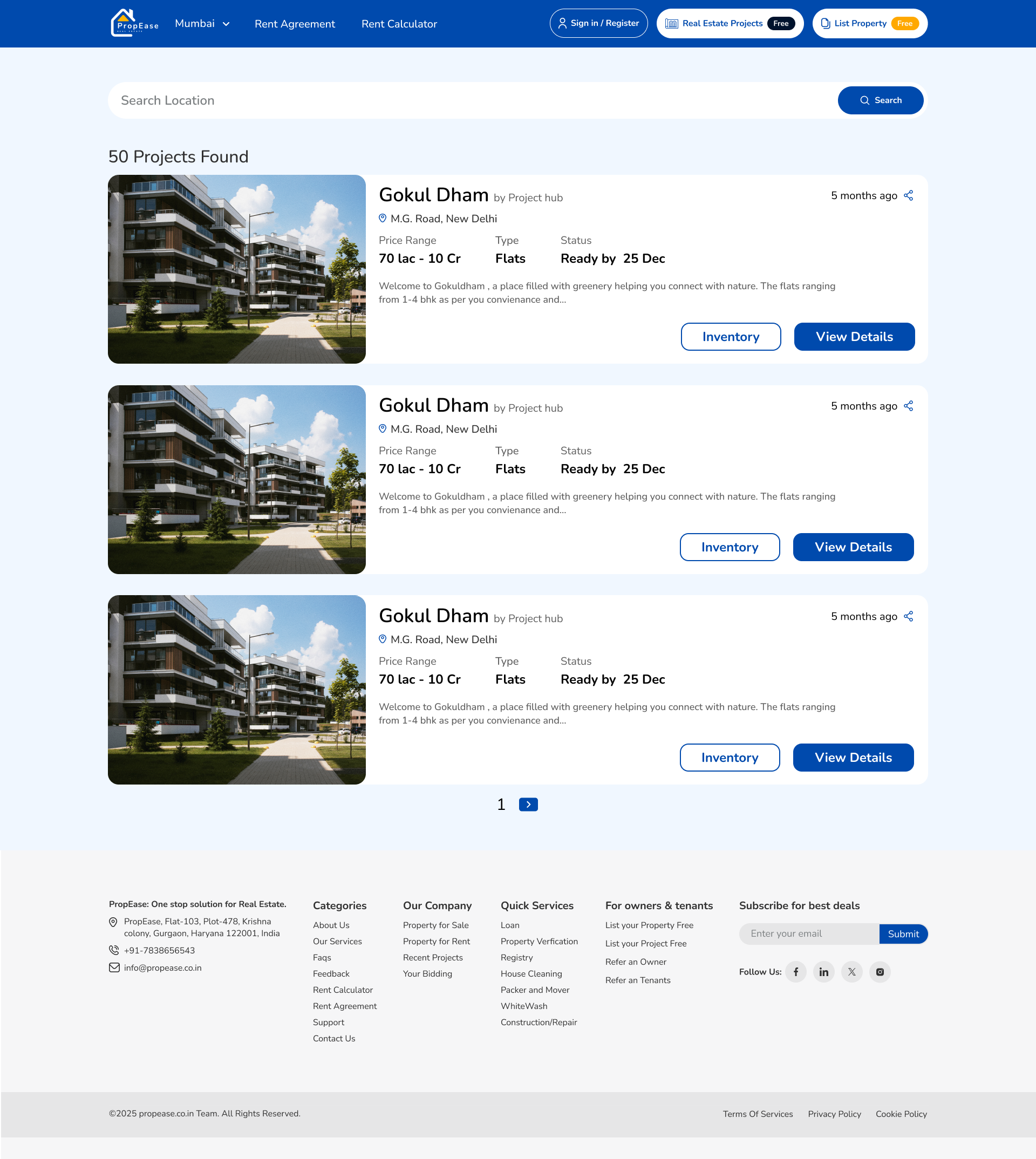
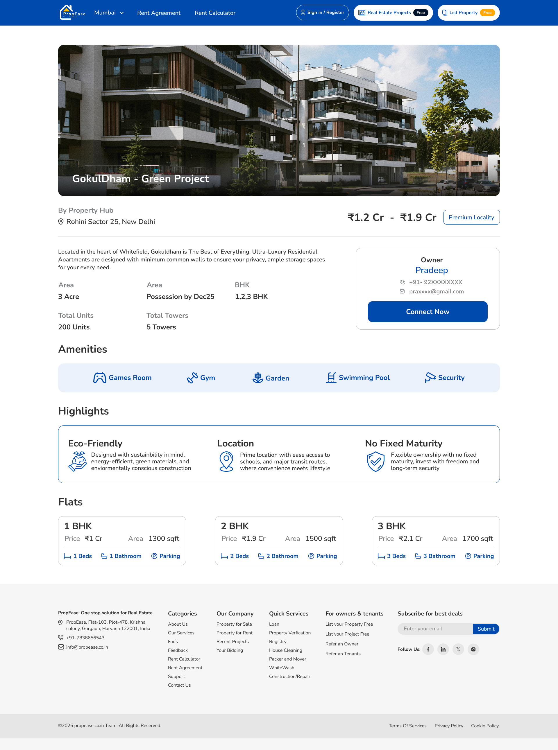
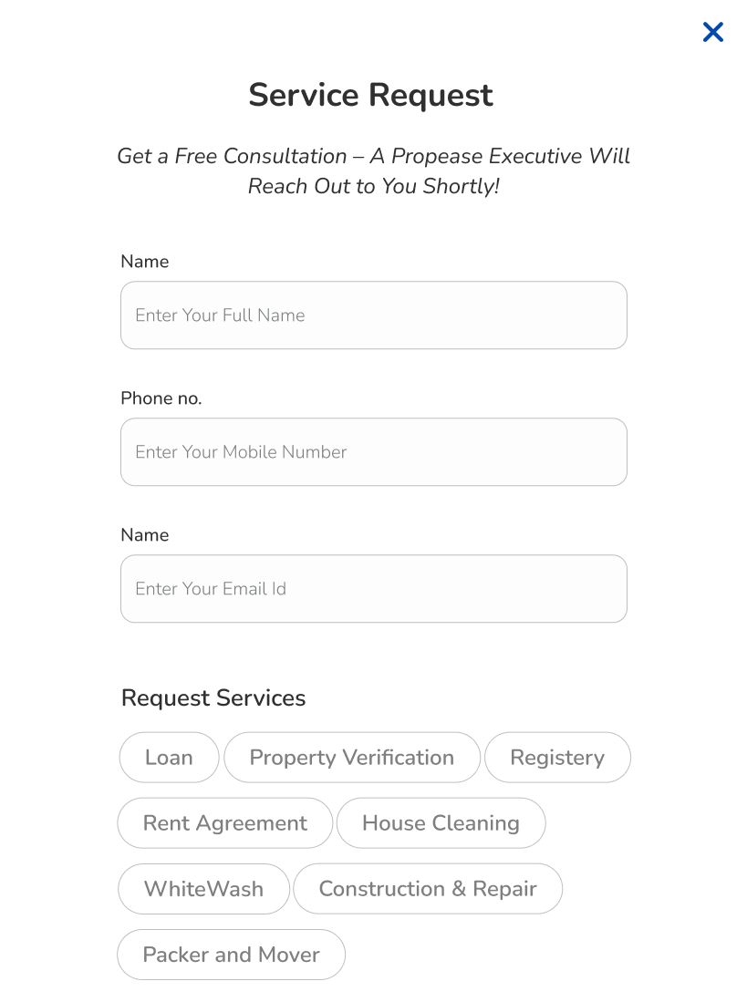
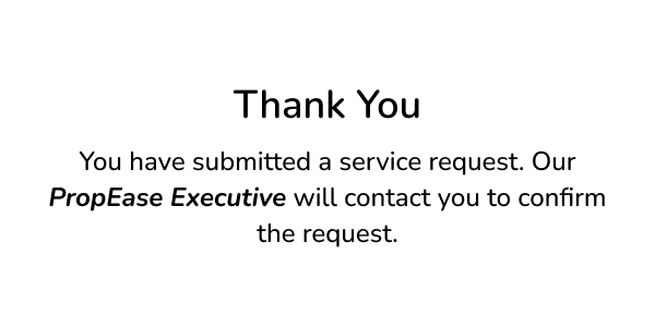
New project launches and on-demand home services sit one tab away from the main flow. I carried the same card language throughout, discover, request, confirm, so nothing in the product feels like a separate app bolted on.

A profile that grows with the user.
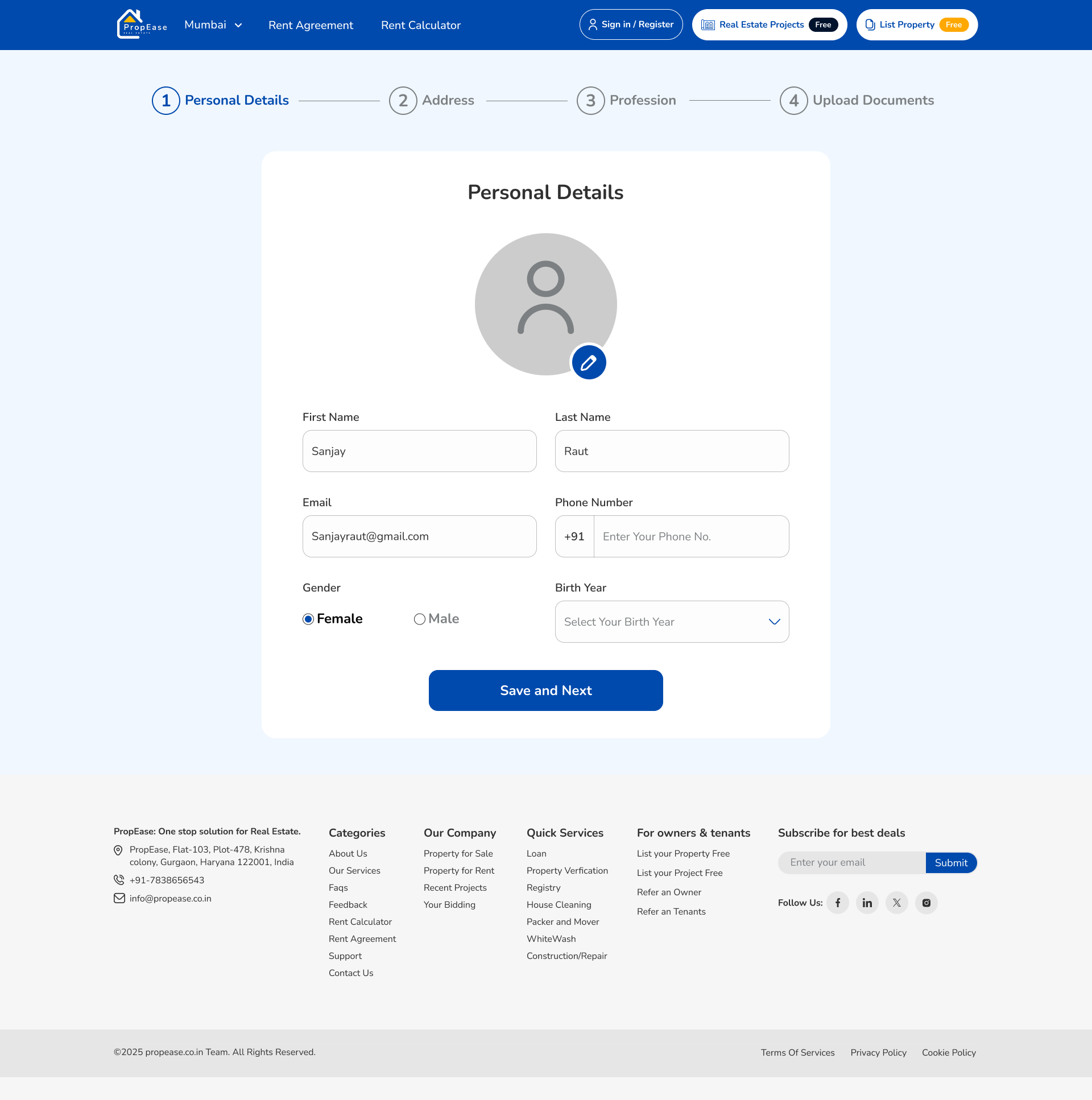
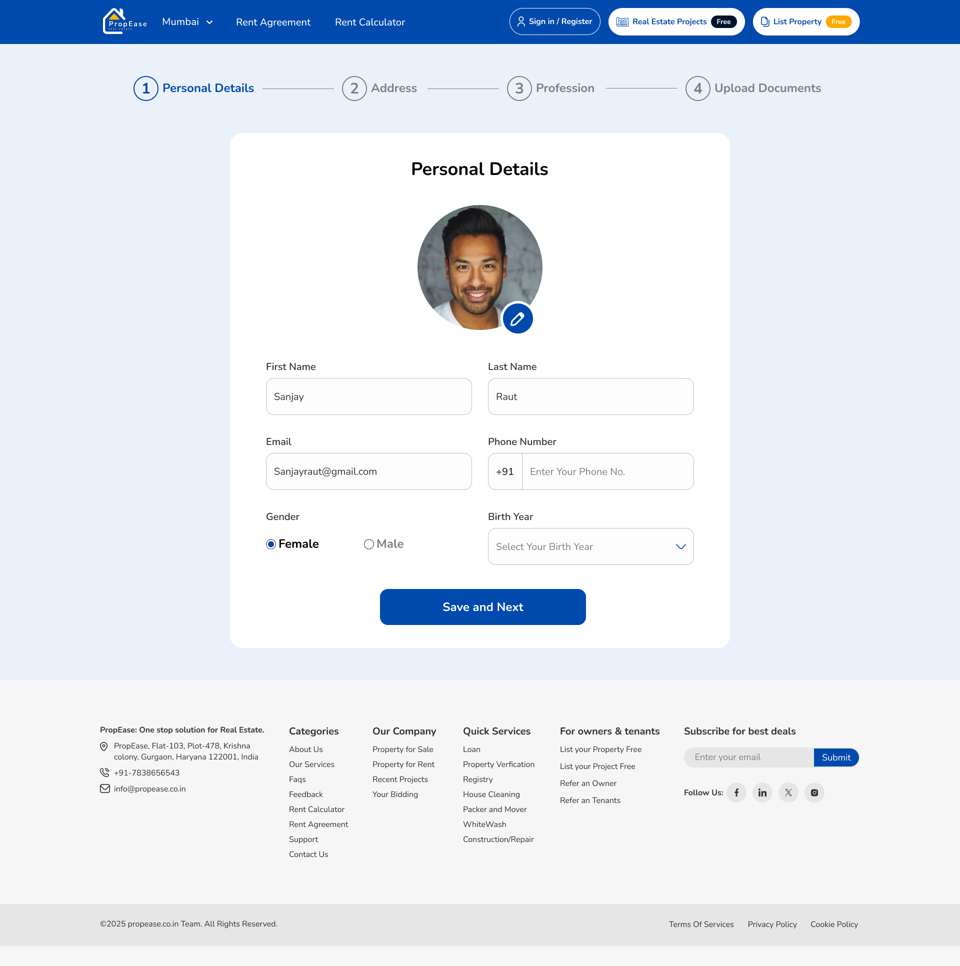
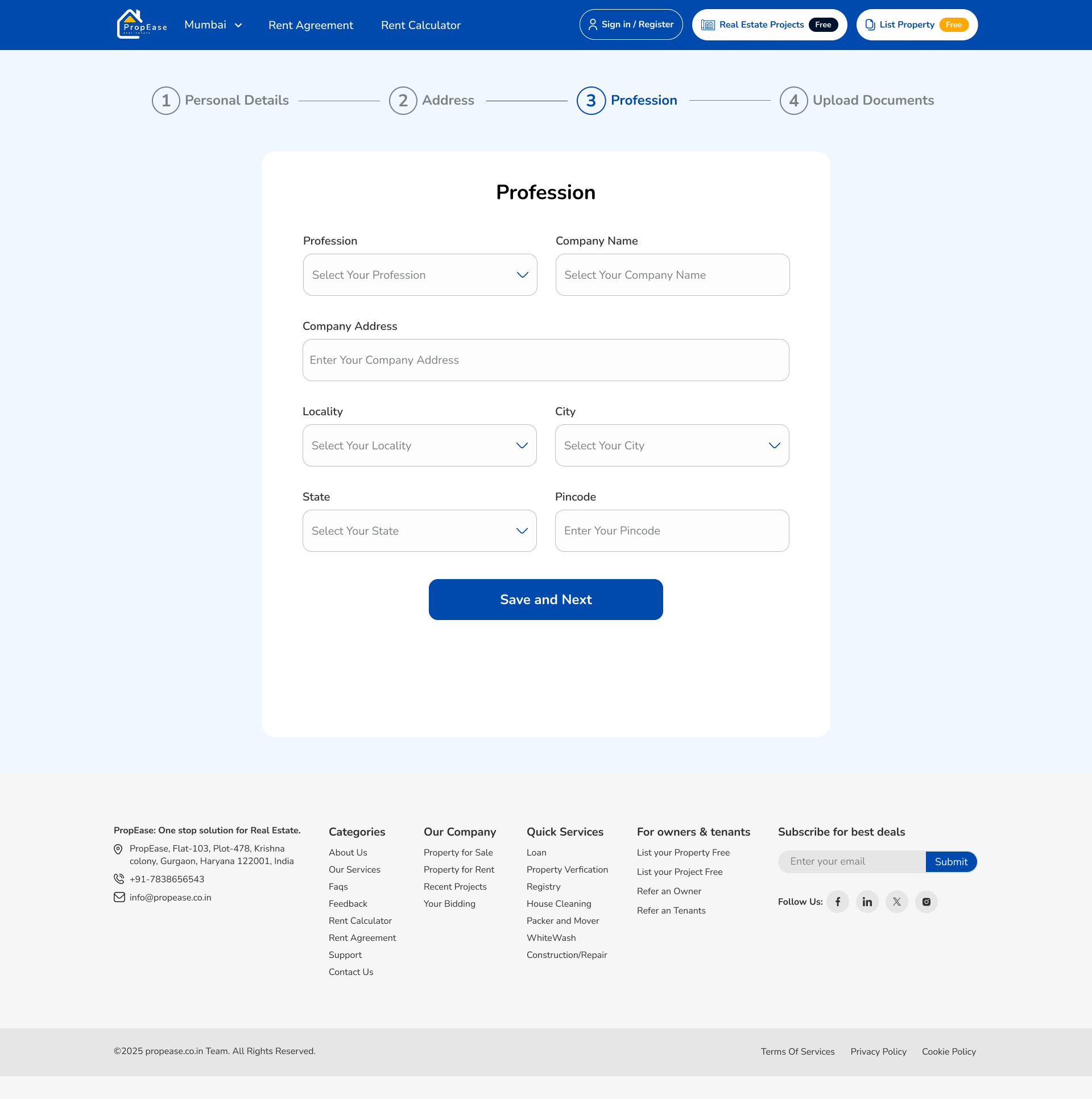
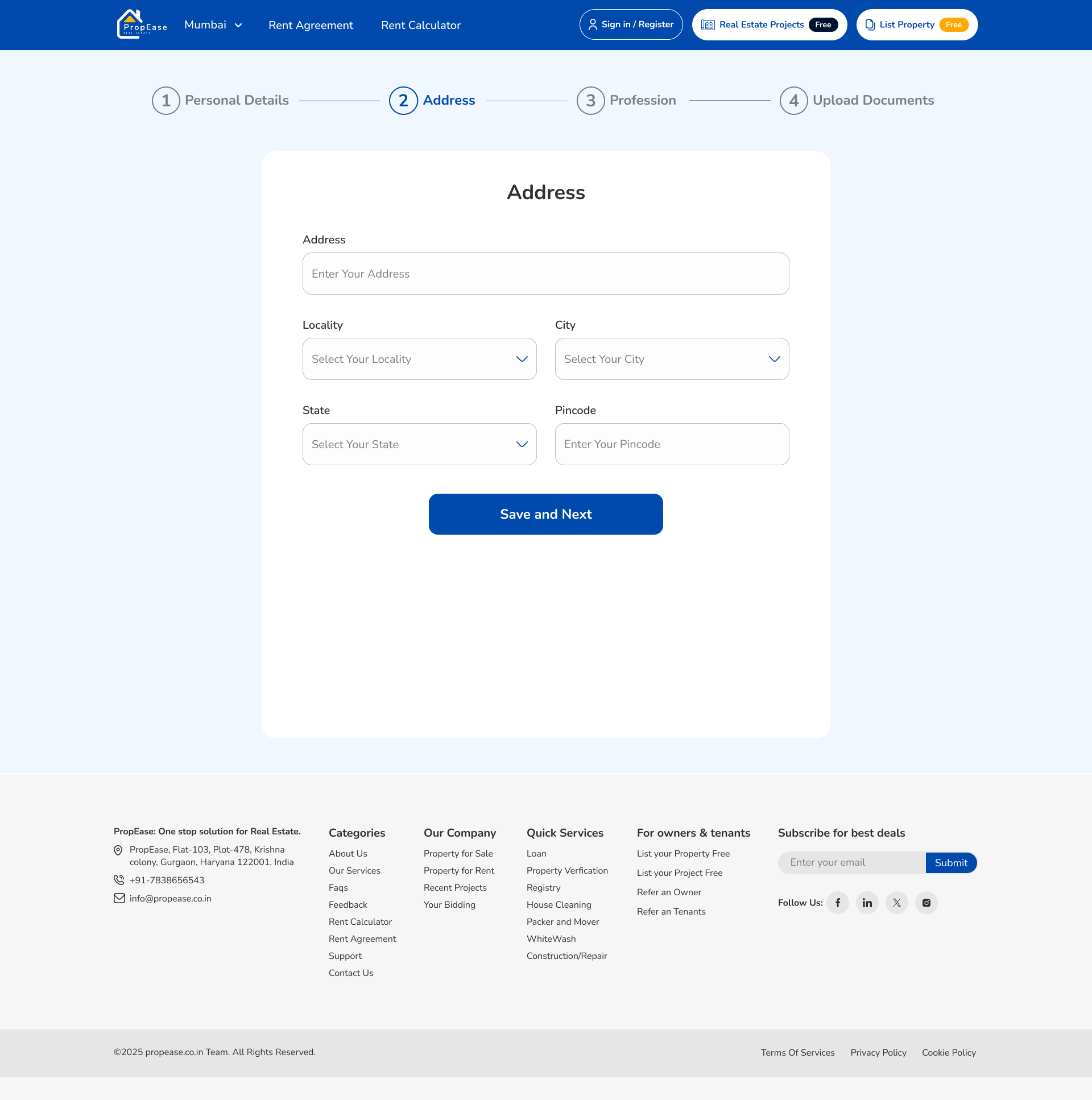
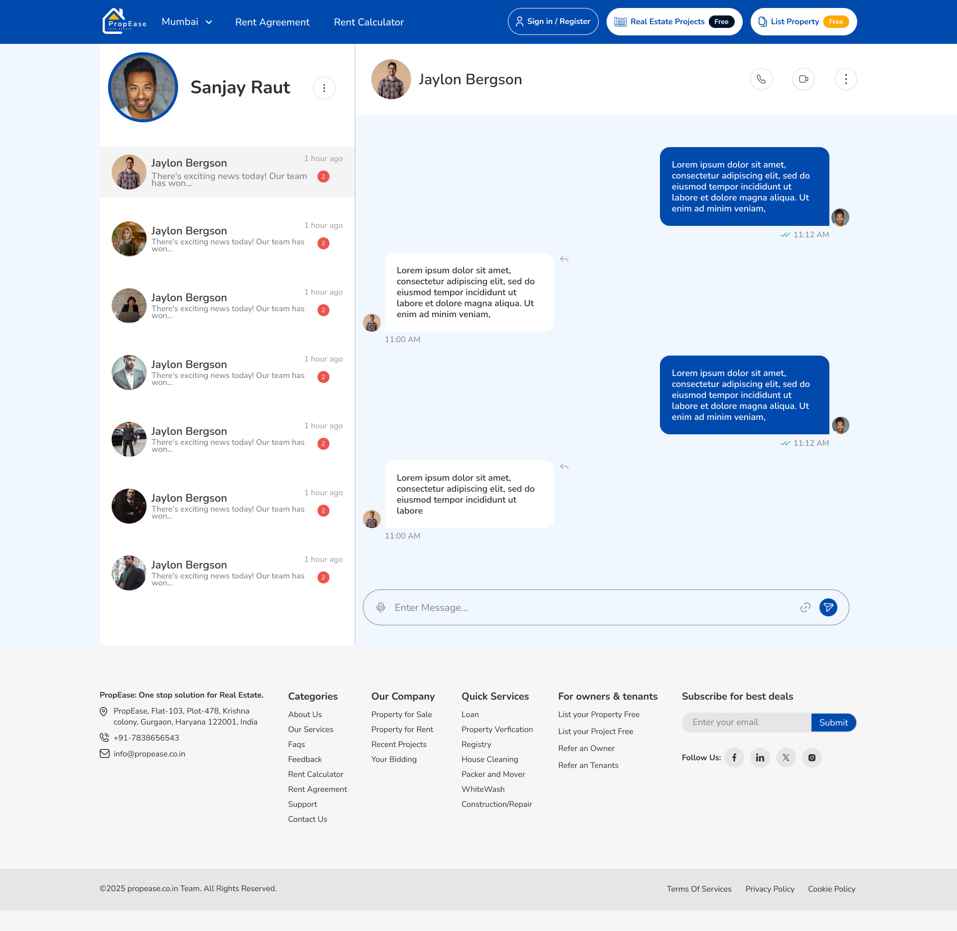
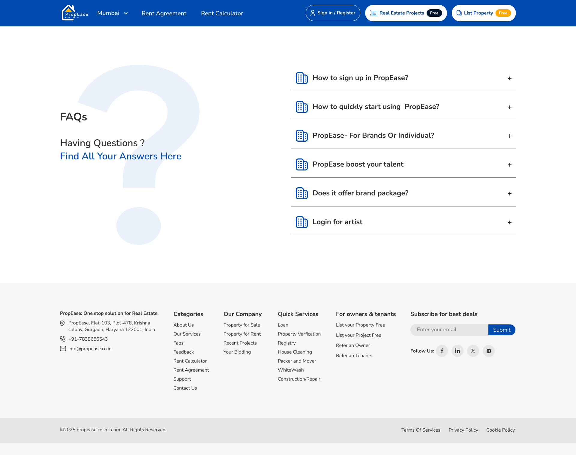
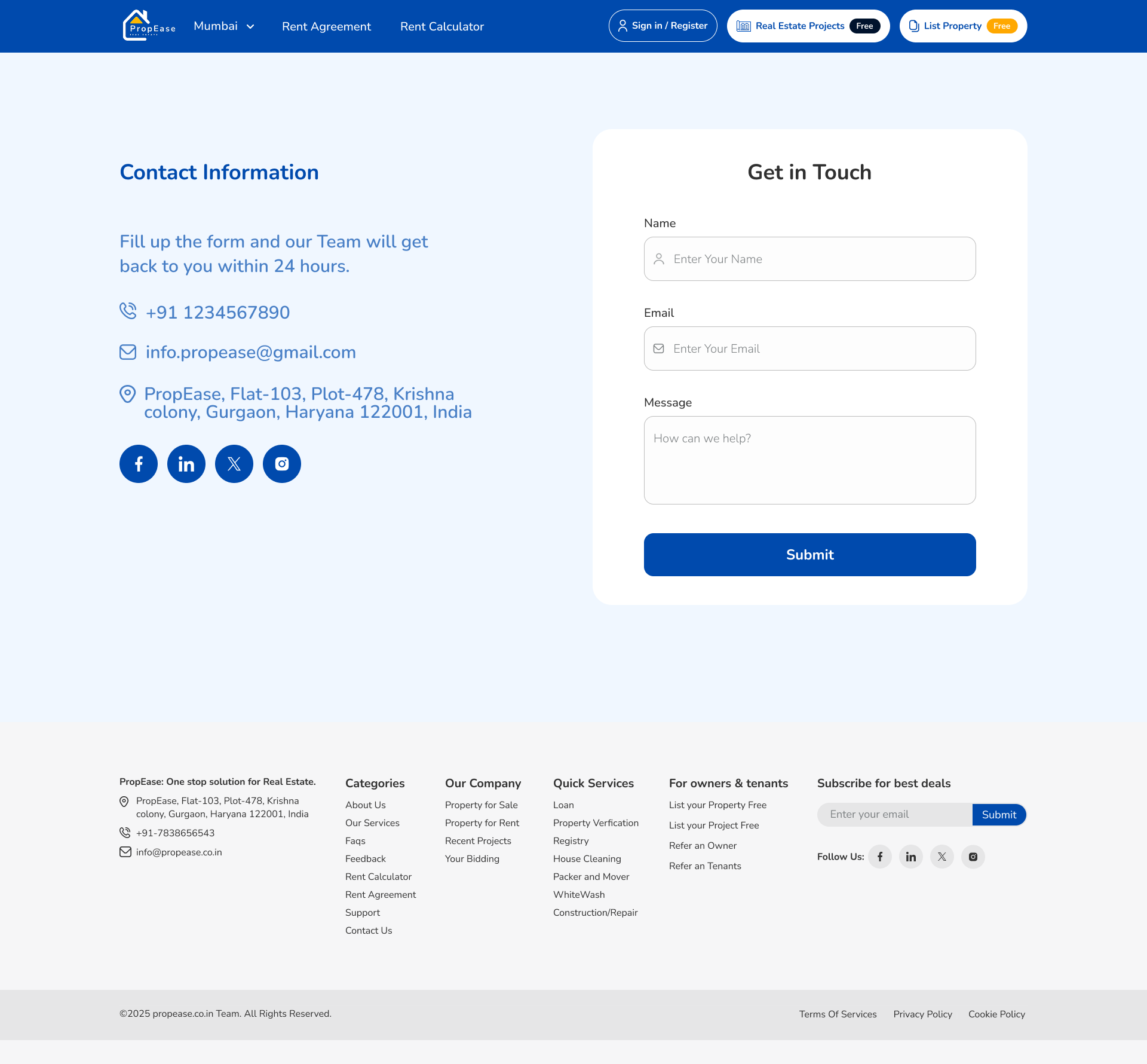
Profile, professional details and address are collected progressively, surfacing at the moment they matter, never before. Messages, FAQ and Contact form a calm support trio for any moment of doubt.
One language across 70 screens.
I chose a teal-led palette, an 8-point spacing grid, and one type ramp to hold the app together as flows diverge. Cards, bottom sheets, filter chips and CTAs all derive from the same primitives, so adding a new screen never breaks the visual rhythm.
Reflection
Real estate is anxious. The app shouldn't be.
Propease showed me that a product's complexity doesn't have to show. The win wasn't the screen count, it was five different user types reaching exactly the right place without ever feeling lost.
Enjoyed this case study?