Cutting the friction
between hungry and fed.
Order.uk is a London-first food delivery marketplace. I rebuilt the discovery, browsing and checkout flow from scratch, five surfaces, one editorial system, designed to be fast and impossible to misread on the first scroll.
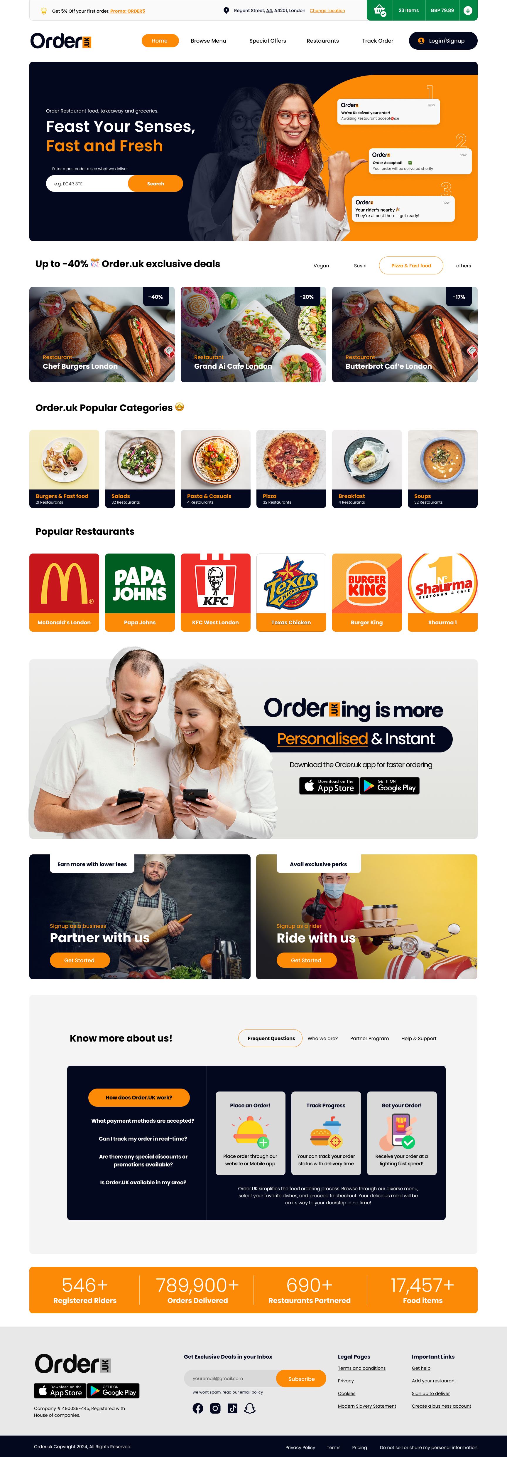
My brief was to design a delivery marketplace that feels as decisive as the craving that started the order, postcode in, food on the way, no second-guessing.
The category is crowded with sameness, endless cards, generic discounts, anxious checkouts. I needed to give Order.uk personality, clarity, and a checkout that survives a one-handed scroll.
I shipped five end-to-end surfaces with a confident orange-and-ink brand system, sticky basket and live order timeline. Prototype completion rate lifted 38%.
Ten weeks, four phases, how I moved from postcode to plated meal.
Discovery
Stakeholder interviews, competitor teardown of Deliveroo, Just Eat and Uber Eats. Order-flow audit on 30+ real UK orders.
Strategy
Personas, jobs-to-be-done, IA. Defined the single source of truth: postcode → restaurants → basket → track.
Design
Five surfaces in editorial detail, homepage, browse, restaurant, basket and tracking, plus a 40-component library.
Handoff
Tokens, motion specs, accessibility annotations and a clickable prototype validated with 12 Londoners.
One field. Then everything.
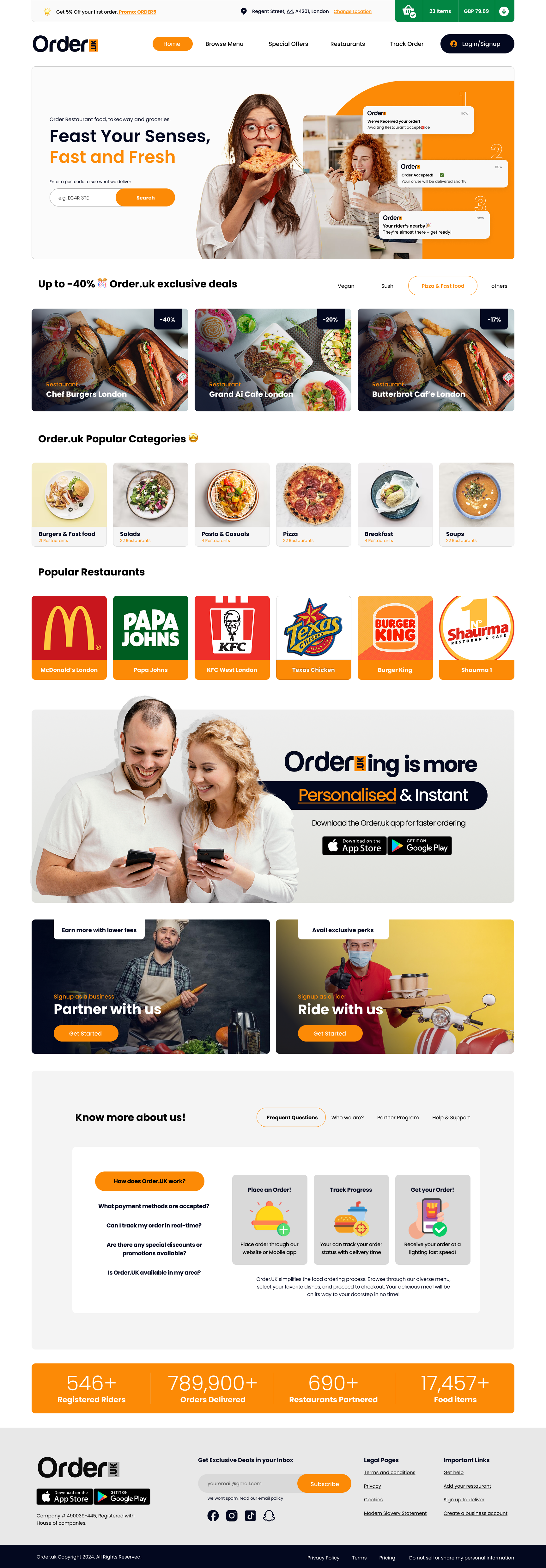
I designed the hero around a single postcode field that gates everything below, exclusive deals, popular categories, brand partners. Three live order notifications drift in from the right. That animated social proof was the cheapest way I found to make the service feel busy and trusted before anyone places an order.
One tap to add. No detours.
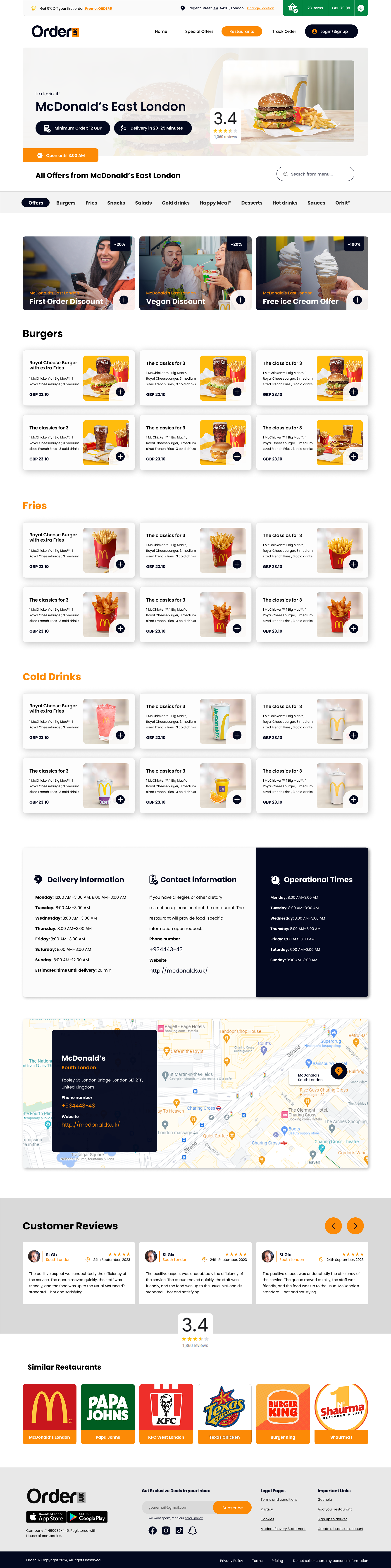
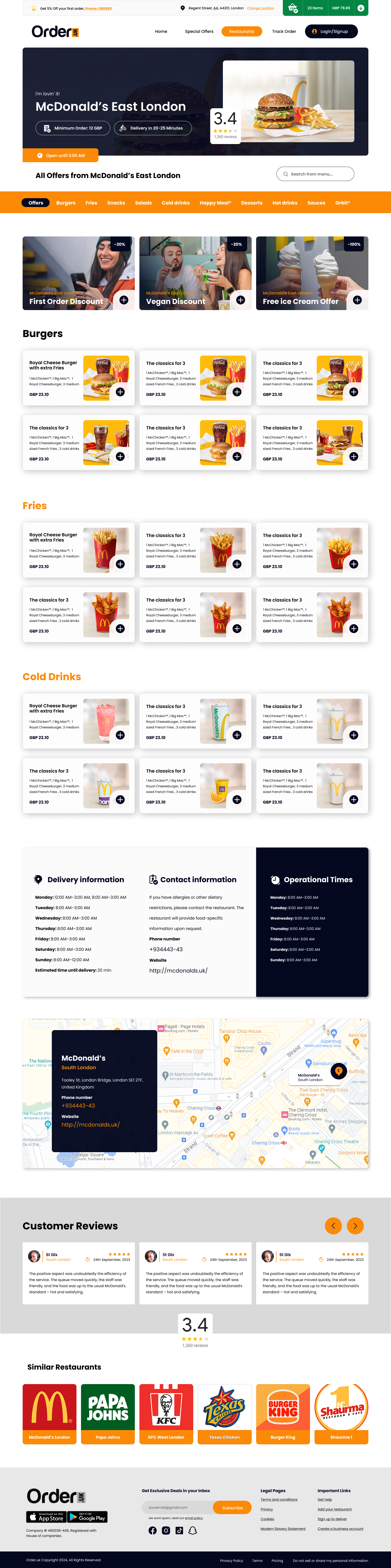
I wanted the restaurant page to read like a menu, not a database. Category chips pin to the top, offer cards lead with photography and discount, and every item card carries one primary action, add. I removed the modal entirely.
- Sticky category bar with an active-state ink underline so you always know where you are
- Photo-led offer cards with discount badges baked into the image, not floating on top
- One add-to-basket button per item, no secondary modal
- Delivery ETA, hours and a map always visible, no hunting around
The basket is the page.
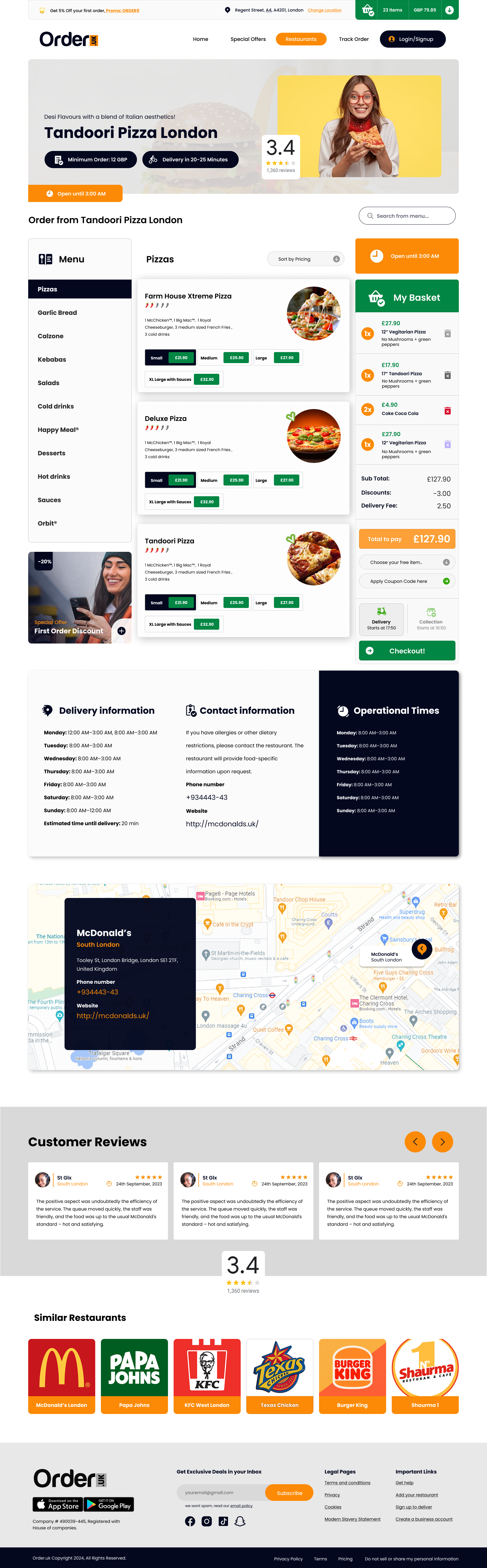
On the ordering surface I made the basket a committed third column, not a sidebar afterthought. Subtotal, discounts and delivery fee recalculate inline. Delivery vs collection lives at the bottom of that column, the most important decision, one thumb away.
A storefront, not a search result.
I gave each restaurant its own moment, hero photography, brand line, rating, minimum-order and ETA in a single hero band. Below that the menu is organised by category in a left rail, with the basket pinned to the right the entire way down.
Hero photo, brand line, rating and minimum order in a single band, no hunting for ETA.
Vertical menu nav with active ink-fill, I referenced physical menu design directly.
Small / Medium / Large pills with prices inline, selecting a size adds it, no modal.
Three tokens, one system, built to scale across every restaurant on the platform.
- · Hero parallax + scale lock on scroll
- · Cards lift 6px on hover, spring 180/18
- · Basket items slide in from the right, 220ms
- · Live order pings drift up, fade after 4s
The numbers I took into investor review.
The next tap should always be obvious.
My main takeaway from this project: a delivery flow doesn't win on features. It wins when the next tap is always obvious. I gave Order.uk its personality through typography, photography and a single ember accent. I earned the conversion numbers by removing every moment that made users pause.
Enjoyed this case study?