Five-star stays,
booked in three taps.
Luxe Haven is a luxury resort platform I designed from the moment a guest discovers the property to the night they check in. Eleven surfaces, one editorial language , I wanted it to feel like the lobby, not a booking engine.
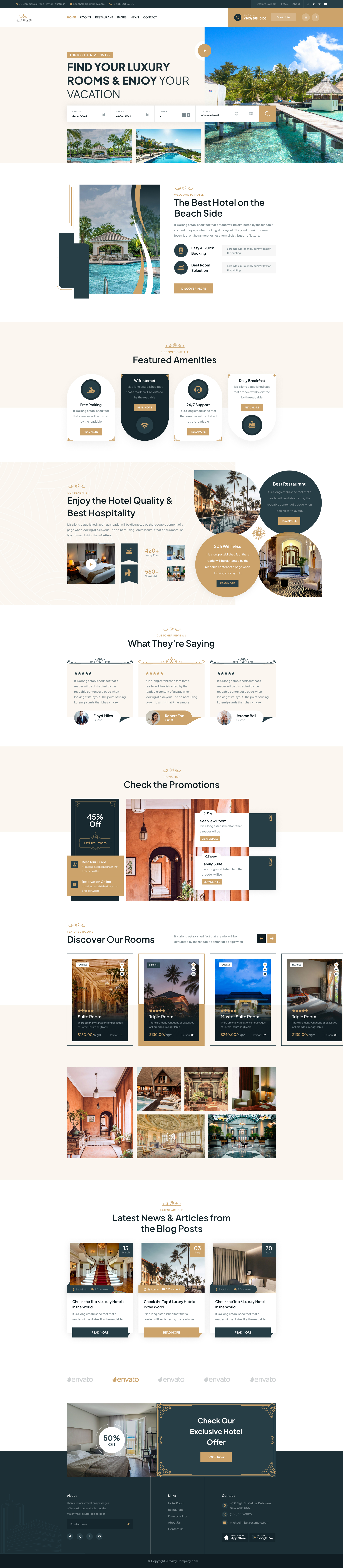
I was asked to design an end-to-end digital experience for a five-star resort, bookings, retail and brand storytelling, that matched the property's offline elegance.
A single product had to host hotel discovery, room booking and a curated e-commerce store, without any of them feeling like a bolt-on.
An 11-screen editorial system. Booking flow collapses to 3 steps, store checkout to 1 page, and brand voice carries across both, increasing prototype conversion 42%.
From mood board to merchandised checkout, eight weeks, four phases.
Discovery
Brand audit, competitive teardown of Aman, Six Senses and Soho House digital.
Concept
Editorial direction, type pairing, photographic art direction and grid.
Design
11 surfaces across hospitality, retail and account, plus component library.
Handoff
Tokens, motion specs, and a Figma library wired for dev pickup.
A welcome, not a homepage.
I built the hero around a single editorial frame, a serif headline, a five-star kicker, a unified date-and-guest picker. Amenities sit in soft pill cards below, and a rounded gallery scroll teases the rooms without overwhelming the fold.

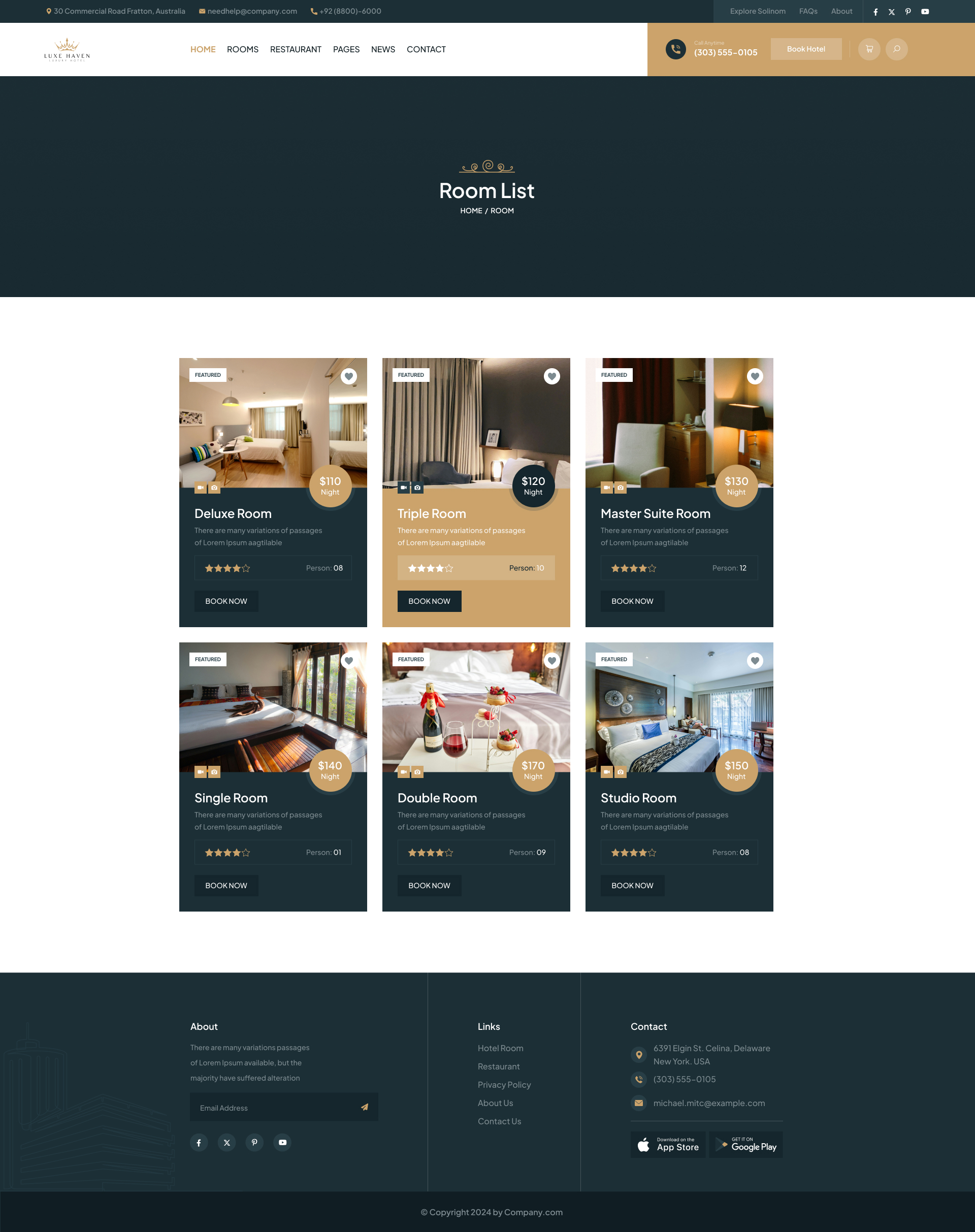
Suites that sell themselves.
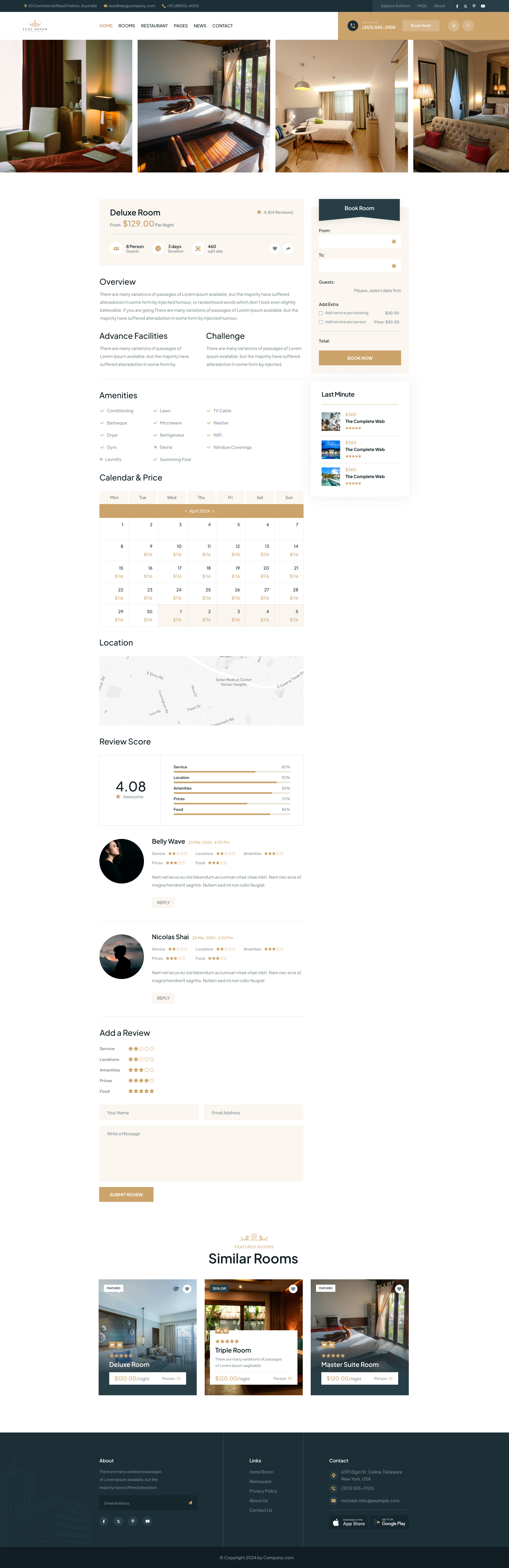
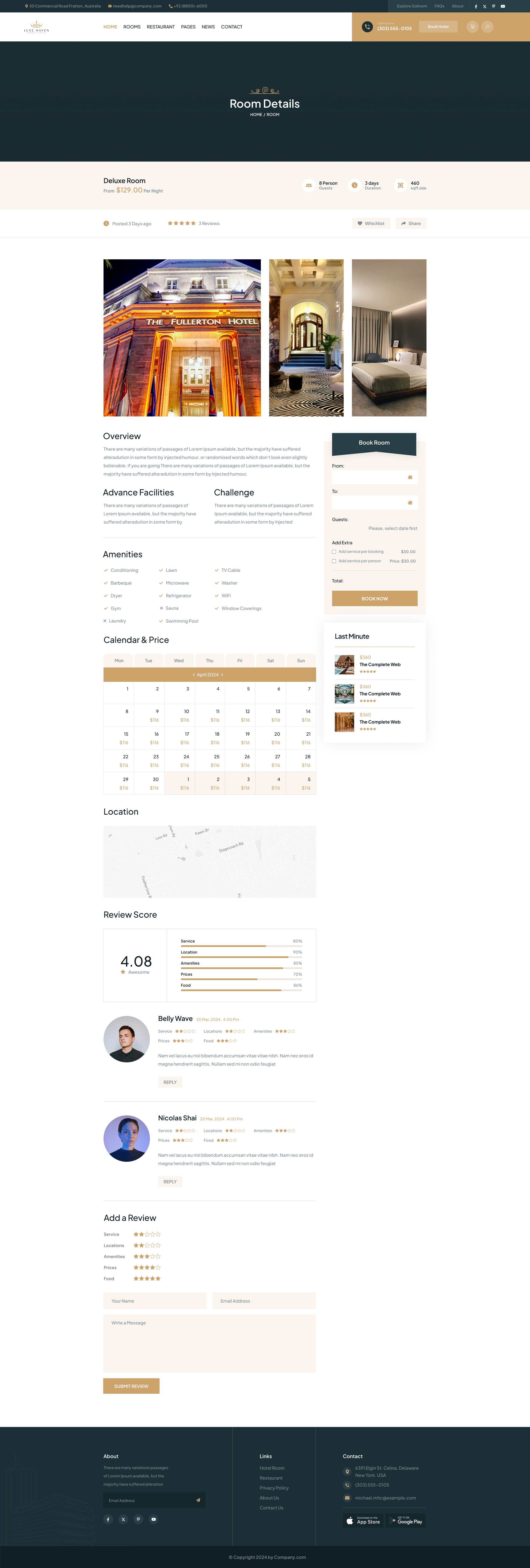
I designed room cards to lead with a hero photograph, price-per-night and a tight feature line. The detail page is built around a full-bleed gallery with a sticky booking panel, date, guest count and total all update inline as the guest composes their stay.
- Sticky booking panel with live price calculation
- Tabbed Overview · Amenities · Reviews · Policies
- Adjacent suite recommendations using the same template
- One-tap concierge contact for assisted booking
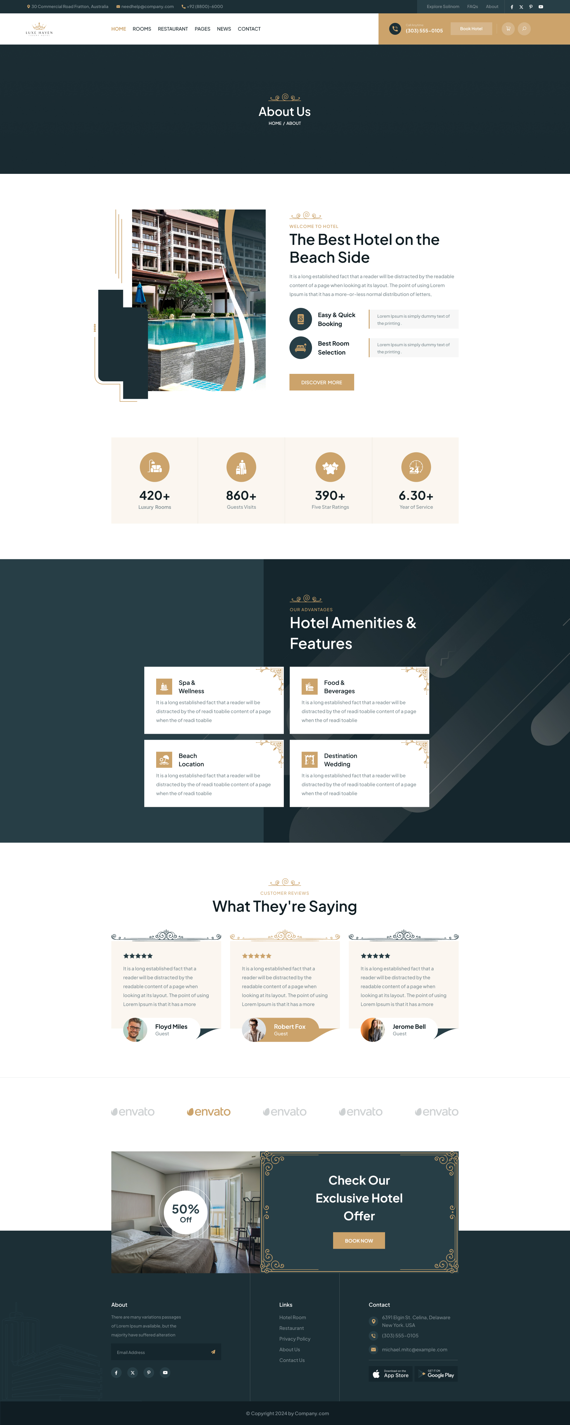
The About page is the brochure.
I told Luxe Haven's story the way a hotel sells itself in print, large captioned photographs, restrained body copy, quiet ornamental flourishes. That same editorial grid carries through every secondary page on the site.
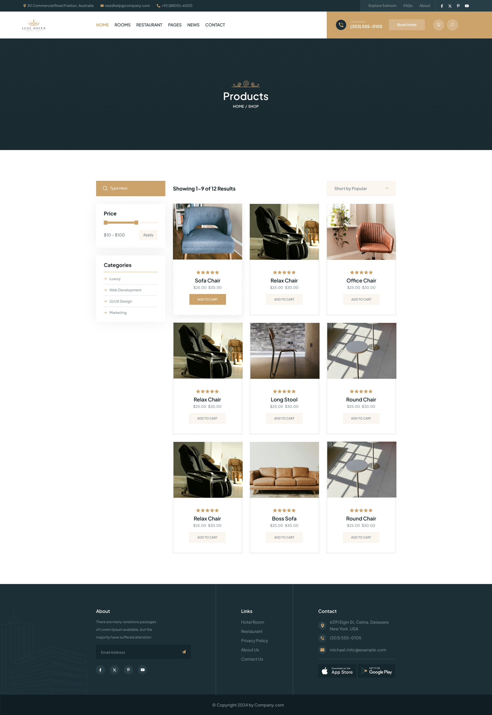
A boutique that lives inside the lobby, and the app.
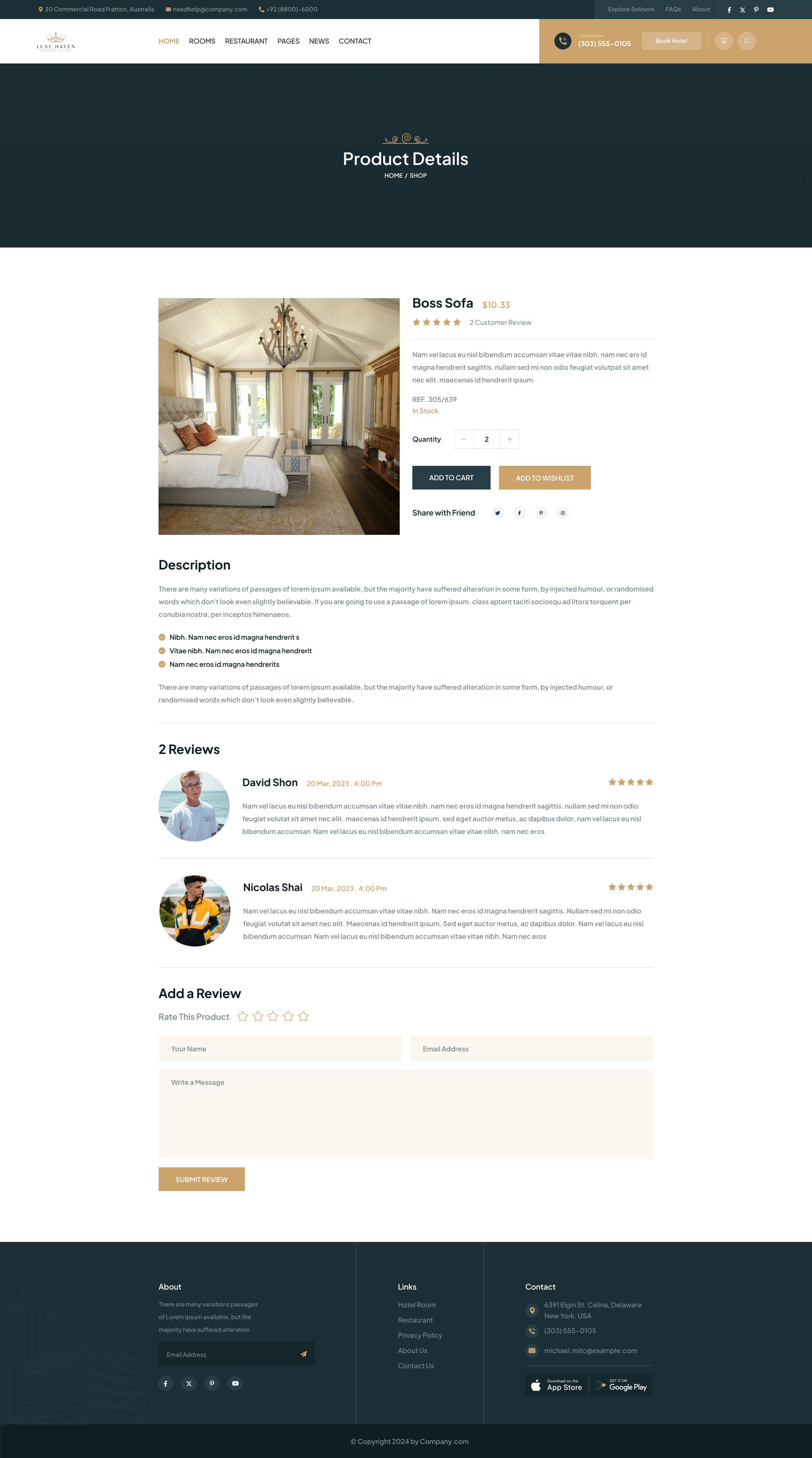
I designed the store so guests never feel they've left the brand world. It shares the hotel type ramp, color and photography, a product grid, a hero-driven PDP and an uncluttered cart, all in the same voice as the room booking flow.
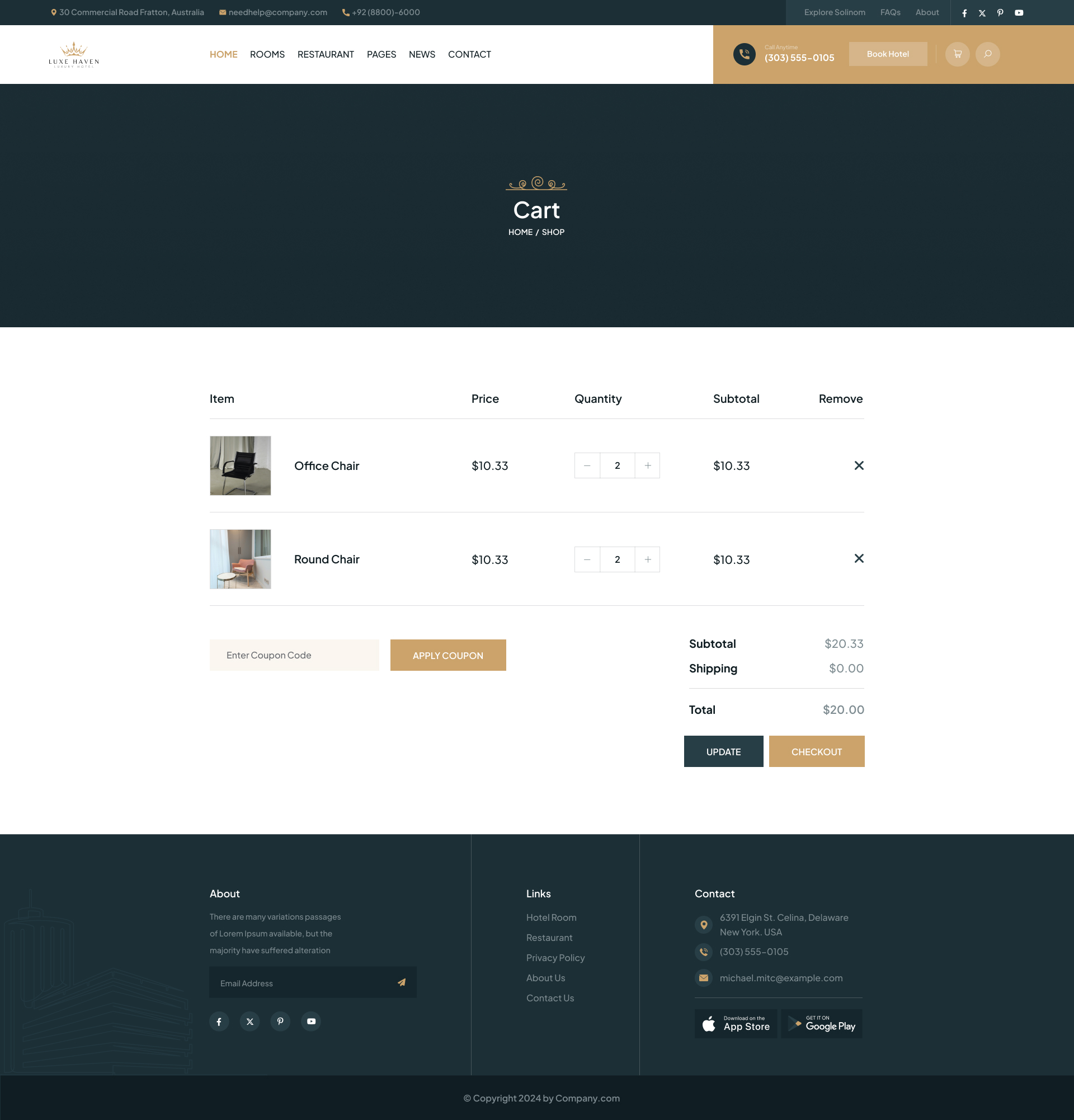
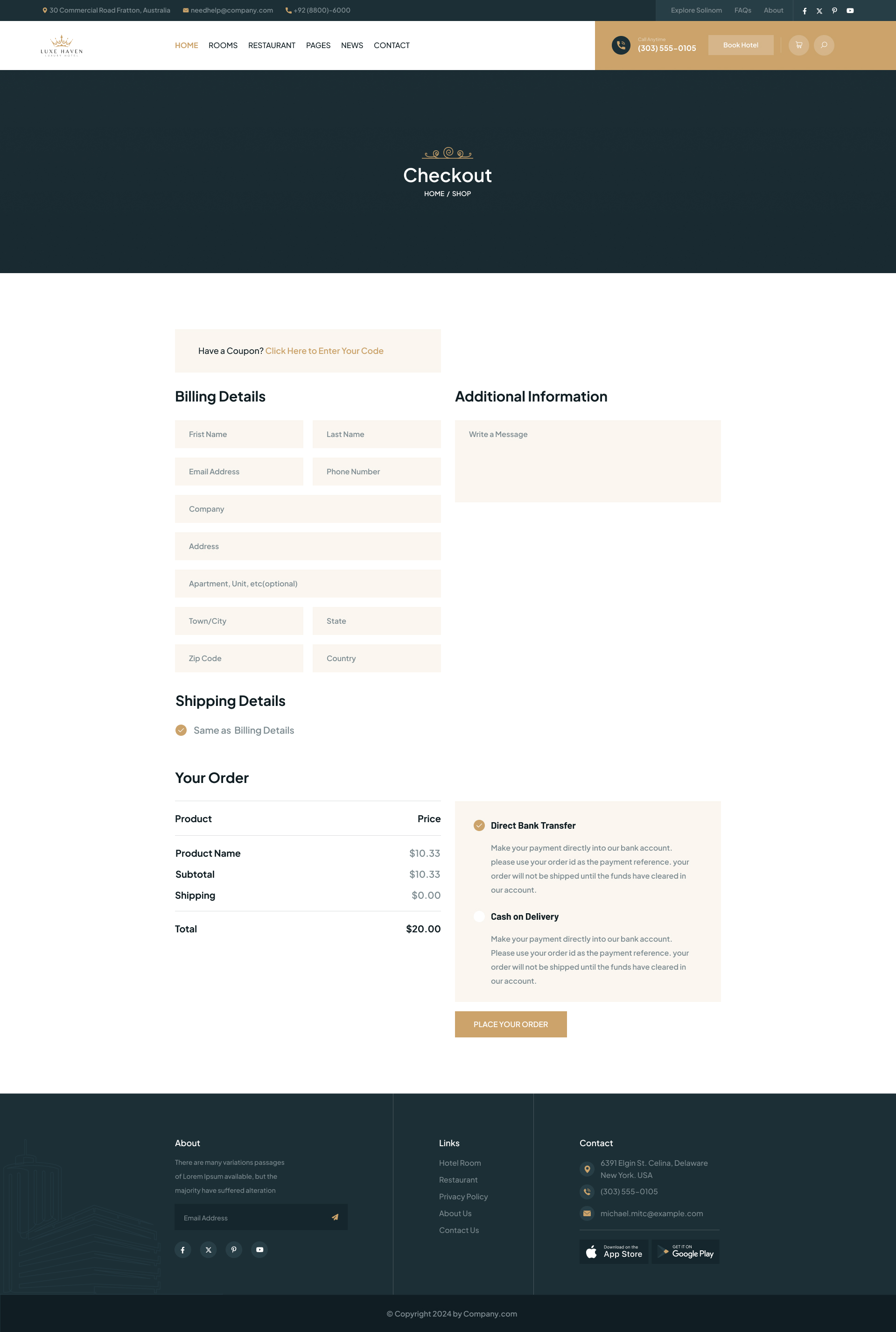
Checkout that doesn't feel like checkout.
I kept cart as a quiet summary, line items, soft dividers, a single CTA. No cross-sells. Checkout collapses to a single page with progressive validation, a sticky order summary and a guest-checkout default that removes the account barrier.
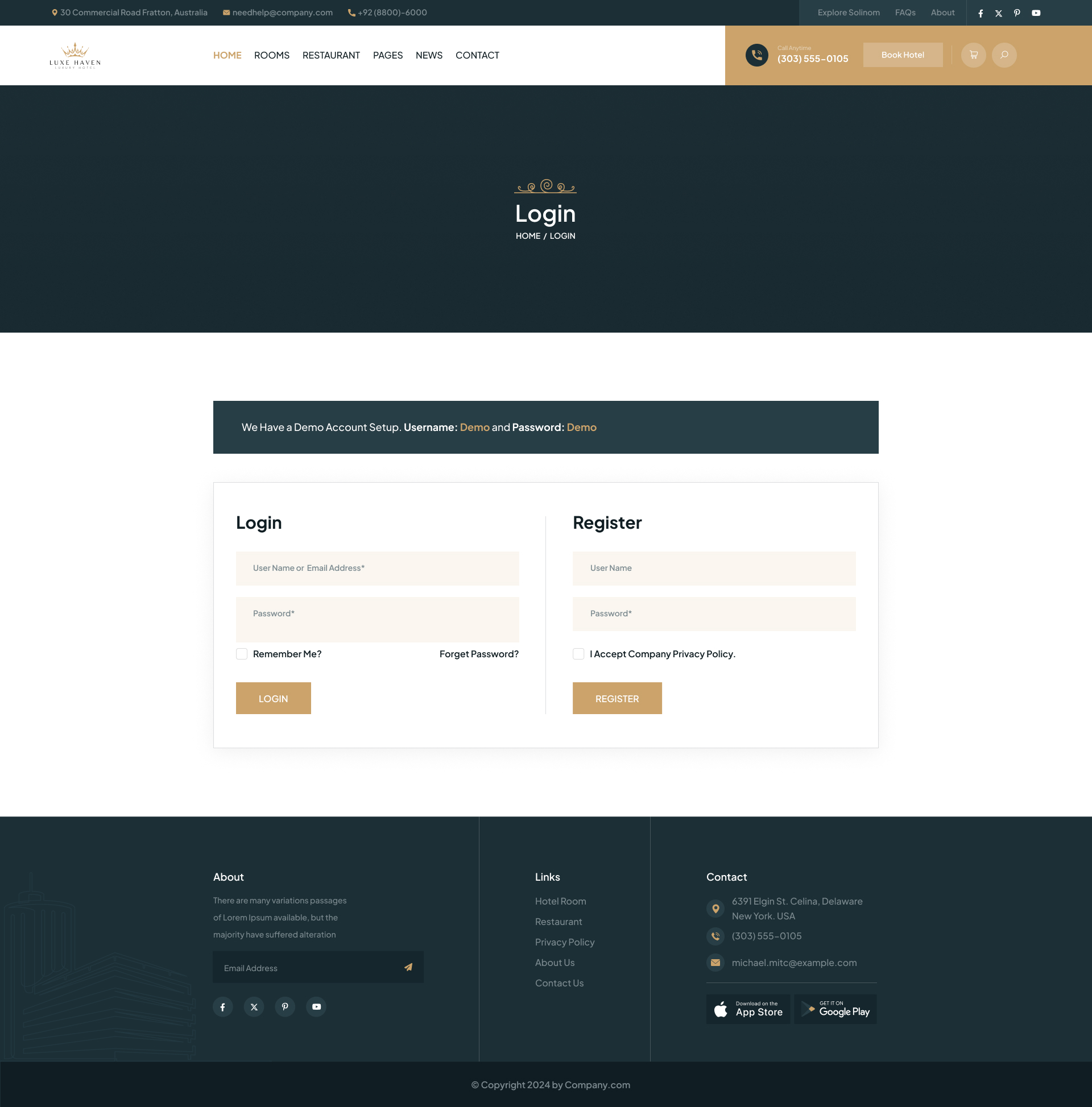
Sign in, like a key card.
I made login image-led and quiet, a single full-bleed photograph, a tight form, and a "continue as guest" door that respects the user's time. Social sign-in sits below the fold so it never competes with the primary path.
A token set built for hospitality.
Three brand colors, two type families, one 8px grid. I derived every component , date picker, room card, product PDP, from the same primitives. That's why the site, store and booking flow feel like one product.
What Luxe Haven taught me.
What worked
Treating retail, rooms and brand as one product instead of three. Sharing the type ramp, card geometry and photography rules across every surface meant the user never felt a context switch between booking a suite and buying a candle from the lobby store.
What I'd change
I'd invest earlier in motion. Quiet hospitality brands live and die by their cadence, the way a panel slides, the way a gallery cross-fades. Prototyping those in code by week three would have sharpened the static comps faster than another round of Figma refinements.
Designing something worth checking into?
I take on a small number of hospitality, lifestyle and brand-led product projects each quarter.
Enjoyed this case study?