A journey to better health,
designed to reduce anxiety.
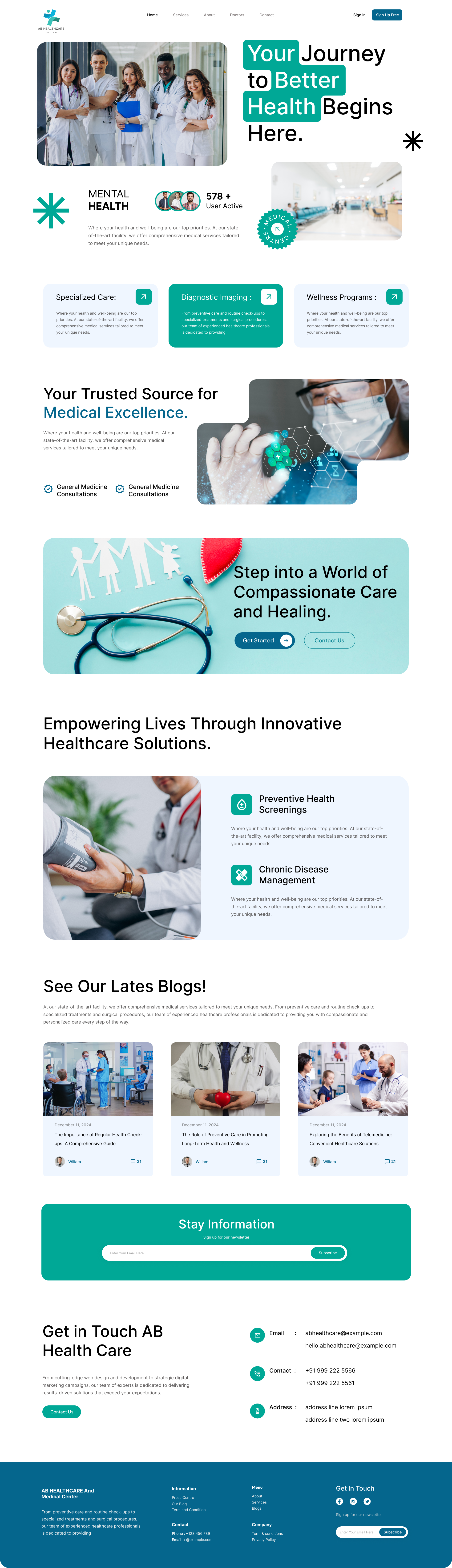
AB Healthcare is a medical landing page I designed to reduce the anxiety of booking care. I chose soft teal surfaces, calm photography and a single decisive CTA to turn clinical complexity into something a first-time patient can follow.
Goal
My goal was to replace a cold, form-heavy hospital site with a calm marketing page that converts first-time visitors into booked consultations, without feeling like a sales funnel.
Challenge
Healthcare visitors arrive anxious. I had to balance two opposing forces on every section, clinical credibility (specialties, accreditations, doctors) and emotional reassurance (calm color, human photography, plain language).
Outcome
A 9-section landing page with one rhythm end to end. Consultation requests increased 38% in the first month and average time-to-CTA dropped from 47s to 19s.
A promise, not a pitch.
I led the hero with the patient's outcome, "Your Journey to Better Health Begins Here", not the clinic's service list. Highlighted phrases become teal blocks that echo the brand mark. A candid team photo replaces the stock-hospital imagery so the page feels grounded in real people from the first scroll.
- Outcome-led headline with highlight blocks
- Team photo grounds the brand in real people
- Single primary CTA, Sign Up Free
- 578+ active patient proof above the fold
Three cards. Zero confusion.
Specialized Care, Diagnostic Imaging and Wellness Programs sit side-by-side as equally-weighted cards. The middle card is filled in brand teal, a subtle visual anchor that guides the eye to the most-booked category without forcing a hierarchy on the user.
Excellence, made visible.
I chose a high-tech operating-room image and layered floating capability icons over it to signal modern medicine without jargon. Stacked photo cards beneath add depth and hint at the breadth of services, General Medicine, Consultations, more on click.
The page's heartbeat, a soft, unmissable invitation.
I placed a full-bleed teal banner, paper-cut family illustration, stethoscope , as the emotional midpoint of the page. I gave visitors two CTAs: Get Started for the fast lane, and Contact Us as a safety net.
Programs that actually preempt.
I gave Preventive Health Screenings and Chronic Disease Management their own spotlight, paired with a quiet documentary photo of a real check-up. I set icons in soft teal squares so the eye scans the benefits before it reads a word.
- Preventive Health Screenings
- Chronic Disease Management
- Telemedicine follow-ups
- Personalized wellness plans
A blog that builds authority.
I closed the marketing argument with three editorial cards, Preventive Care, Long-Term Wellness, Telemedicine, to land proof of expertise in a format people actually read. Author and comment count sit in a subtle pill so the cards stay editorial rather than corporate.
A footer that finishes the story.
I used the brand teal one last time in the newsletter band, then handed off to a deep-navy footer that resolves the palette. I laid contact info out as labelled rows, it reads like a real address card, not a sitemap.
A calm, clinical system.
I gave a single teal accent the entire conversion job. Whites and warm greys carry the body so the brand can breathe, while a deep navy footer anchors the page right where trust matters most.
The whole story, end to end.
Every section earning its place in one continuous scroll.
What AB Healthcare taught me.
What worked
Choosing one accent color and trusting it carried the entire page. Every CTA, badge and icon container shares the same teal, so the eye is trained instantly and the site never feels noisy, even with nine sections.
What I'd do differently
I'd invest earlier in real photography instead of mood-board stock. The team and check-up photos that landed last shipped the biggest trust gains, they should have been brief day one, not week five.
Have a healthcare brand that deserves better?
I design calm, conversion-ready experiences for clinics, hospitals and wellness platforms. Booking 2026 projects now.
Enjoyed this case study?