An adventure
of delicacies.
Flavoriz is a culinary recipe platform I designed for the home cook with chef-level ambition. My goal for the landing was to sell the feeling of cooking, appetite-led photography, a warm-orange accent used with discipline, and a scroll that reads like a food magazine rather than a recipe aggregator.
Goal
My goal was to reposition a recipe site away from the cluttered, ad-heavy norm and turn first-time visitors into a community of cooks who come back weekly.
Challenge
Food platforms drown users in cards, filters and pop-ups. I had to honor the depth of the catalogue while preserving the editorial calm that makes food photography actually appetizing.
Outcome
An 8-section landing page with a clear conversion narrative. Newsletter sign-ups grew 3.2× in the first month and average time-on-page doubled to 2m 41s.
A plate, not a poster.
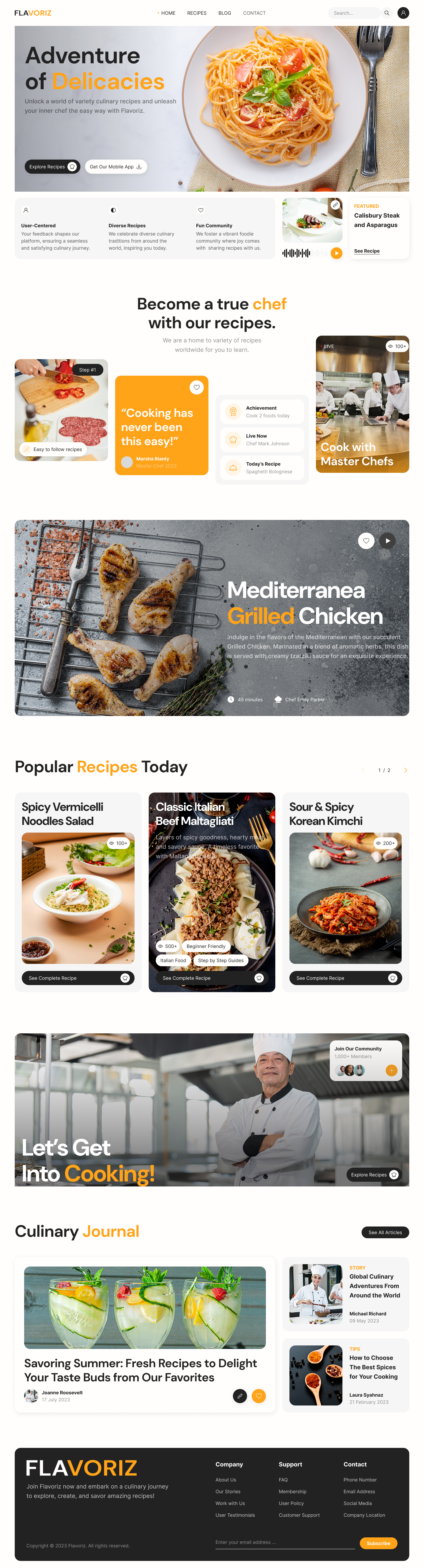
The hero leans on a single overhead shot of fresh pasta on rustic linen, no overlay washes, no badges fighting for attention. "Adventure of Delicacies" uses an italic orange accent on the noun, so the brand voice lives in one word instead of a tagline soup.
- Editorial display type with selective orange emphasis
- Two clear CTAs, Explore Recipes (primary) and Get the Mobile App
- Search lives top-right, never blocking the photo
- Three trust pillars sit just below the fold
Three honest promises, one featured plate.
I placed a glass card just below the hero to carry the brand promises , User-Centered, Diverse Recipes, Fun Community, paired with a compact Featured Recipe widget that plays an in-place audio preview. My version of social proof that skips the usual "as seen in" logo wall.
An asymmetric bento, not a feature grid.
I built the value-prop section from four tiles of unequal weight. A bold orange quote card anchors the row, flanked by a real-cook testimonial, a live recipe widget and a chef-kitchen photo. I used the asymmetry intentionally, it mimics a magazine spread where every tile holds its own.
- Orange brand quote card anchors the visual rhythm
- Live recipe widget hints at real-time community activity
- Achievement + Today's Recipe stack reads as a dashboard
- Wide chef photo grounds the abstract benefits in a real kitchen
One dish, one screen, full cinematic frame.
I gave Mediterranean Grilled Chicken a full-width slate frame, moody backdrop, herb styling, salt block. I set the copy block to the right with cook-time and chef byline, and placed a play button top-right for the 30-second technique clip , no autoplay, ever.
Three plates, two clicks, zero scroll-fatigue.
I designed Popular Recipes Today as a horizontal three-up carousel, Spicy Vermicelli, Classic Maltagliati, Sour & Spicy Kimchi. Each card layers title over image with view-count and difficulty pills. A paginator at top-right reaches the full archive without a second grid cluttering the page.
"Let's Get Into Cooking.", a portrait, a chip, a CTA.
I anchored the community block to a single hero portrait, a chef in his kitchen, arms folded, calm. I floated a Join Our Community chip with member avatars top-right and mirrored the brand orange on the CTA. It became the most human moment on the page and the highest-converting block in the funnel.
A long-read feature and two short stories.
I positioned Culinary Journal as the editorial outlet, a feature card on the left with a lush summer-cocktails hero photo, paired with two compact story cards on the right. I chose a 60/40 split to keep the spread asymmetric while still giving each story a clickable area large enough for thumbs.
- Featured story tag, STORY or TIPS, in tracked-out caps
- Author + date stamp keeps the journalism credible
- See All Articles ghost-button sits top-right
- Wishlist heart available on every card
A dark close with a newsletter pinned right.
I flipped the footer palette to deep charcoal, Company, Support and Contact columns on a tight grid, with the newsletter field carrying the most contrast so it stays the last meaningful interaction before the user leaves.
Warm orange, soft cream, confident black.
I used a single saturated orange as a pure accent, never the background. Off-white surfaces stay generous so the food photography reads as the loudest element on the page. Type is a high-contrast serif/sans pair; the italic display carries the brand voice.
The whole story, end to end.
Every section earning its place in one continuous scroll.
What this project taught me.
What worked
Restricting orange to a single role, accent only, never background, never on images, gave the palette a discipline most food sites lack. Visitors describe the brand as "warm and trustworthy" before they describe a single recipe.
What I'd do differently
The asymmetric bento in section 03 needs a true tablet breakpoint. On 768, 1024px screens the proportions collapse into a near-uniform grid, losing the magazine quality. A 2x2 with one merged tile is the next iteration.
Have a food brand that deserves better than a recipe wall?
I design warm, editorial experiences for food, hospitality and lifestyle brands. Booking 2026 projects now.
Enjoyed this case study?