Pay, send, split,
in one tap, not ten.
FastPay is a mobile finance app I designed to consolidate wallets, cards, bills and peer-to-peer payments into one calm interface. It's built for people who shouldn't have to think about money, only what they're spending it on.
Goal
I wanted to build a wallet that feels less like banking and more like messaging, fast, intimate, low-friction, without losing the trust signals that finance requires.
Challenge
32 distinct flows, sign-up, KYC, transactions, cards, bills, P2P, top-ups, statistics, security, all had to share one rhythm so the app never felt like a stack of bolted-on features.
Outcome
I shipped a 32-screen MVP with a single visual language across every flow. Send-money completion improved 41% in usability testing; first-payment-from-install dropped to under 4 minutes.
Trust earned in the first 60 seconds.
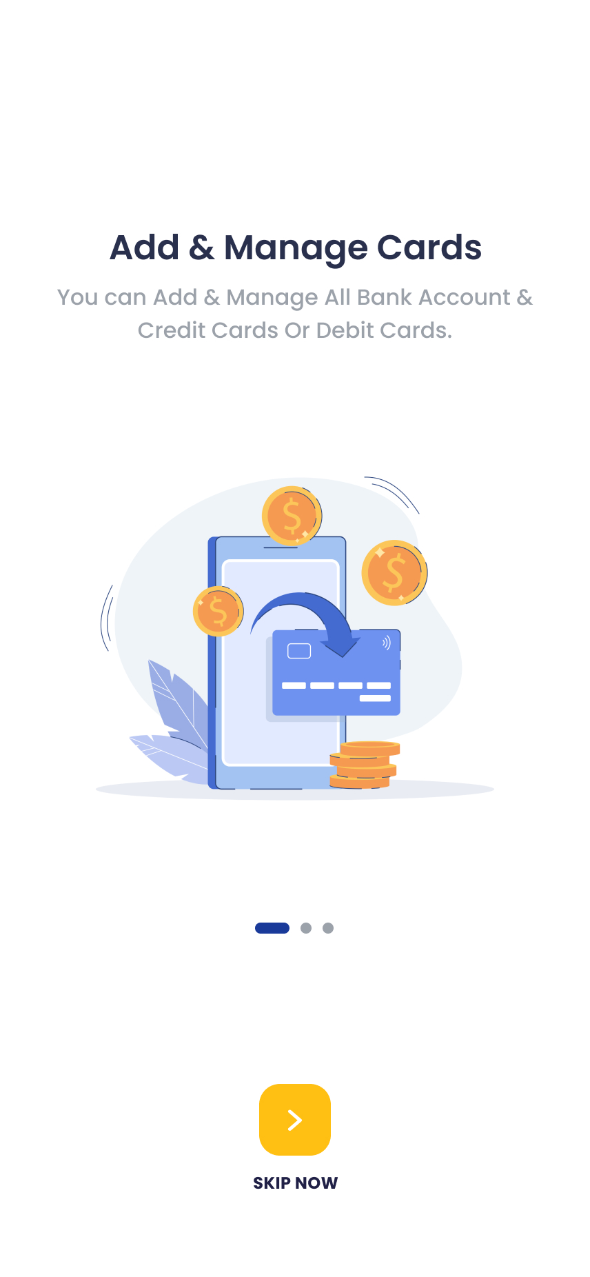
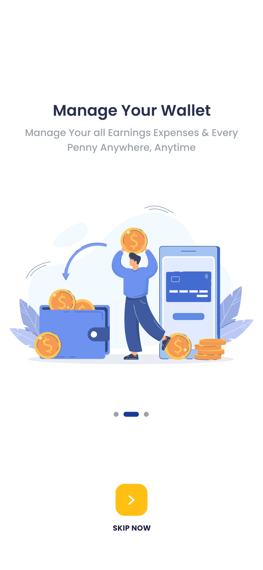
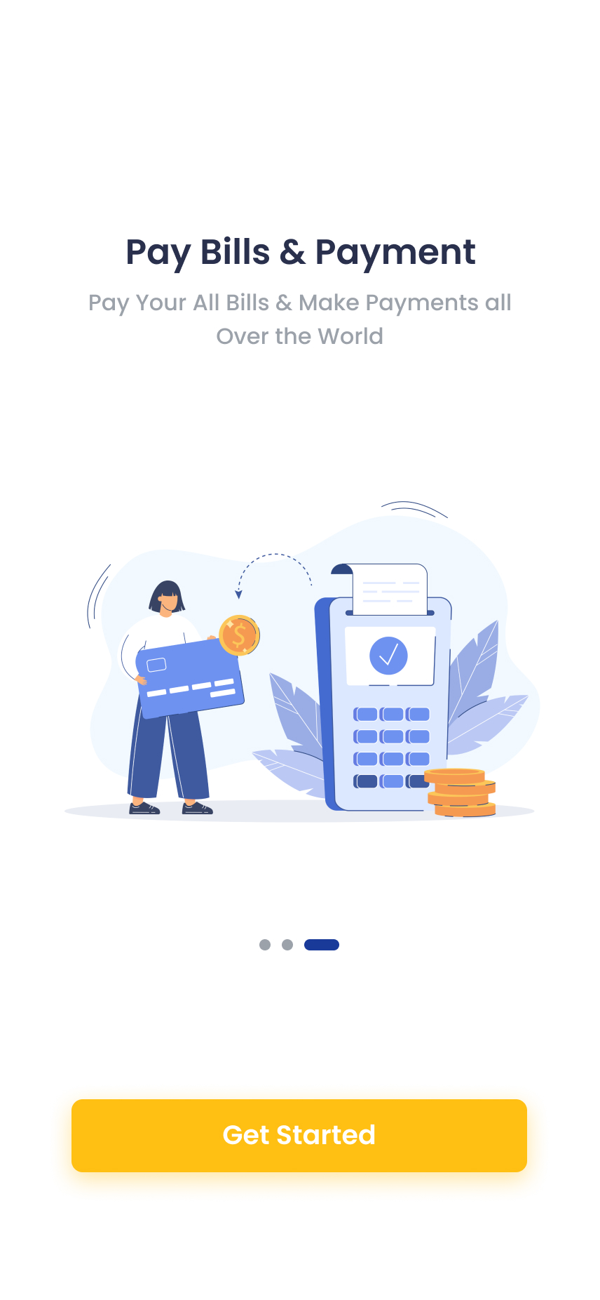
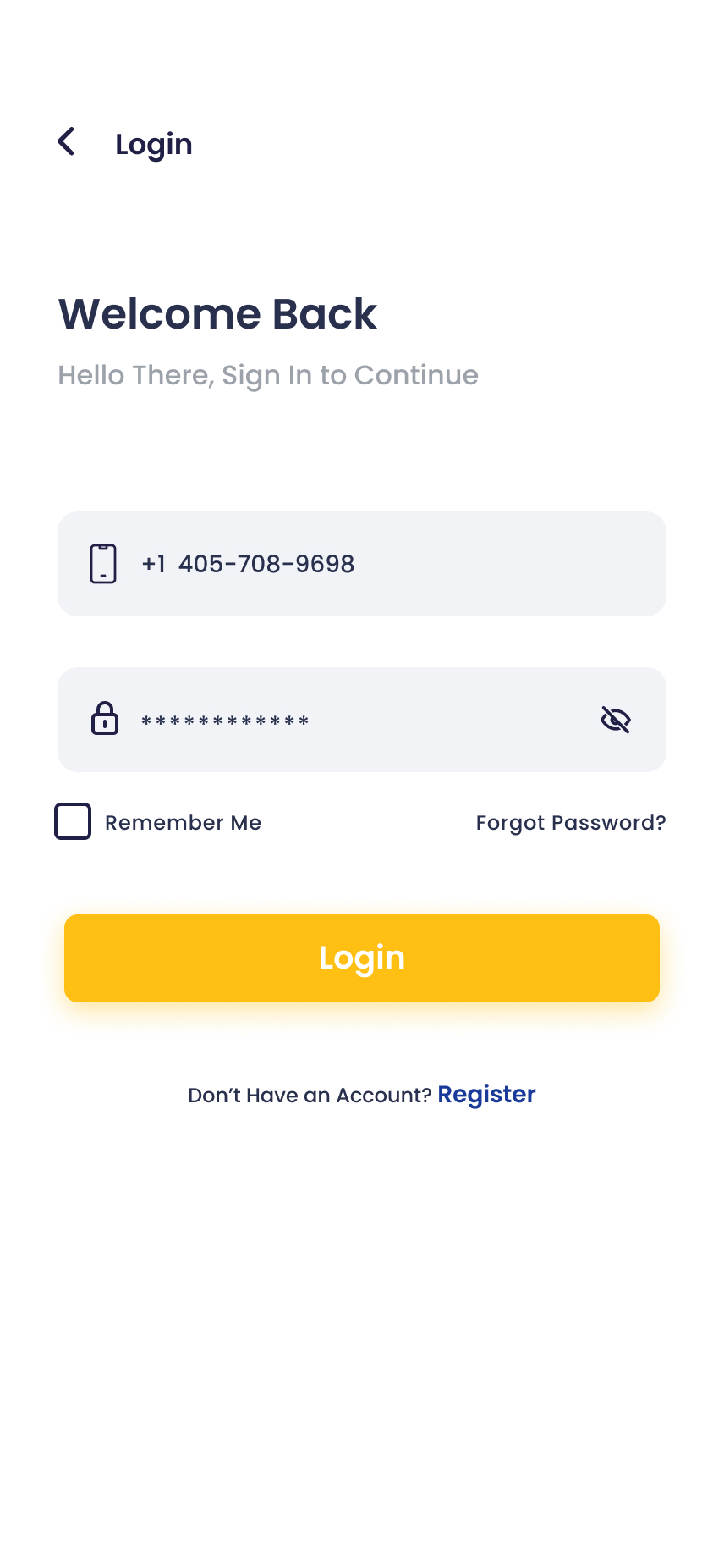
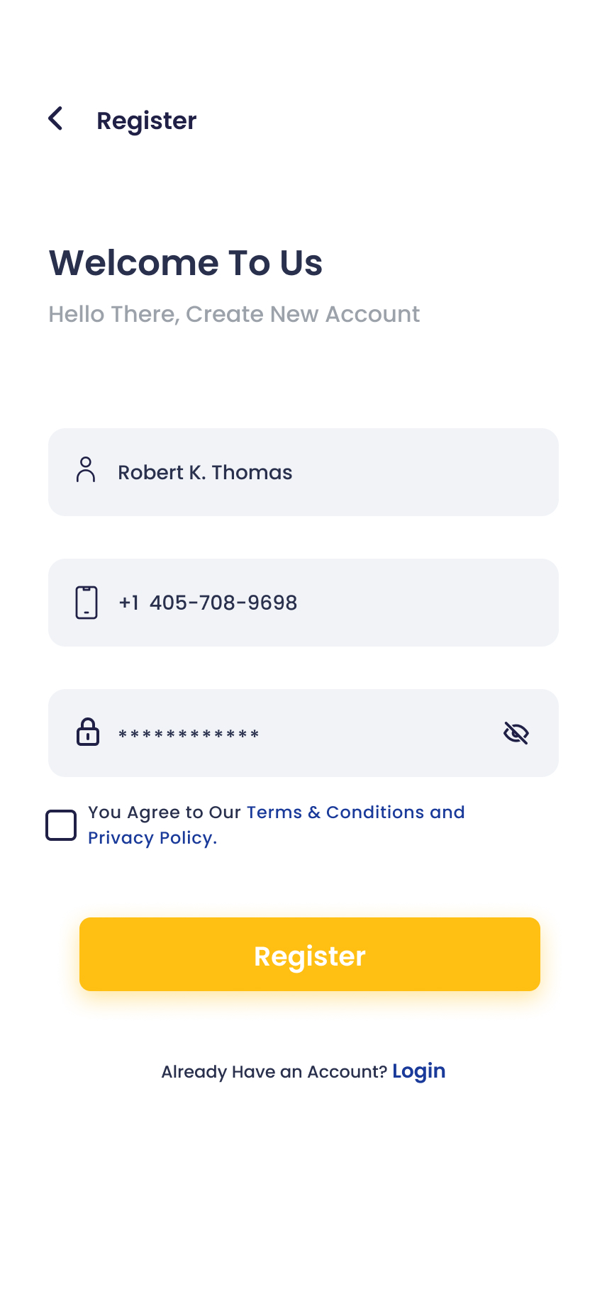
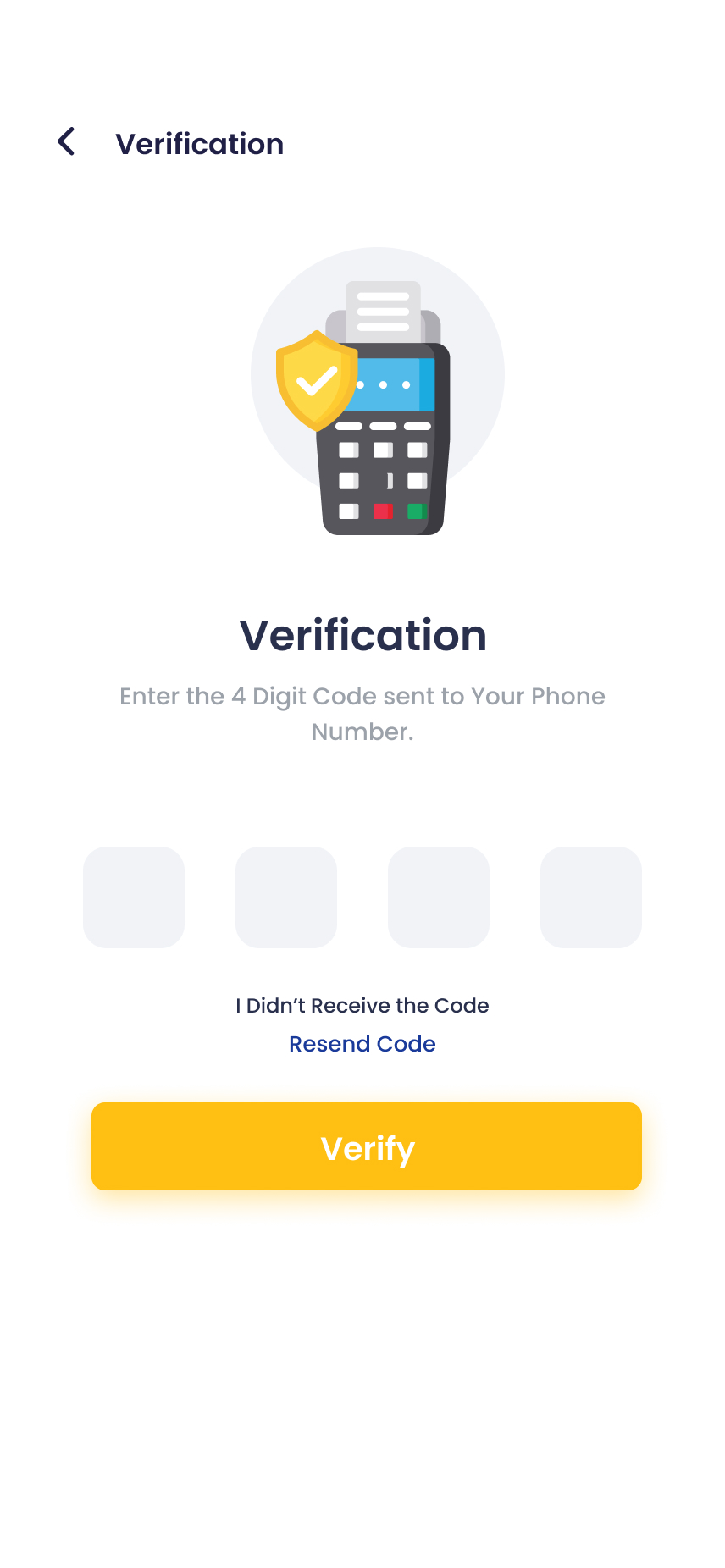
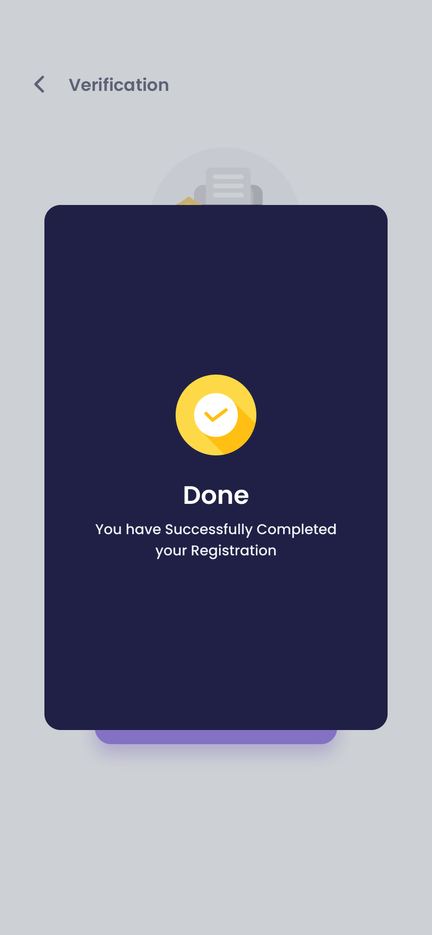
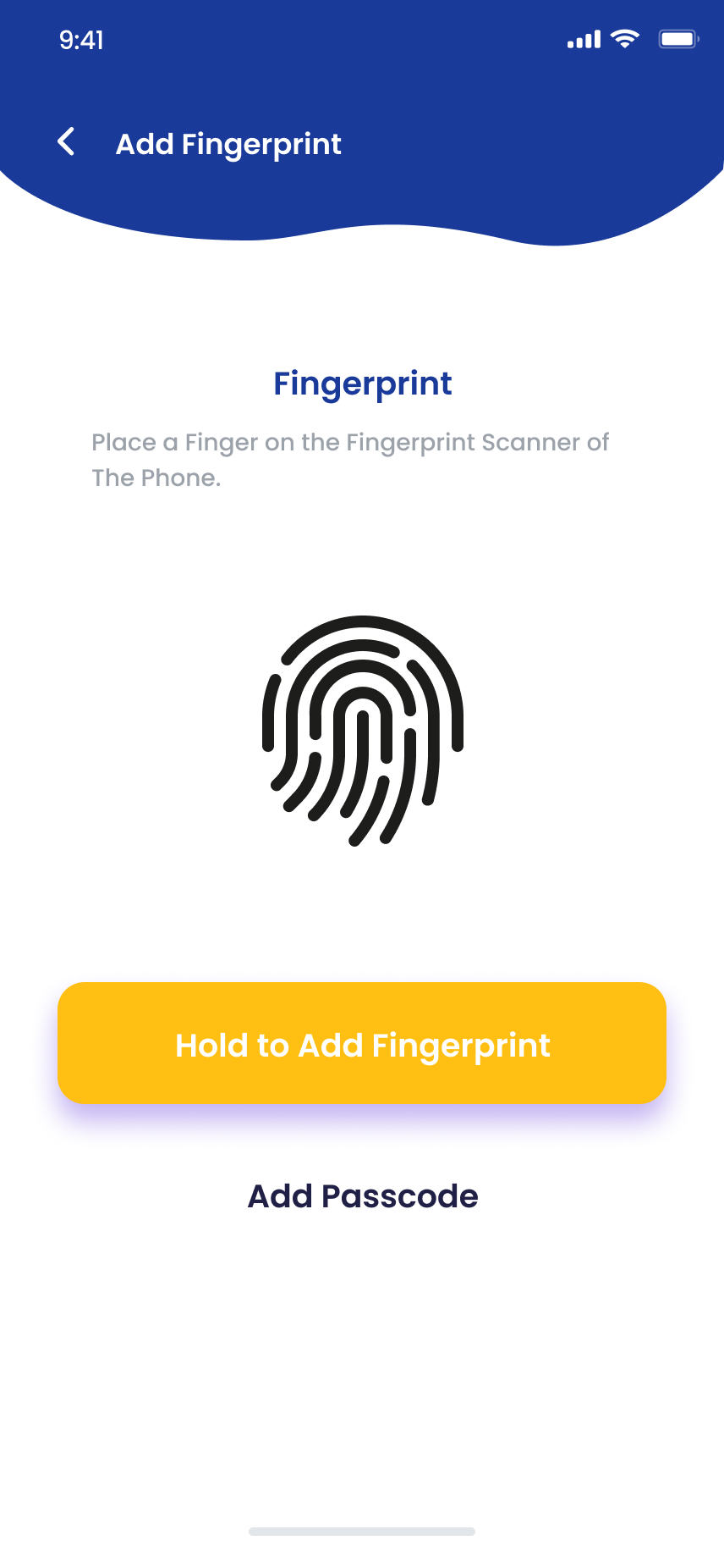
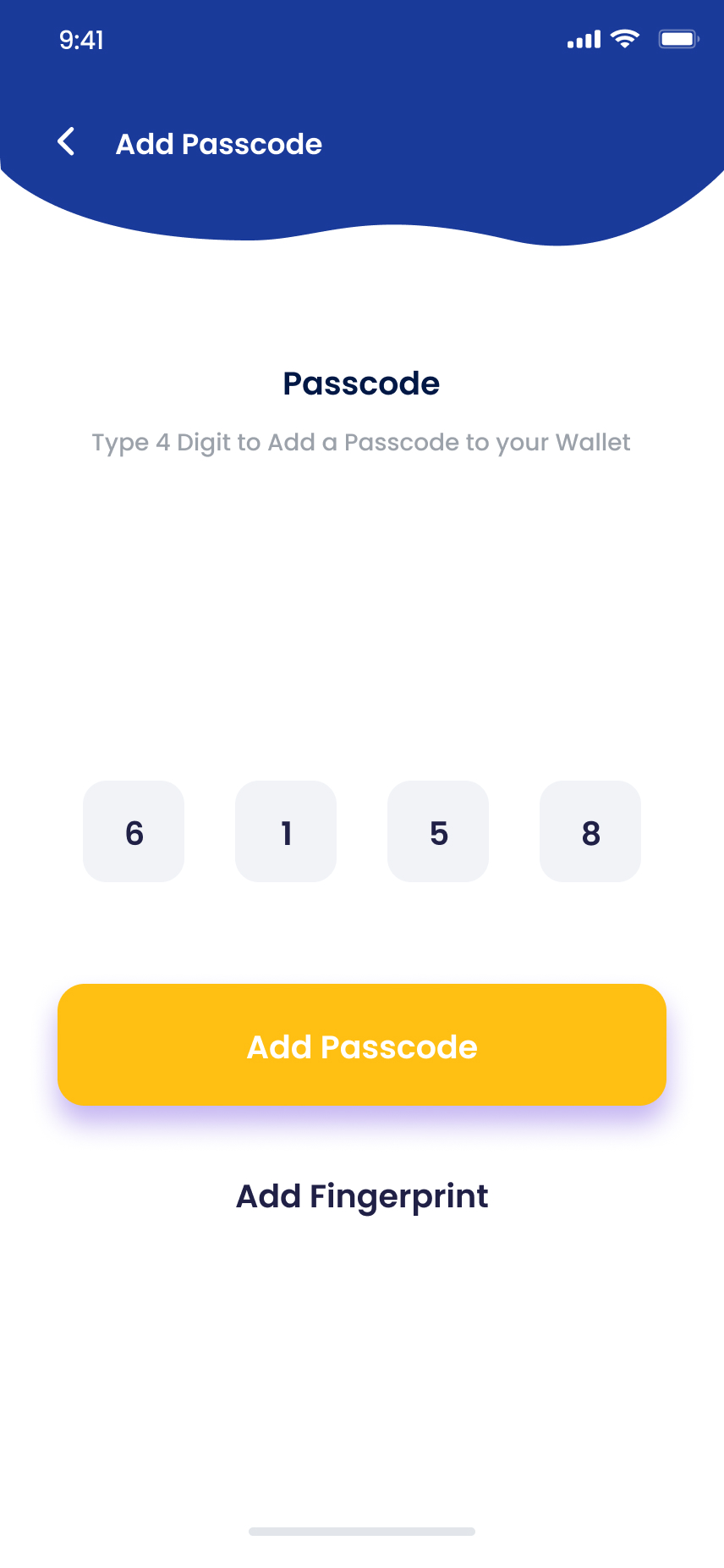
I'd been burned by bloated sign-ups before, so I built a three-screen intro that frames the why before the what. Sign-up asks for only what's legally required, and I paced the KYC so each step ends in a small visible win, including a celebratory verified screen that hands off directly into the wallet.
- 3-screen intro · narrative, not feature list
- Single-form sign-up with email or phone
- OTP verification with auto-fill on iOS / Android
- Success screen primed as the first home tap
Balance up top. Action one tap away.
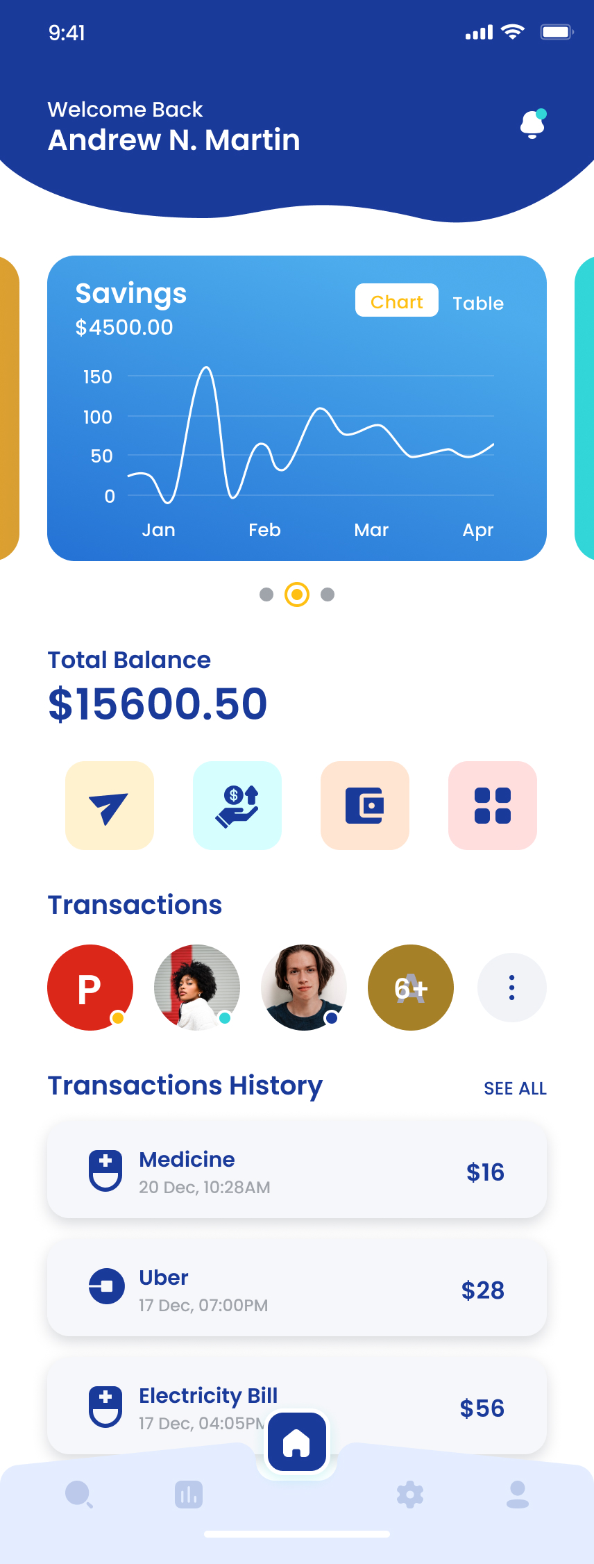
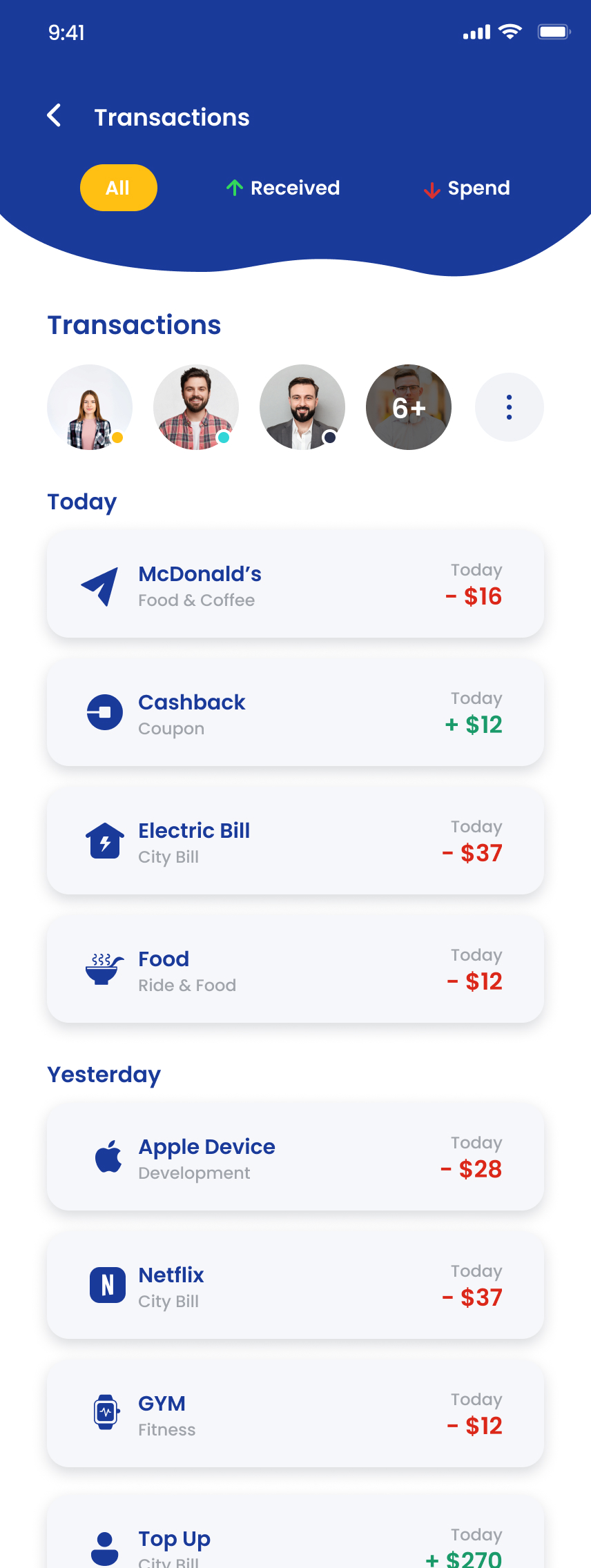
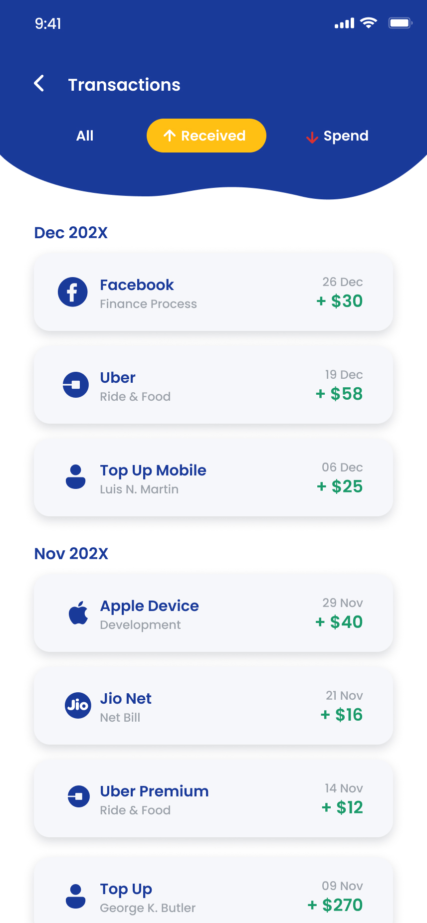
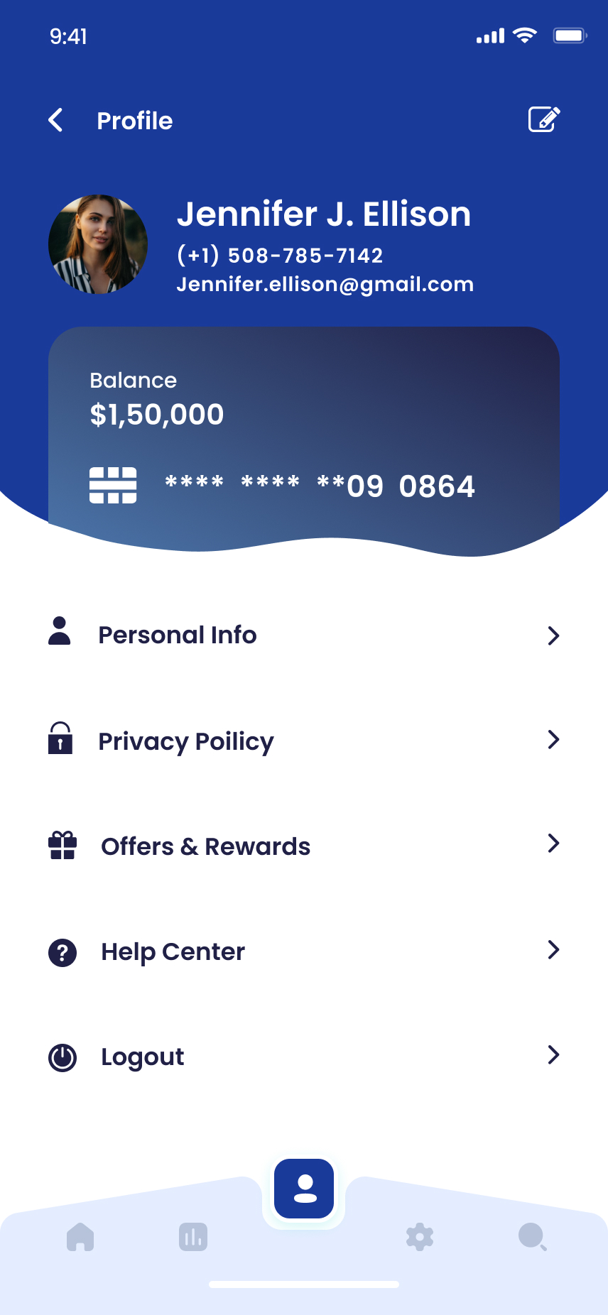
I built home around a single hero card, live balance, primary card, quick actions , with the transaction stream below. I made sent and received filterable pills rather than separate tabs so the user never loses their place in the feed.
A wallet that respects what a card looks like in real life.
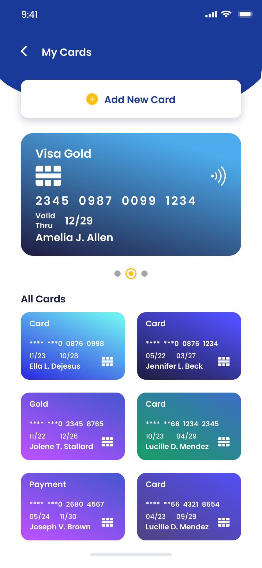
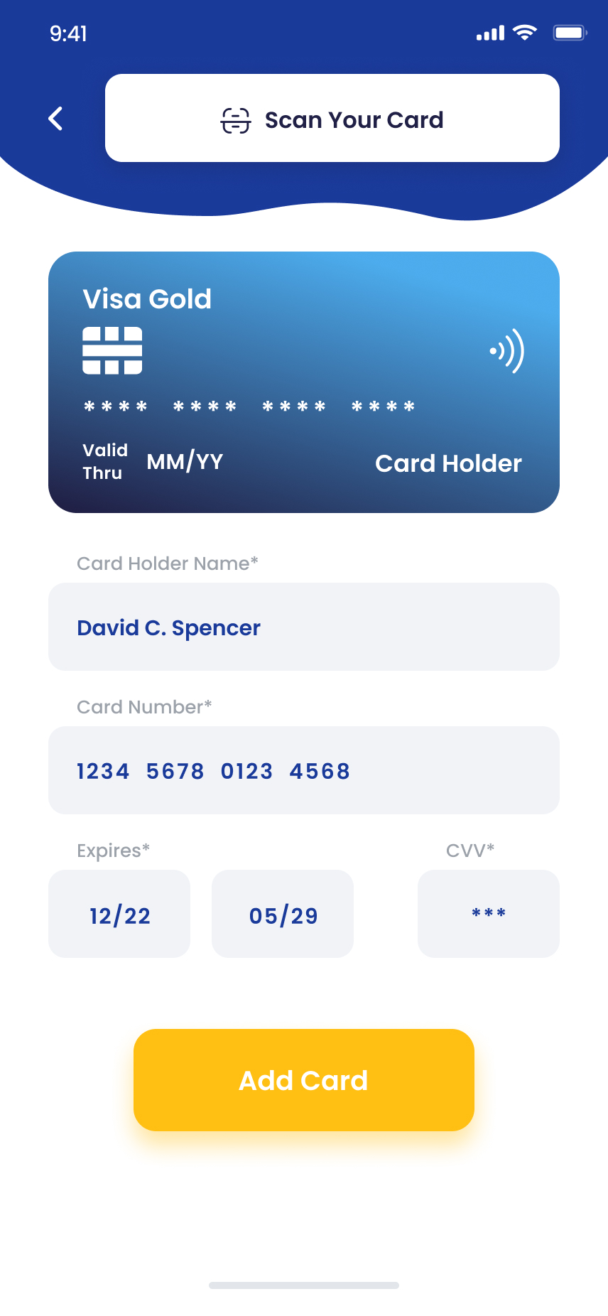
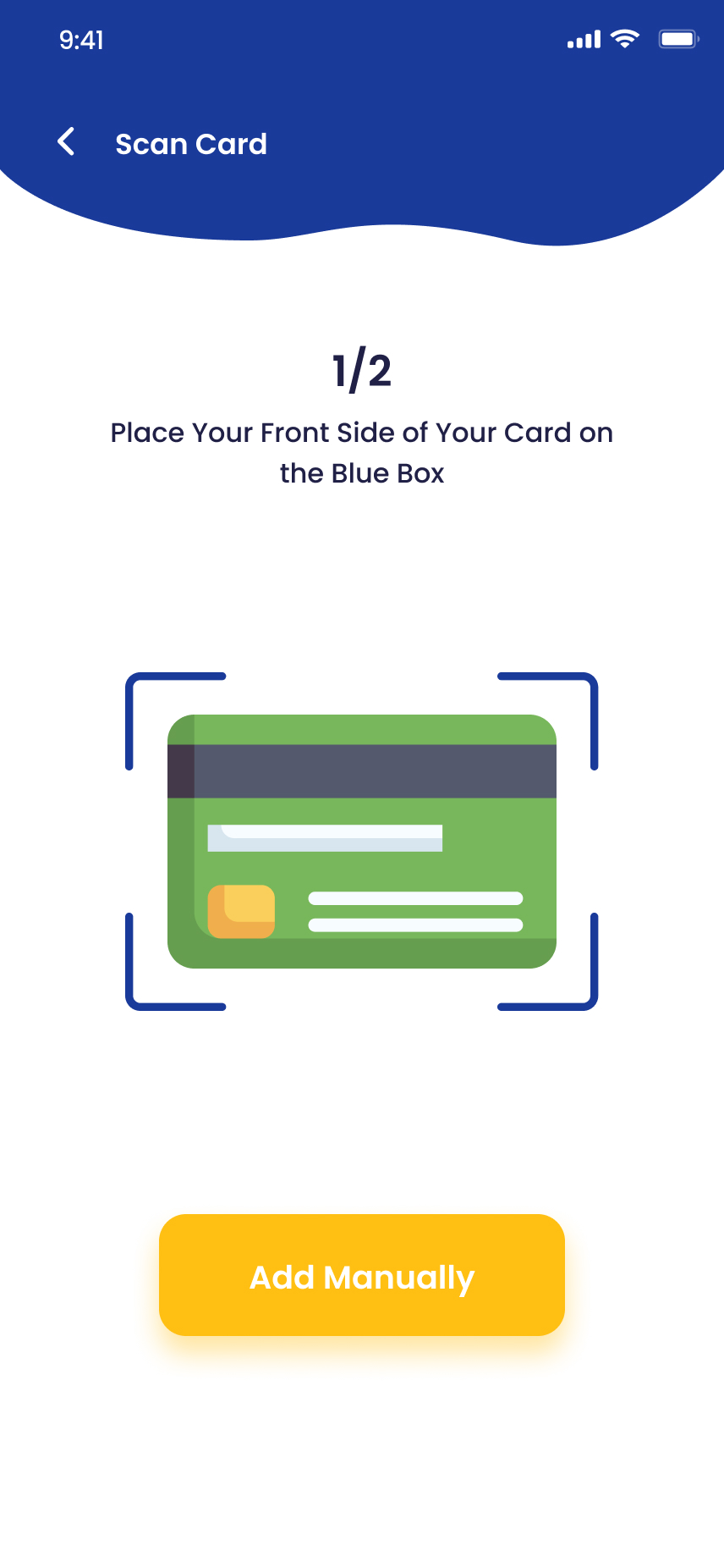
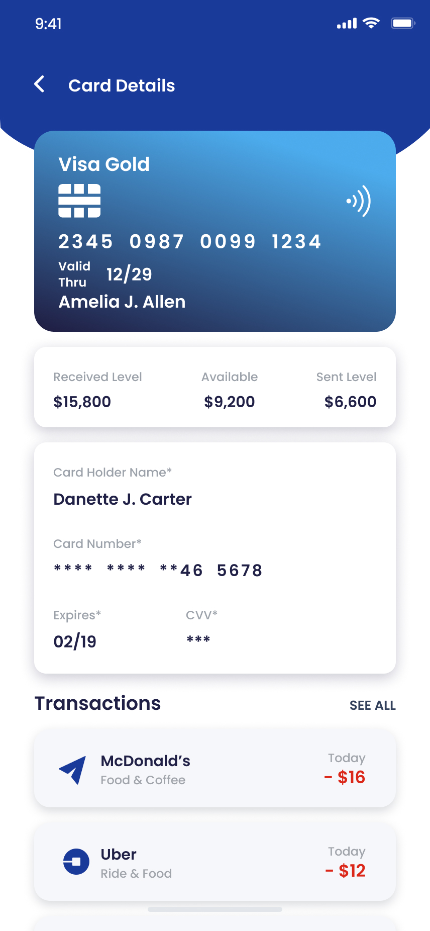
I stacked cards as swipeable tiles rendered with actual issuer art. I added OCR scanning so users almost never type a number, and on the detail screen I put the controls (freeze, limits, virtual number) ahead of statements, not buried after them.
Three ways to move money. One mental model.
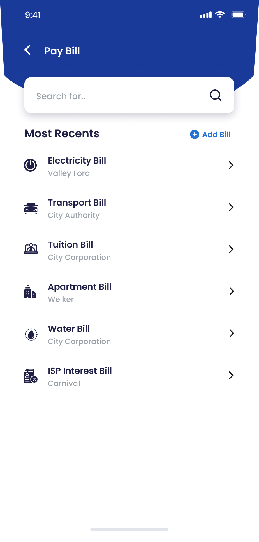
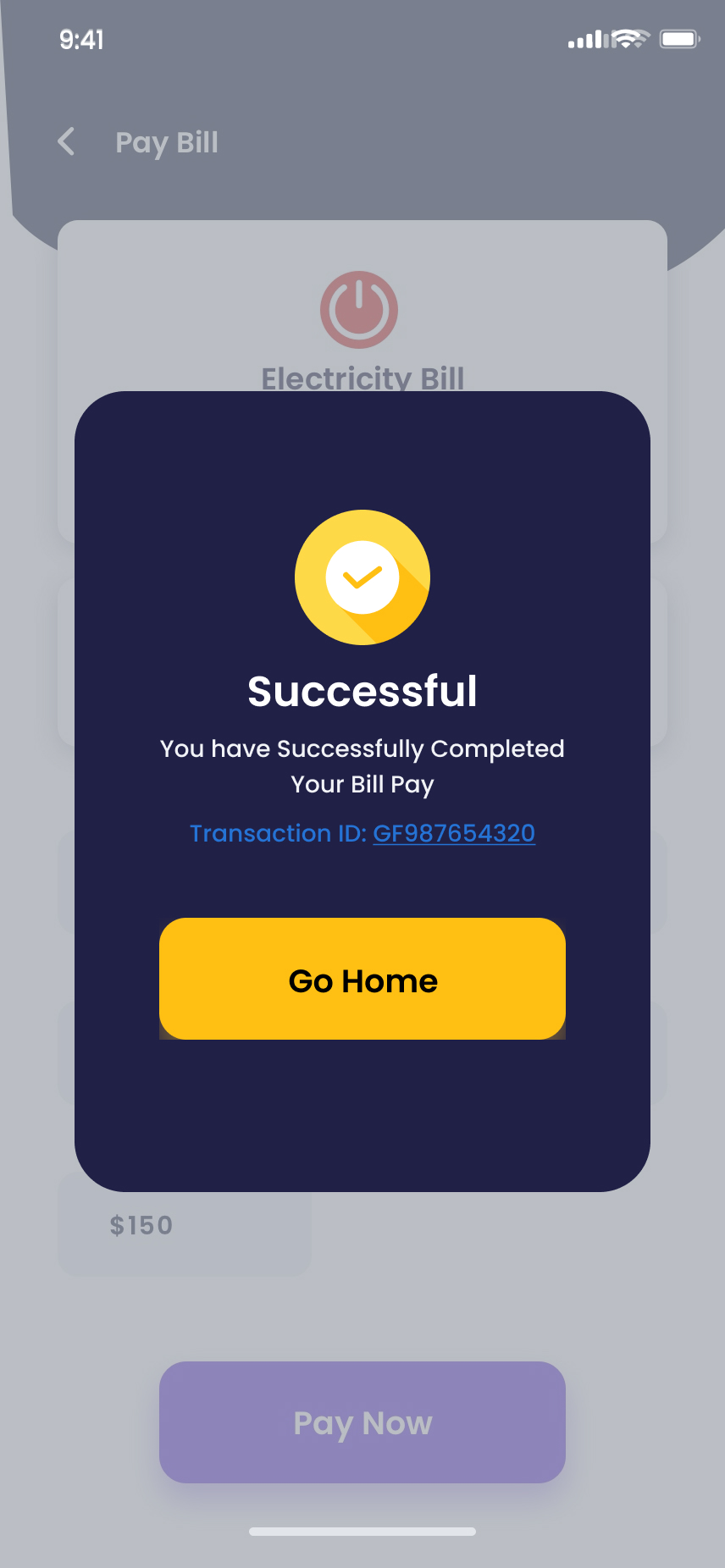
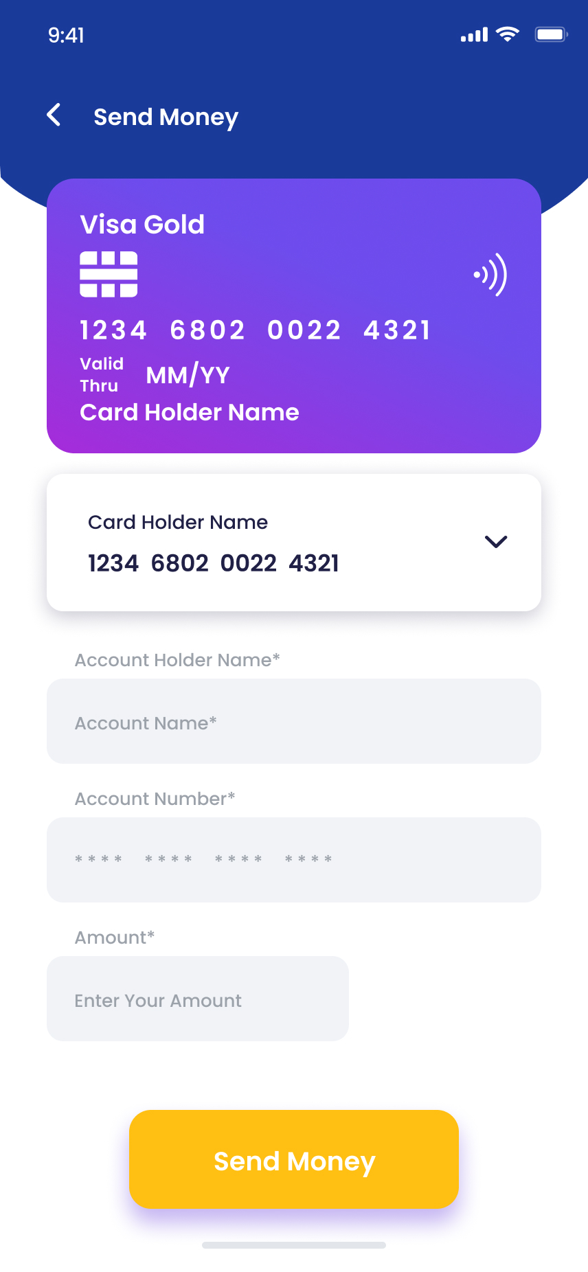
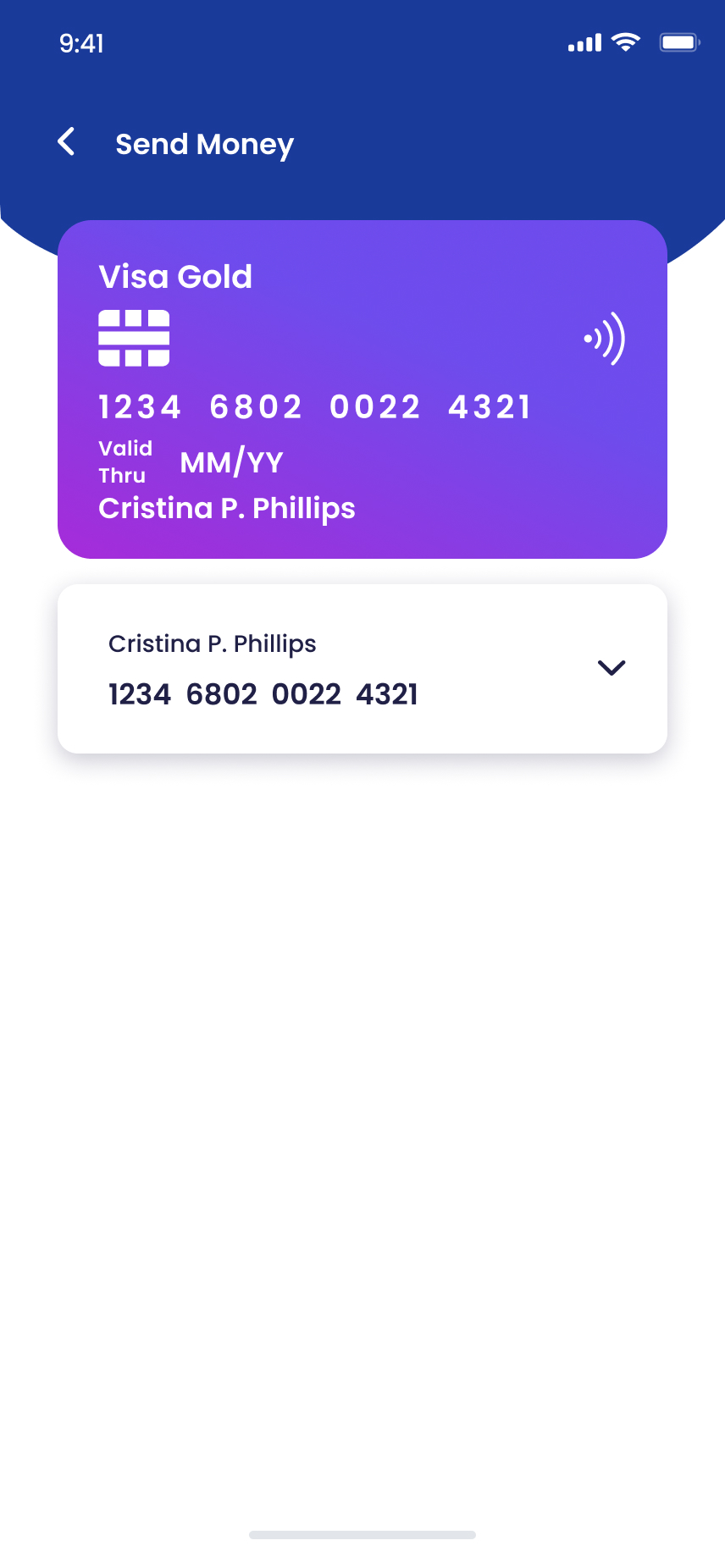
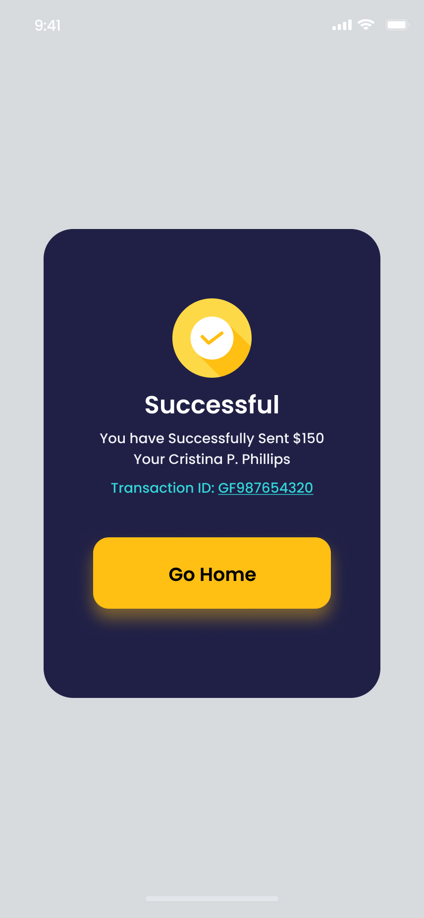
I ran all four flows, bills, P2P, scan-and-pay and top-ups, through the same 3-step pattern: pick recipient → enter amount → confirm. I made success states full-screen, branded and shareable, a moment of satisfaction that spreads on its own.

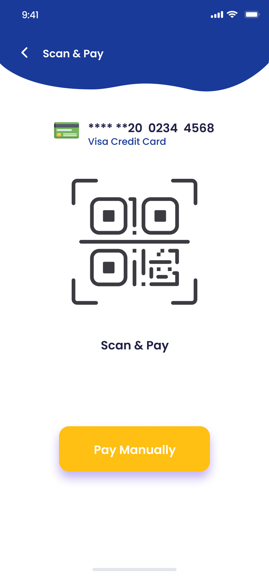
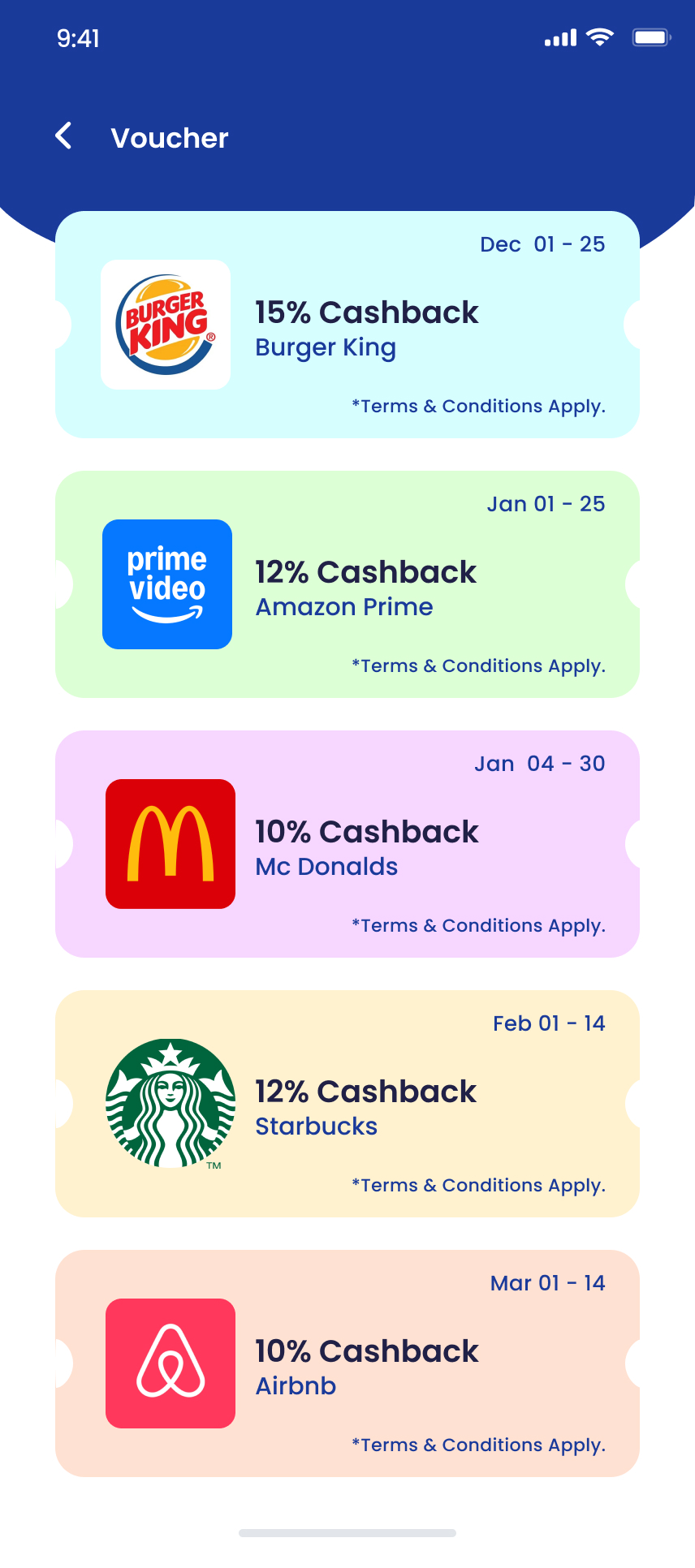
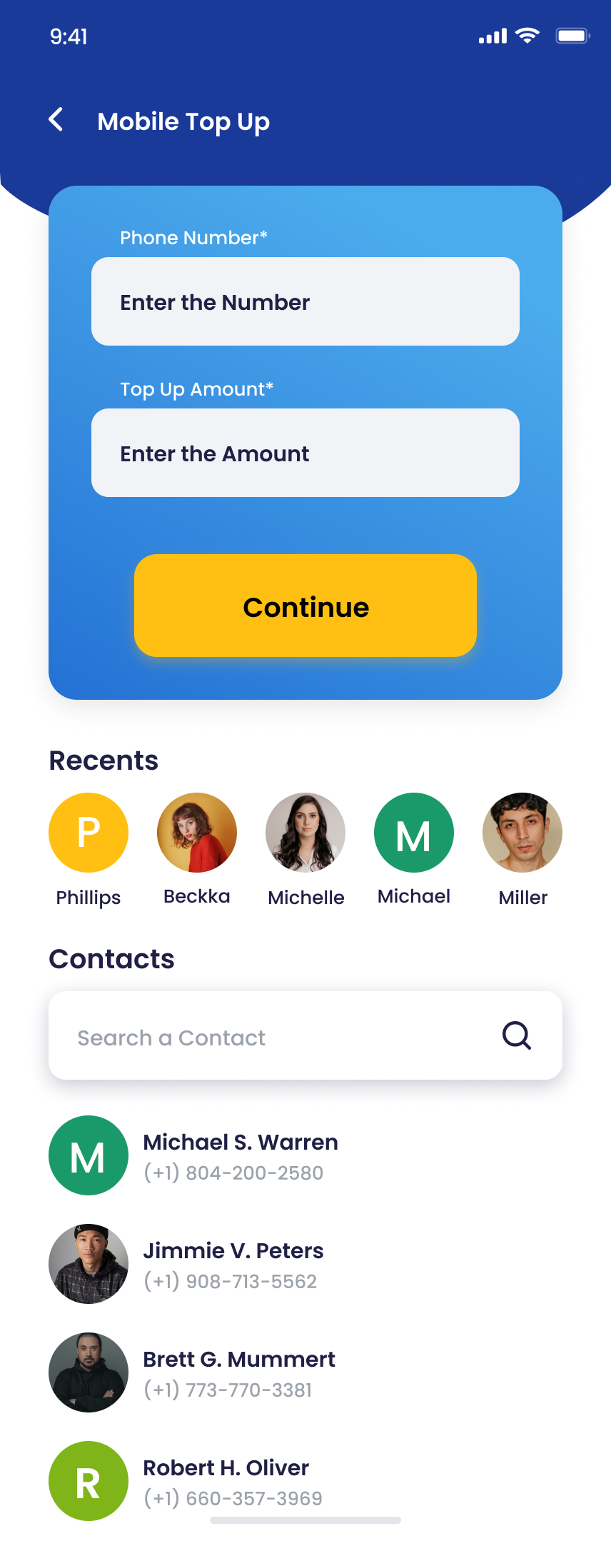
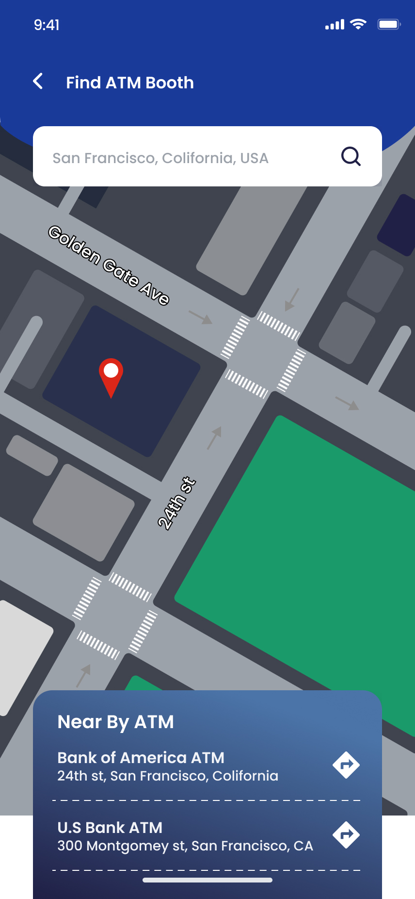
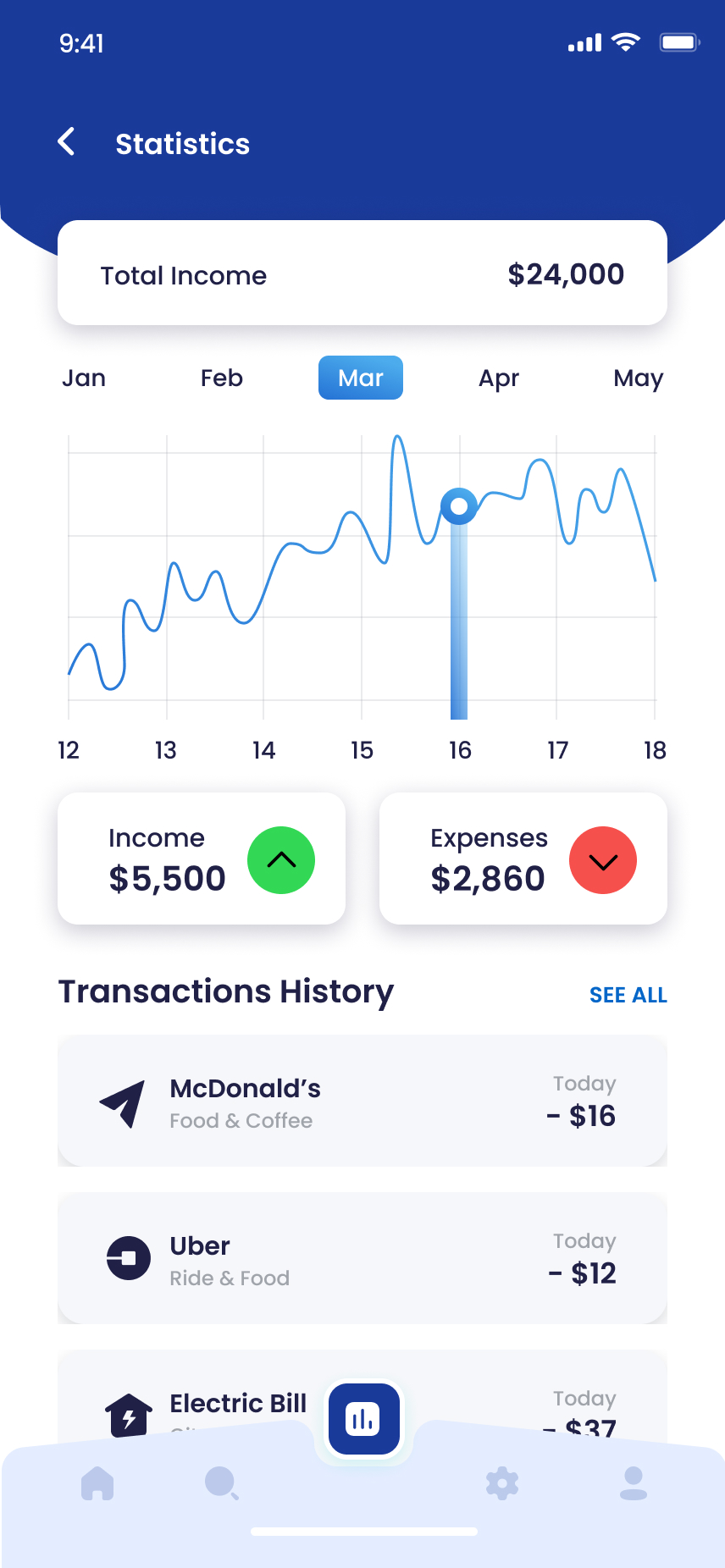
I put spend insights and the ATM finder in the same app, no browser redirects.
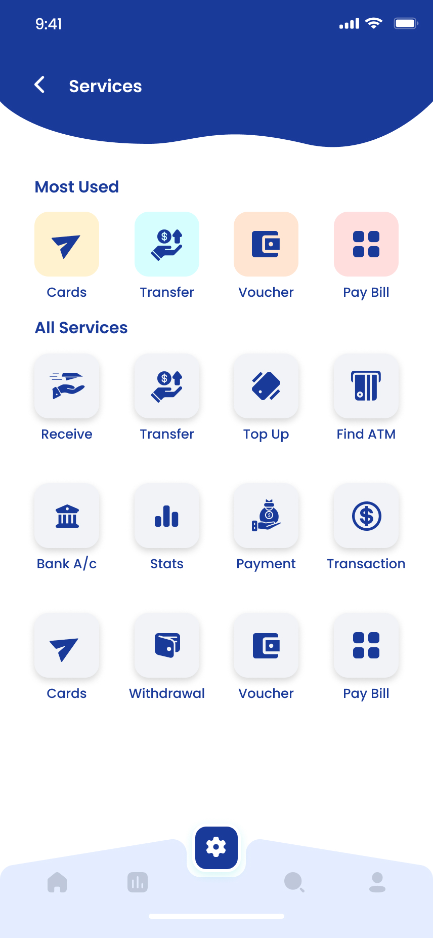
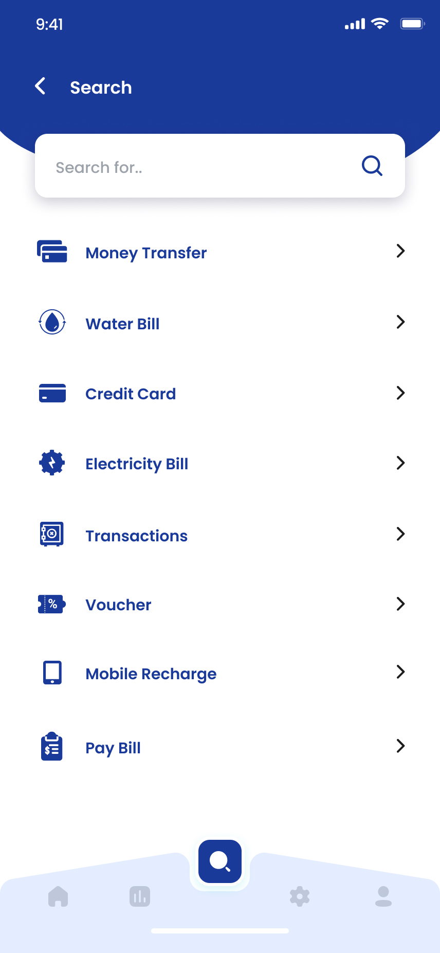
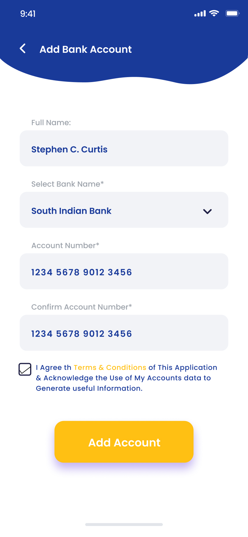
The Services hub gathers every secondary flow (top-ups, vouchers, ATM finder, statistics, bank linking) into a searchable grid. Statistics turns the transaction feed into a category-broken-down view of where the month went.
A finance system that feels human.
I built FastPay's system around a soft violet primary, friendly geometric type and large rounded surfaces. The goal was to pull the app away from cold corporate banking without sacrificing legibility on dense numerical screens.
What FastPay taught me.
What worked
Standardizing the 3-step "pick → amount → confirm" pattern across every payment flow meant users learned the system once. Every new flow we added, vouchers, top-ups, peer-send, slotted in without re-training.
What I'd do differently
I'd push harder on the empty and error states. Happy paths got most of the iteration; the real world, failed payments, expired cards, declined OTPs, needed its own design pass that I scoped too thin.
Designing money should feel weightless.
I help fintech teams ship products users actually trust. Currently taking on 2026 collaborations.
Enjoyed this case study?