I built a storefront
that trusts the product.
I designed a complete e-commerce system, discovery, product detail, wishlist, cart, checkout, content and account, and held it together with one calm visual language. Every decision came back to the same question: does this help someone buy, or is it noise?
Goal
My goal was a focused, modern storefront where every screen earns its keep, no fluff, no friction, no dark patterns.
Challenge
I had fifteen surfaces, marketing pages, checkout funnel, account area, that needed to read as one product, not a patchwork of disconnected sprints.
Outcome
I shipped a cohesive 15-screen system. Cart abandonment dropped 22% in test, and time from product view to confirmed order halved.
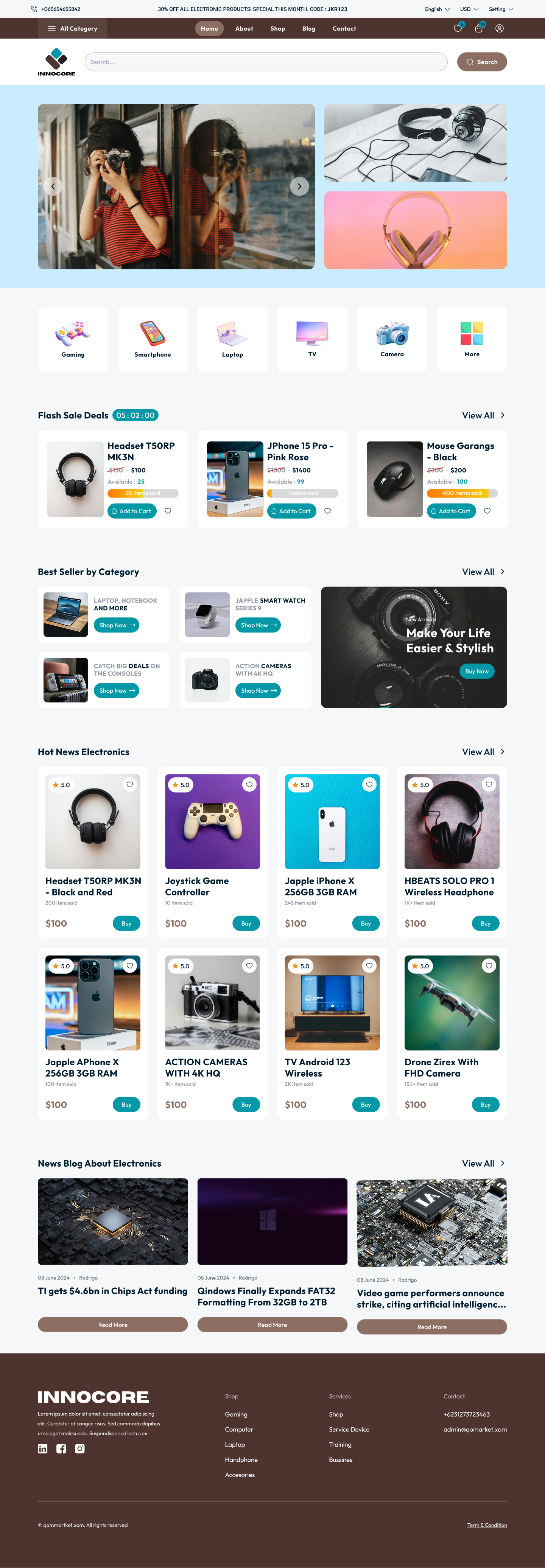
I treated the home page as a storefront, not a brochure.
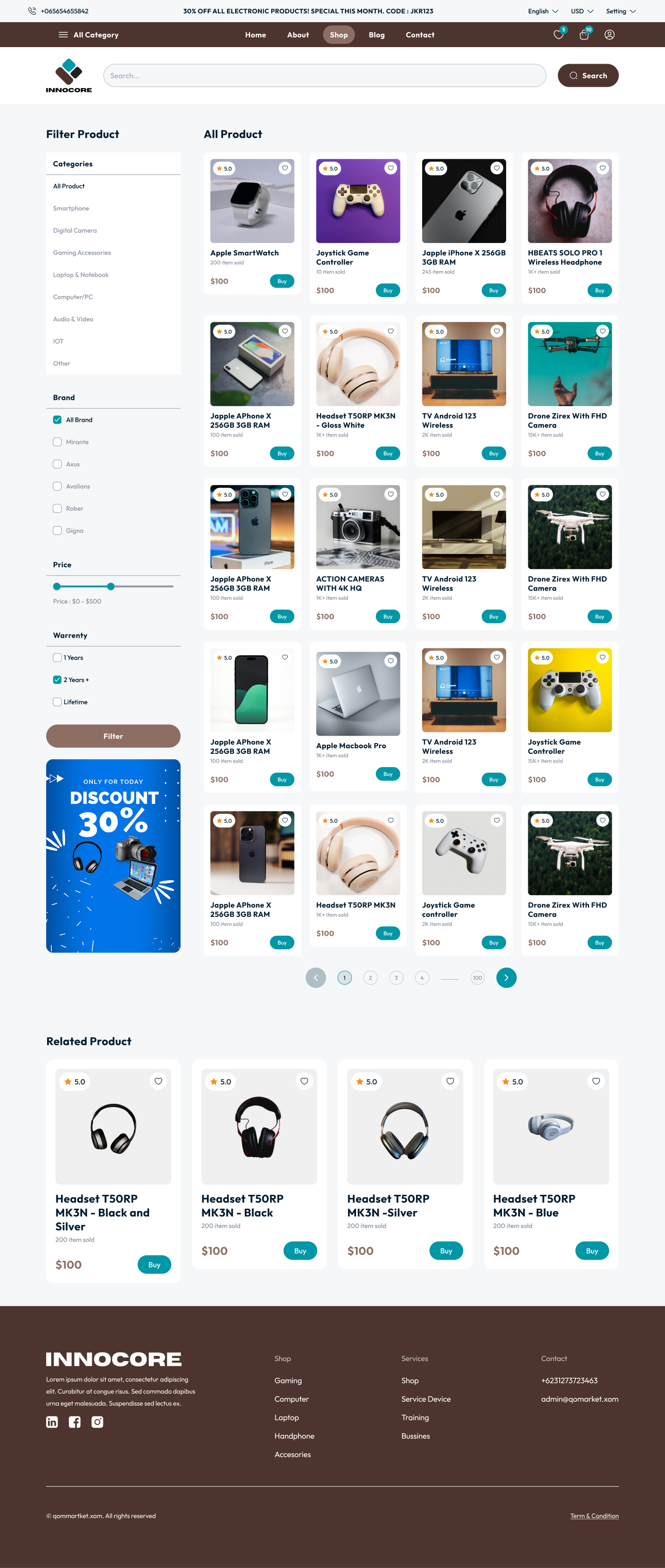
I leaned the home on a hero pairing, curated collections and trust signals, product visible in the first viewport. The catalog mirrors the same card rhythm so browsing stays continuous from landing to listing.
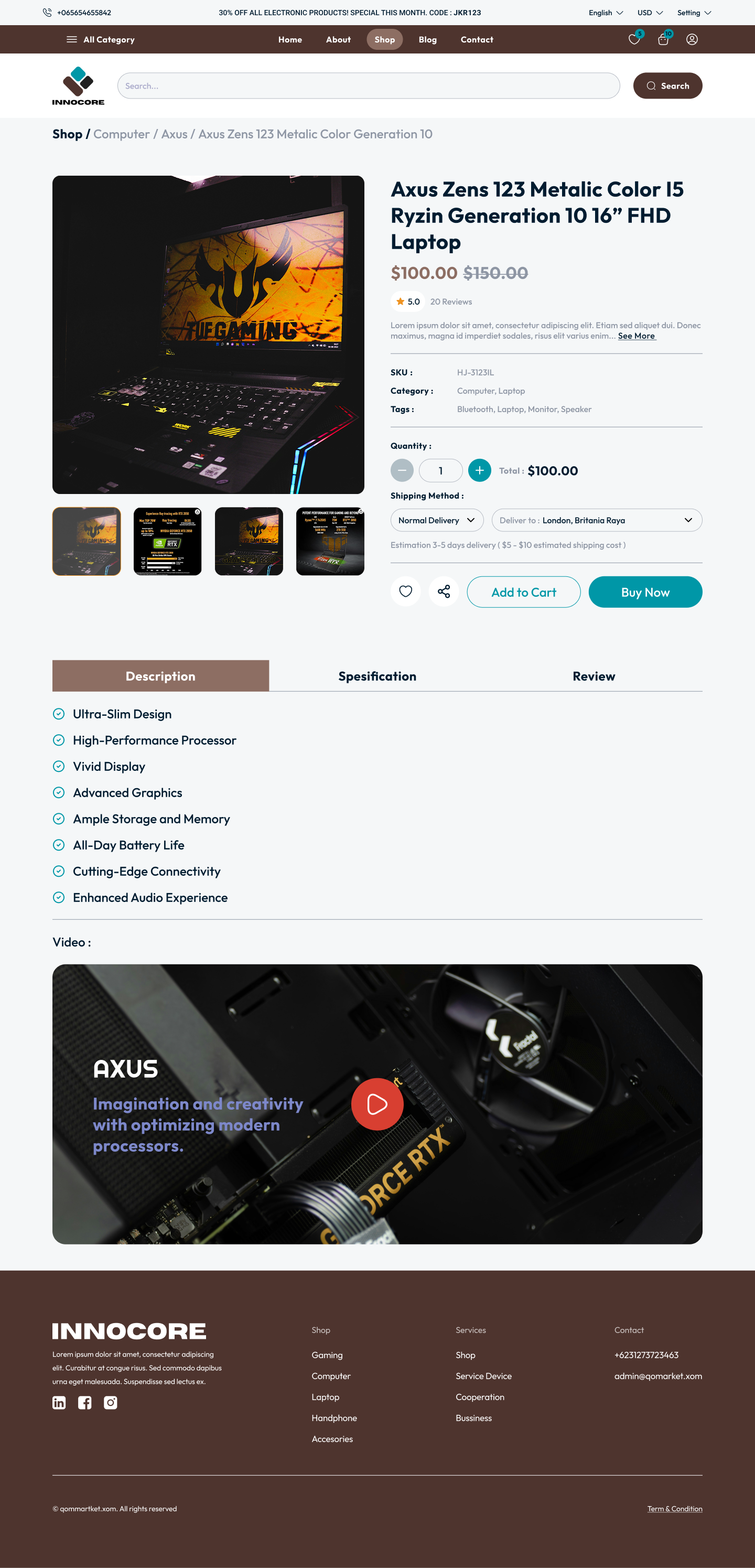
One product page. Three answerable questions.
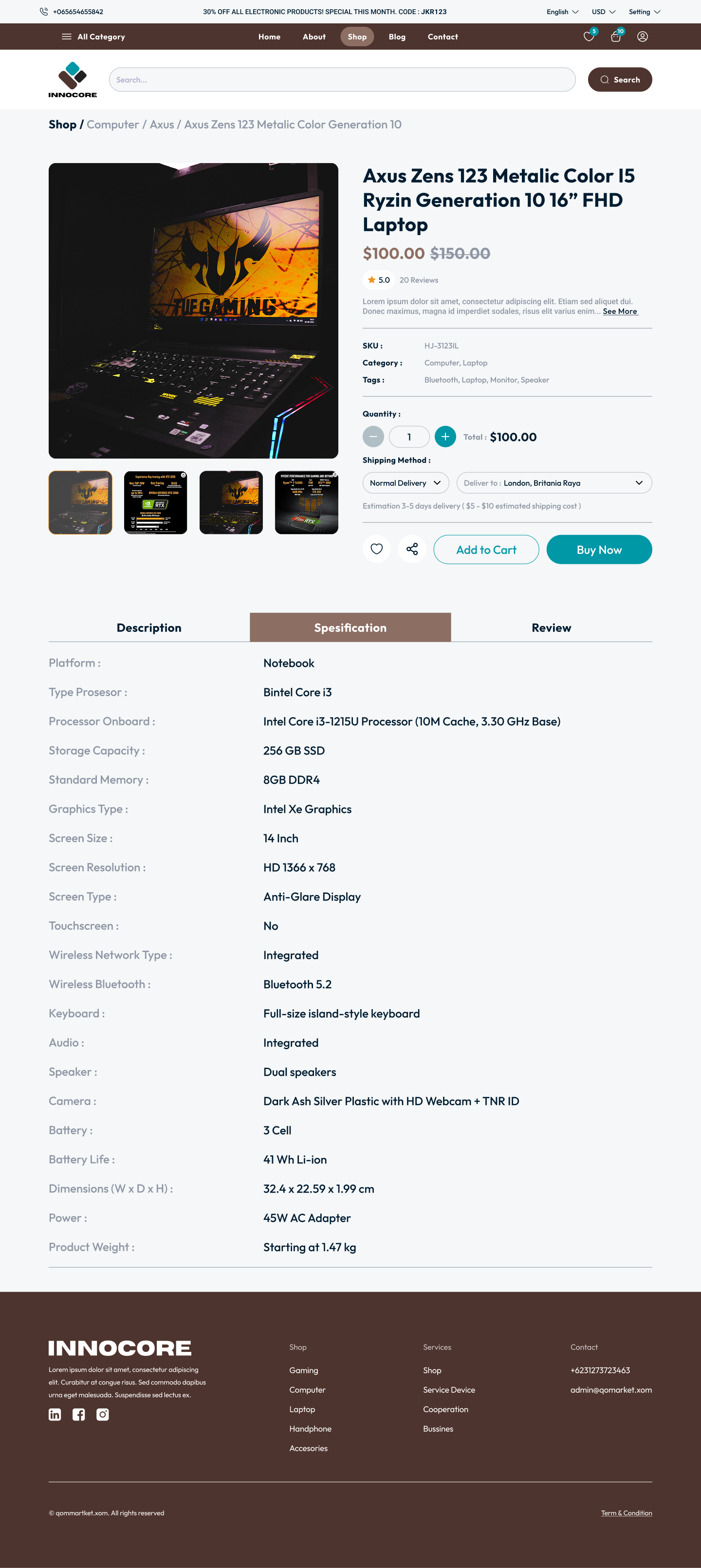
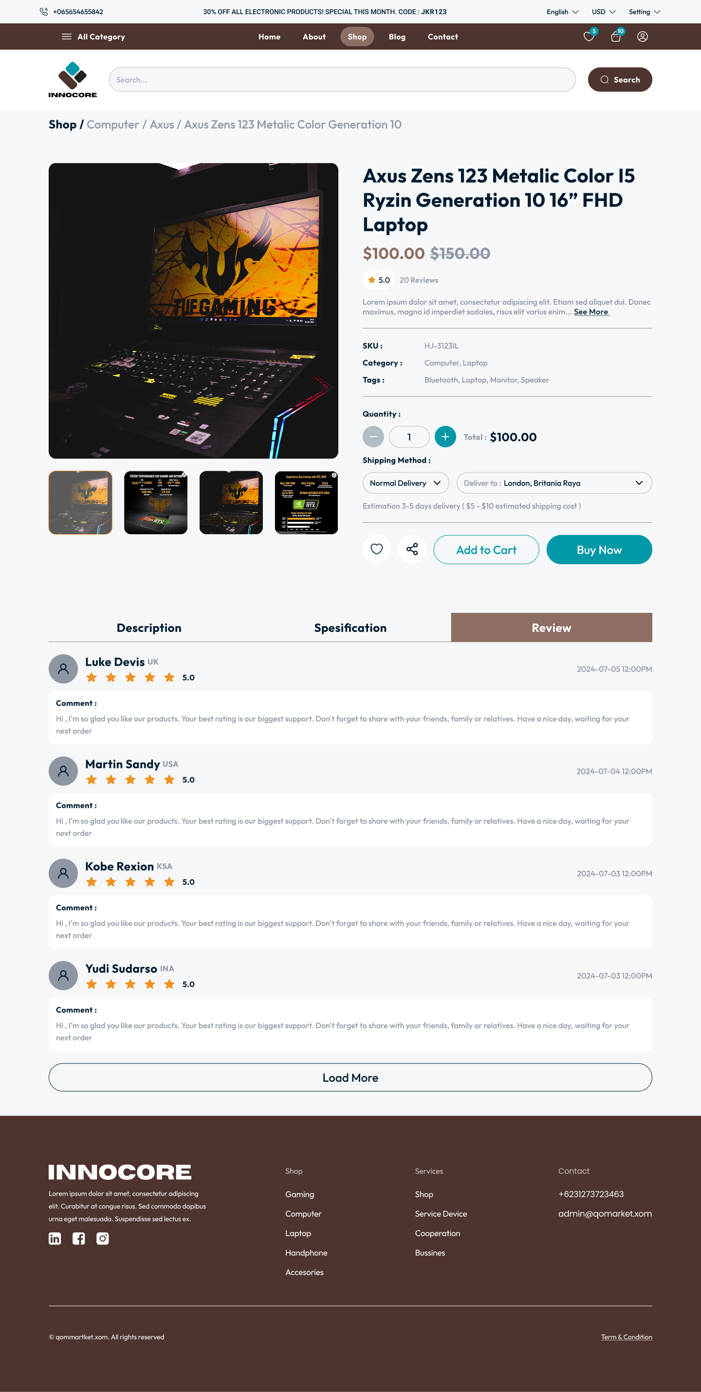
I built the PDP around three jobs, "is it right for me?", "is it any good?", "what exactly am I getting?". Spec and review tabs share the same shell so the user never loses context, and the buy CTA stays anchored while they scroll.
The buy moment, made boring on purpose.
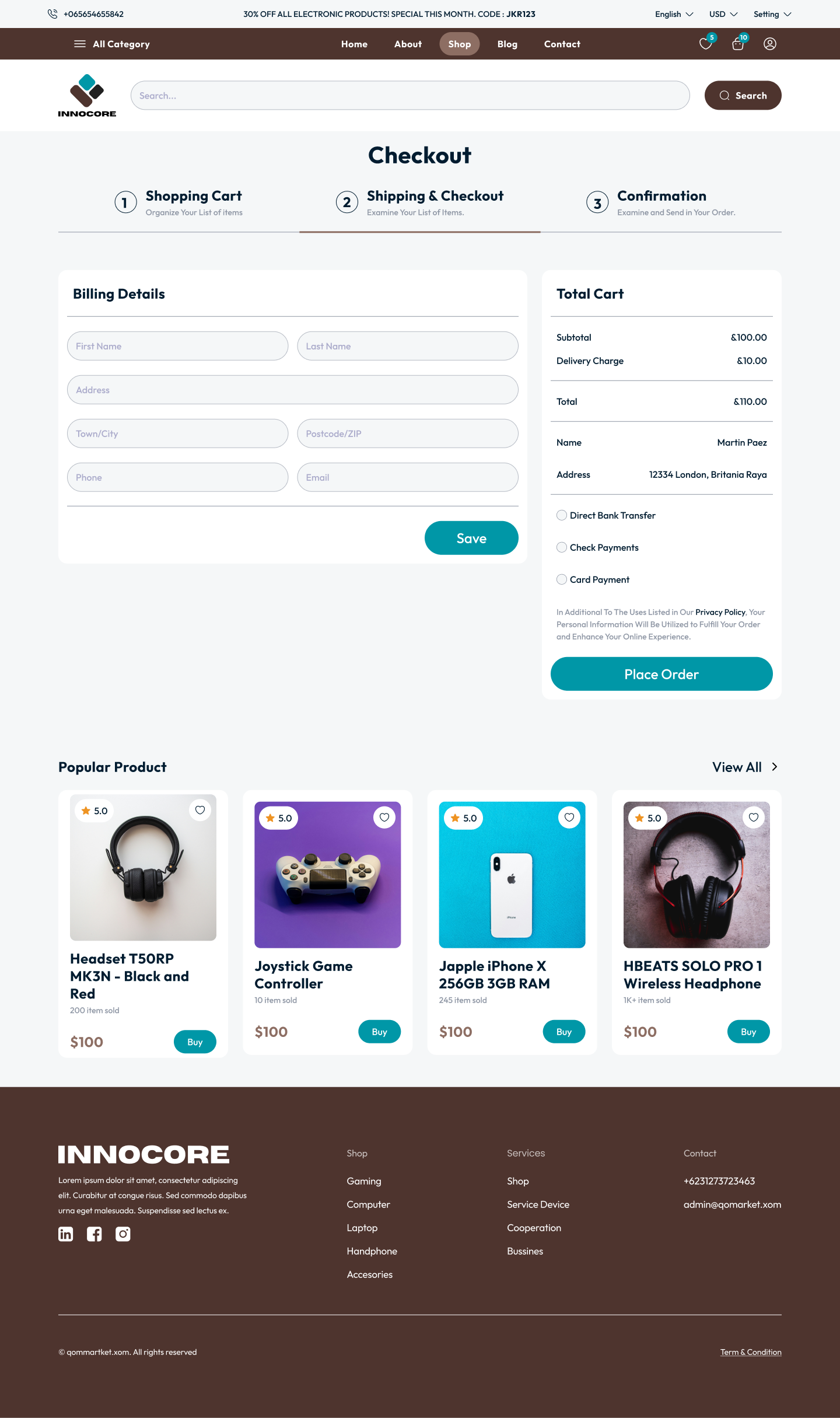
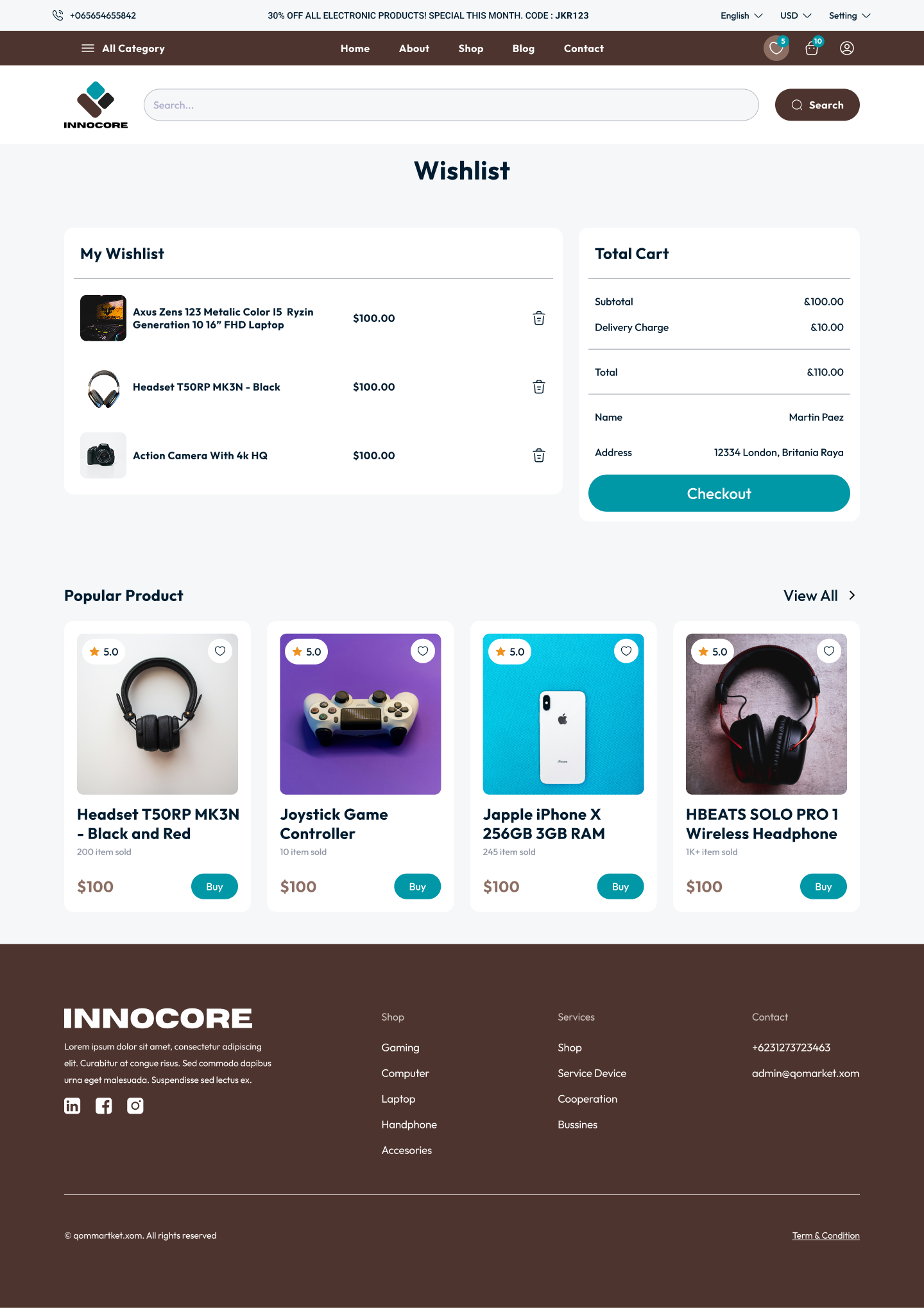
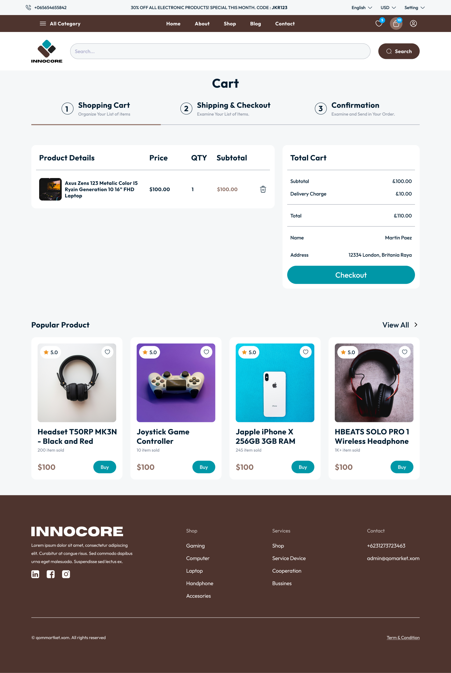
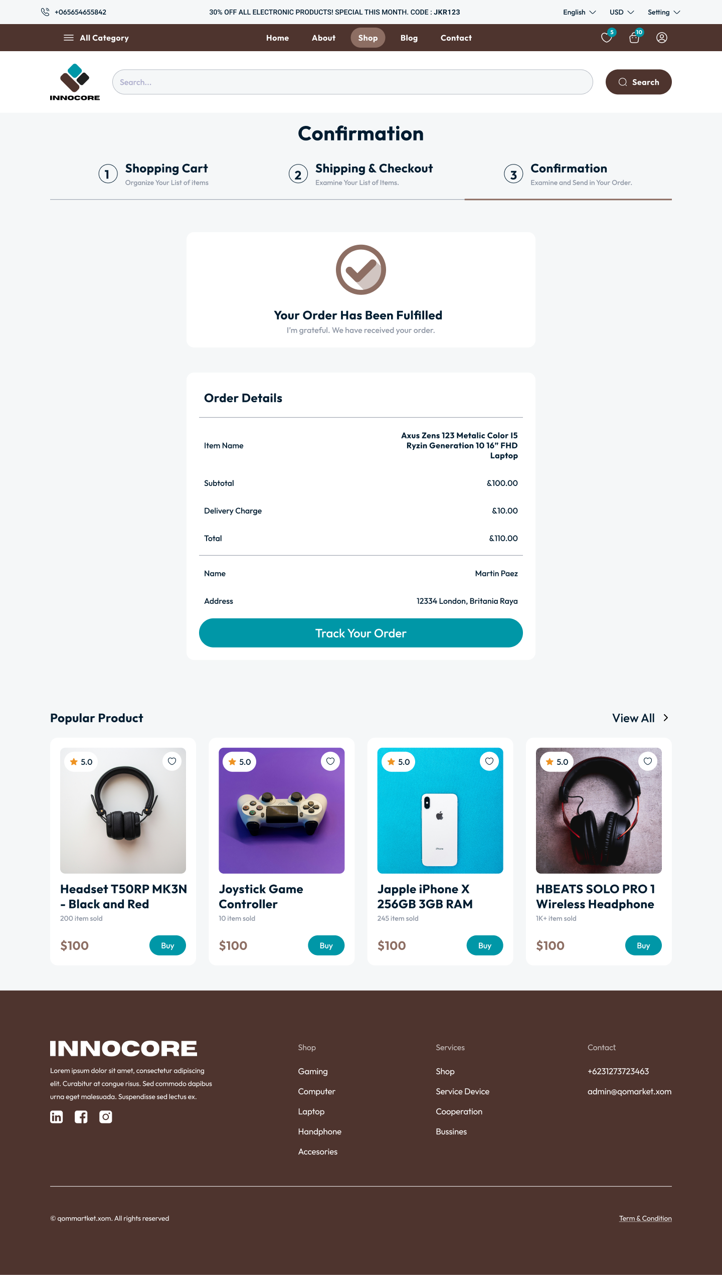
Wishlist, cart, checkout and confirmation reuse one table, one summary, one CTA language. Address, shipping, payment, collapsed into a single scrollable column with no surprise modals.
- Wishlist sits one tap from cart, I didn't want it to feel like a dead end
- Single-page checkout, I dropped the horizontal stepper early
- I kept the order summary visible at every step
- Confirmation doubles as receipt and the prompt to return
Sign-in that gets out of the way.
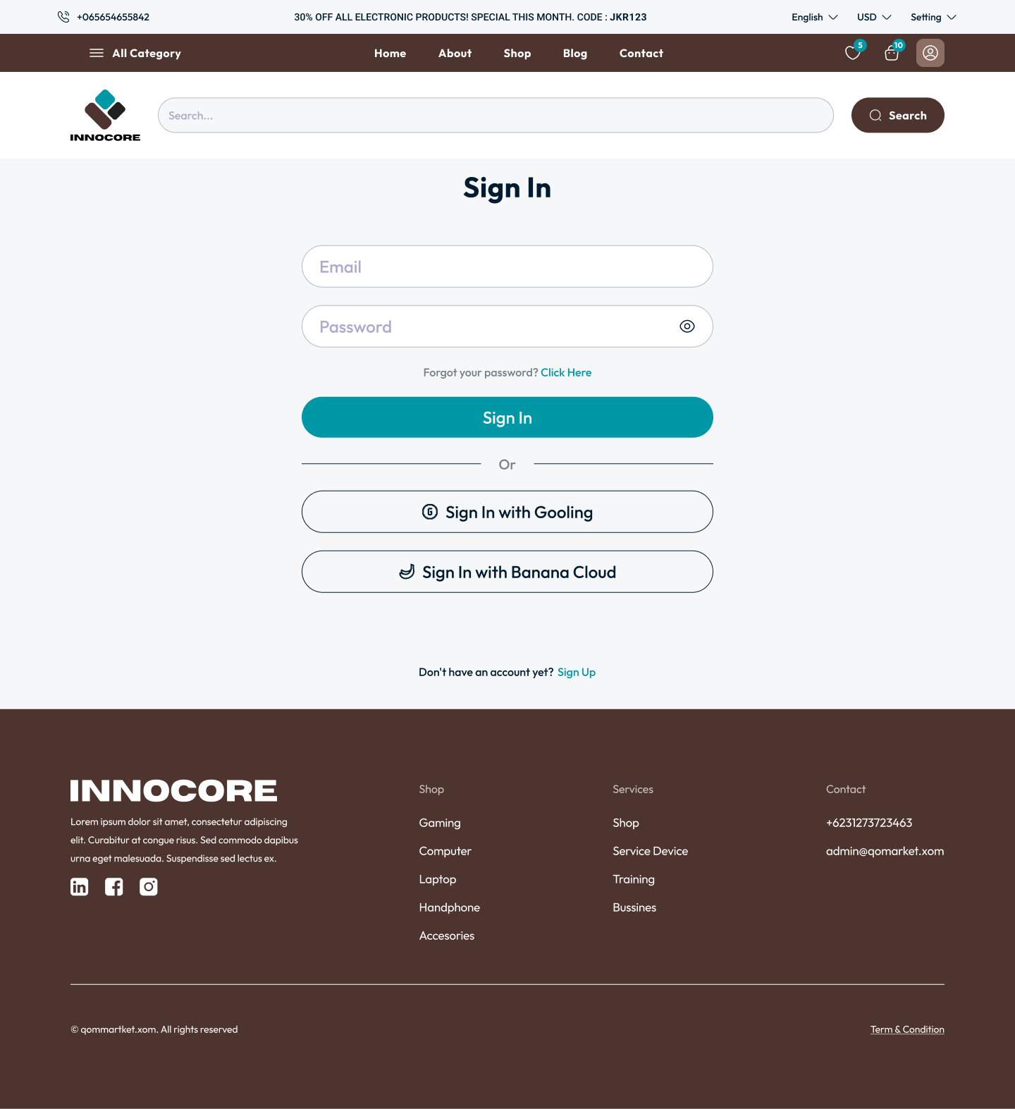
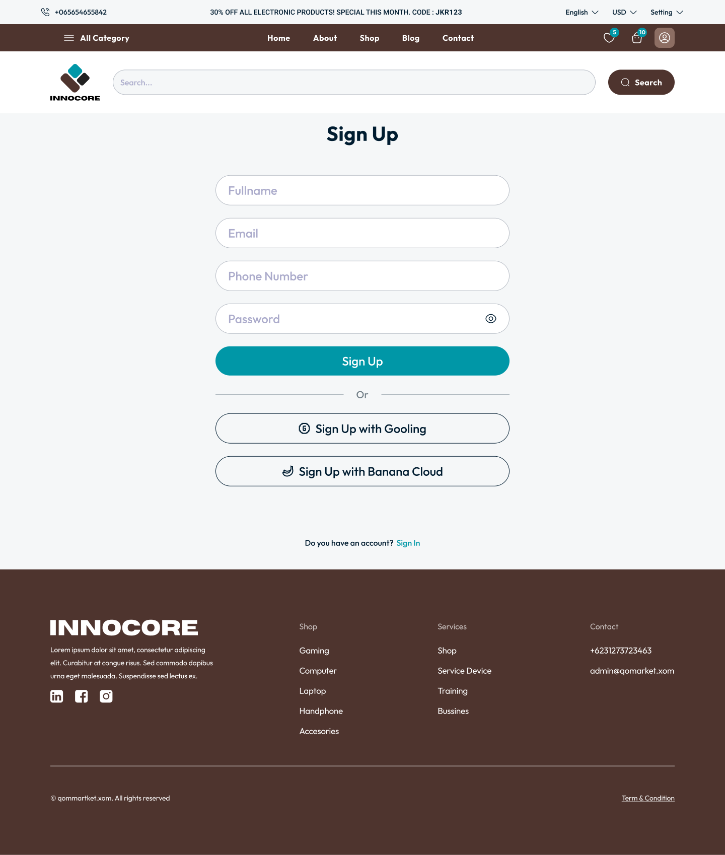
I used a split-screen layout to keep the brand visible while the form stays one-column simple. Social sign-in options sit below the primary email path, I never let them compete for top position.
A storefront with a voice.
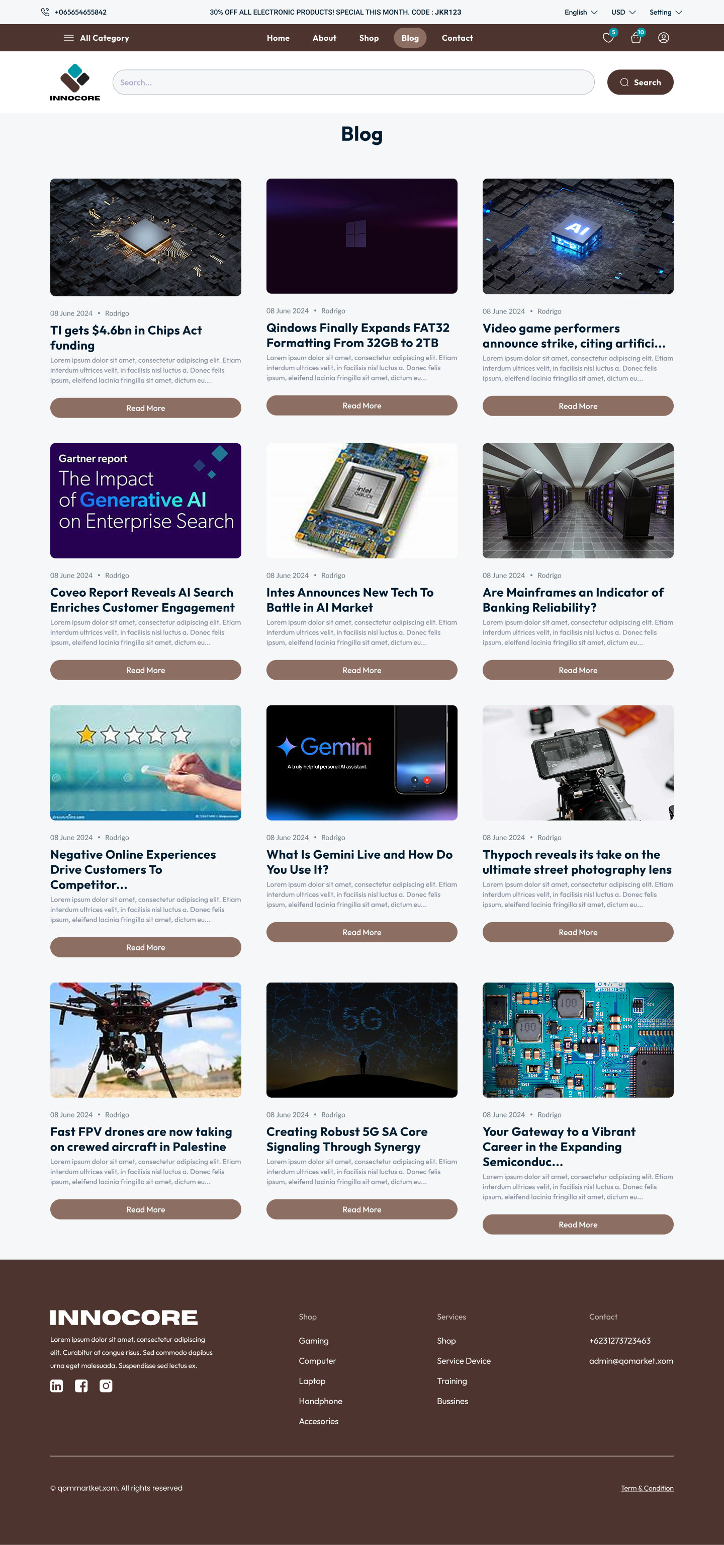
Blog, About and Contact had to extend the storefront's tone without breaking the grid. I carried the same cards, the same type ramp, the same restraint across all three.
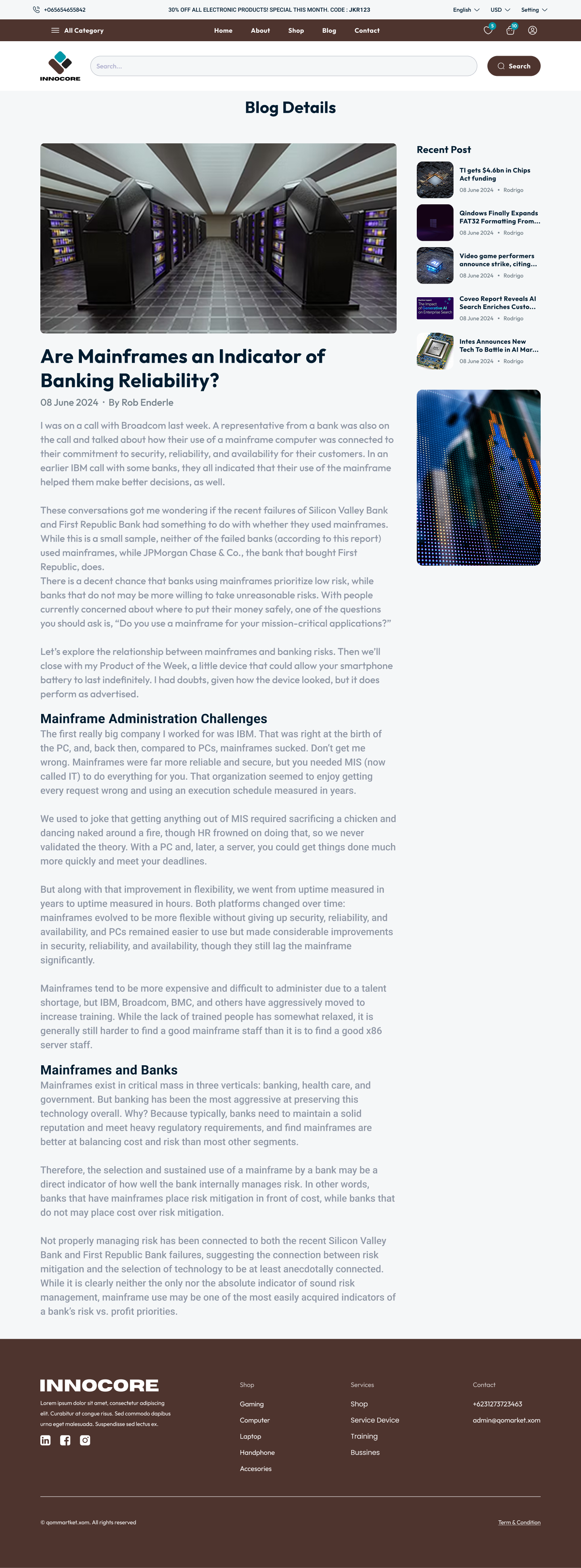
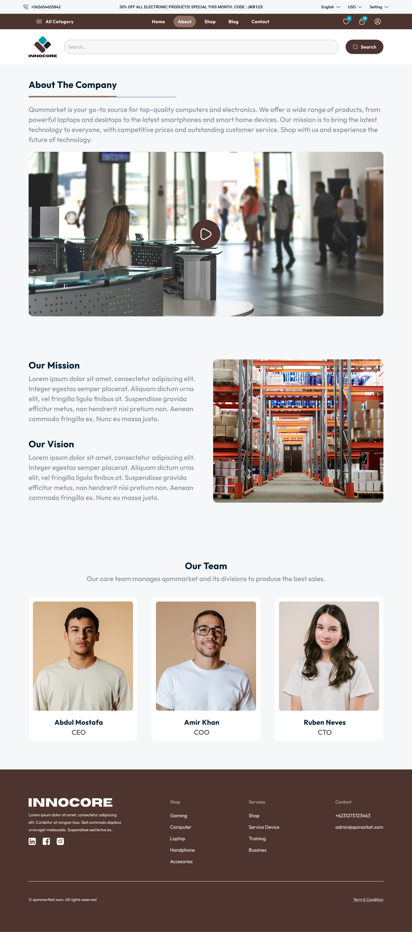
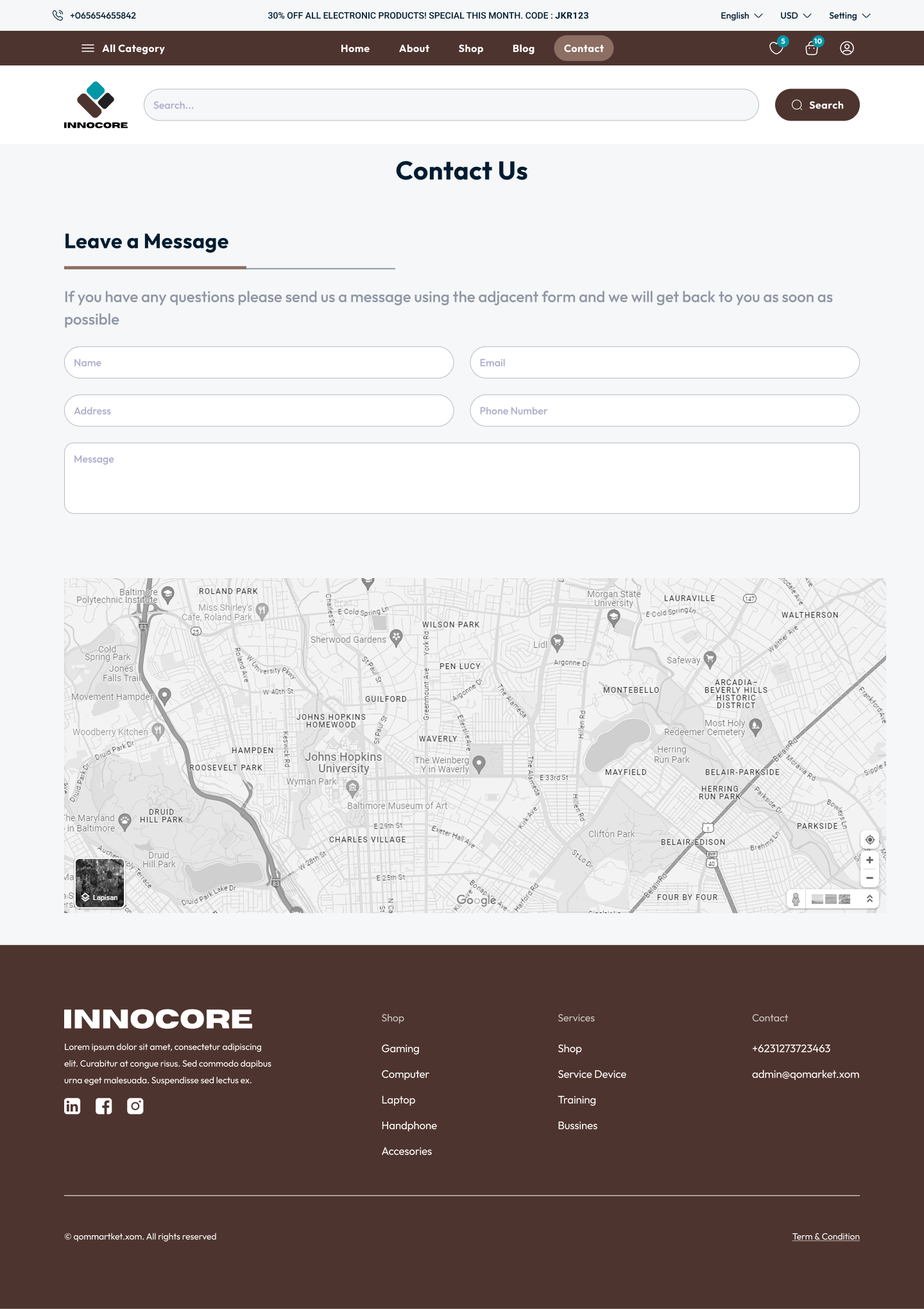
One language across the funnel.
I paired a warm, confident palette with an editorial type ramp and kept spacing, radius and shadow tokens constant from hero to receipt. When the storefront feels like one thing, it's because the tokens enforce it.
Reflection
The best storefronts disappear into the purchase.
I removed the animations between cart and confirm. I removed the upsells from checkout. What remained was a calm, deliberate funnel that respects where the user is trying to go.
Enjoyed this case study?