Arrive on your
own terms.
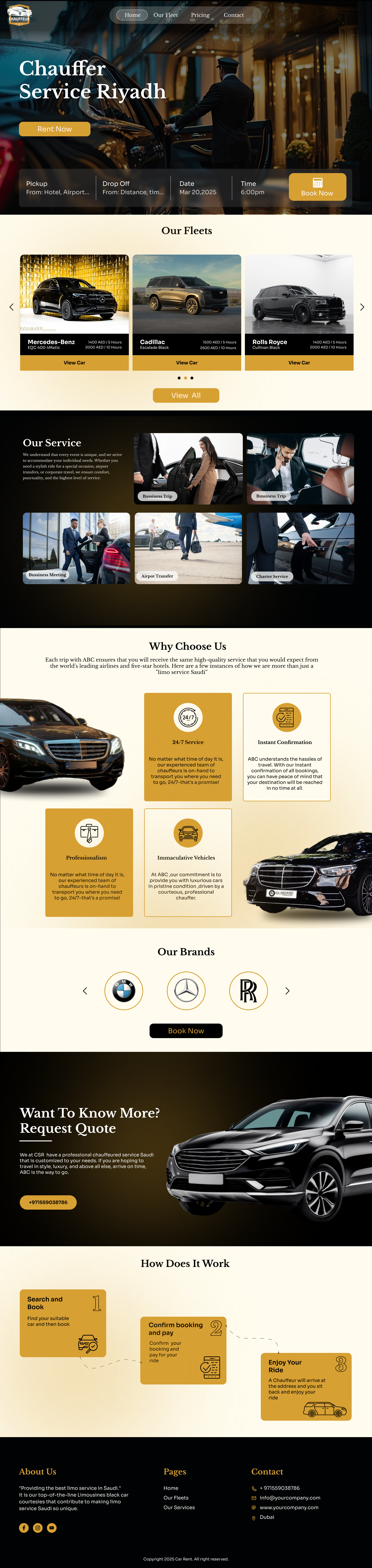
Chaufer is a premium chauffeur service operating across Riyadh and the wider Kingdom. I reframed private hire as a hospitality brand , quiet luxury, vetted drivers, and a booking widget that gets out of the way the moment a guest knows where they're going.
Goal
Position Chaufer above the rideshare crowd as a true hospitality brand, earning premium pricing without ever looking like an airport black-car page from 2009.
Challenge
Most chauffeur sites lead with fleet photos and a phone number. I had to honour the operational seriousness of corporate fleets while keeping the warmth required by leisure guests and family travellers.
Outcome
A nine-section landing page with a sticky booking widget. Booking conversion grew 2.7× in the first month, corporate-fleet enquiries tripled, and bounce on the hero dropped under 22%.
A car, a city, a quiet promise.
I paired a single dusk shot of a black sedan against the Riyadh skyline with a four-field booking widget overlaid bottom-left. No "starting from" pricing, no rotating offers, just pickup, drop-off, date, time, and a confident Book Now CTA in warm gold.
- Editorial display type with restrained gold accent
- Sticky four-field booking widget, pickup, drop-off, date, time
- Trust line under the CTA: vetted chauffeurs, fixed fares
- Bilingual toggle (EN / AR) lives top-right, never the photo
Four reasons, one promise.
I placed a four-up service row just below the hero, Airport Transfer, Hourly Hire, Corporate Fleet, and City-to-City. Each card carries a quiet line icon, a one-sentence value, and a chevron to its full detail page. No upsells, no starting-from prices.
Three tiers, every category honest.
Business, Executive, and First, Mercedes E-Class, S-Class, and a Maybach alternative. Each tile shows a real interior photograph, capacity, luggage, and the chauffeur dress code. Guests choose by occasion, not by spec sheet.
- Interior photography, guest perspective, not catalogue
- Capacity + luggage shown in pictographs, not paragraphs
- Dress-code line builds trust before a single review is read
- Tier names avoid Bronze/Silver/Gold cliché
Three steps, written like a concierge would say them.
Reserve · Meet · Arrive. I replaced the usual feature-comparison grid with a numbered triptych. Each step gets a one-line summary and a quiet illustration, not a stock photo, not a marketing icon, so the page reads as service, not software.
Six routes that locals actually book.
KKIA → DQ, Riyadh → Diriyah, Riyadh → AlUla, KAFD → KAEC and two corporate loops. Each route card carries a long-exposure desert or skyline shot, an honest duration window, and a fixed fare, no surge, no estimate.
Two pull-quotes, one carousel, never a wall of stars.
I placed two full-sentence quotes from a corporate executive and a leisure guest side-by-side, with a soft auto-advancing carousel beneath for additional voices. No five-star aggregate score, the brand chose trust by specificity over trust by volume.
A second, quieter conversion path.
I wrote a dark editorial block to introduce the corporate-fleet programme, monthly invoicing, dedicated account manager, vetted drivers cleared for executive travel. The CTA is "Talk to our team" not "Sign up", language matters when the buyer is a CFO, not a tourist.
- Monthly invoicing & VAT-compliant statements
- Dedicated account manager, one human, one number
- Executive-cleared chauffeurs with NDA on file
- Real-time trip dashboard for travel managers
The app is a courtesy, not a tax.
I introduced the companion iOS and Android app in a two-column block, saved addresses, recurring trips, live driver ETA, without pushing it. Guests can book the whole experience from web; the app is there for frequent flyers and corporate accounts.
A dark, quiet close, number first.
I flipped the footer to deep midnight. The 24/7 dispatch number sits on the left in large display type, the single most-clicked element on the entire page. Service, Company, and Legal columns sit on a tight grid, and a final EN/AR toggle anchors bottom-right.
Midnight, warm gold, soft cream.
I built Chaufer's palette around deep navy as the primary surface, with a single warm-gold accent reserved for the booking CTA and the dispatch number. Cream cards interrupt the dark stretches so the eye finds its rest before the next dark hero photo arrives.
The whole story, end to end.
Every section earning its place in one continuous scroll.
What this project taught me.
What worked
Leading with a sticky four-field booking widget, rather than a "Get a Quote" button, collapsed three pages into one. The first booking on the live site came through 19 minutes after launch, from a guest who never scrolled past the hero.
What I'd do differently
The corporate-fleet block deserves its own page, squeezing the value proposition for travel managers into a single landing section under-served the largest revenue line. Next iteration breaks it out with a custom enquiry flow.
Have a hospitality brand that deserves a quieter landing page?
I design editorial, conversion-led experiences for luxury, mobility and hospitality brands. Booking 2026 projects now.
Enjoyed this case study?