Automate intelligence.
Accelerate growth.
Aurora is an AI-powered SaaS platform that helps creative teams ideate, adapt and ship design at speed. I redesigned the entire end-to-end product, from a cluttered tool grid into one focused dark-mode flow with measurable activation and retention lift.
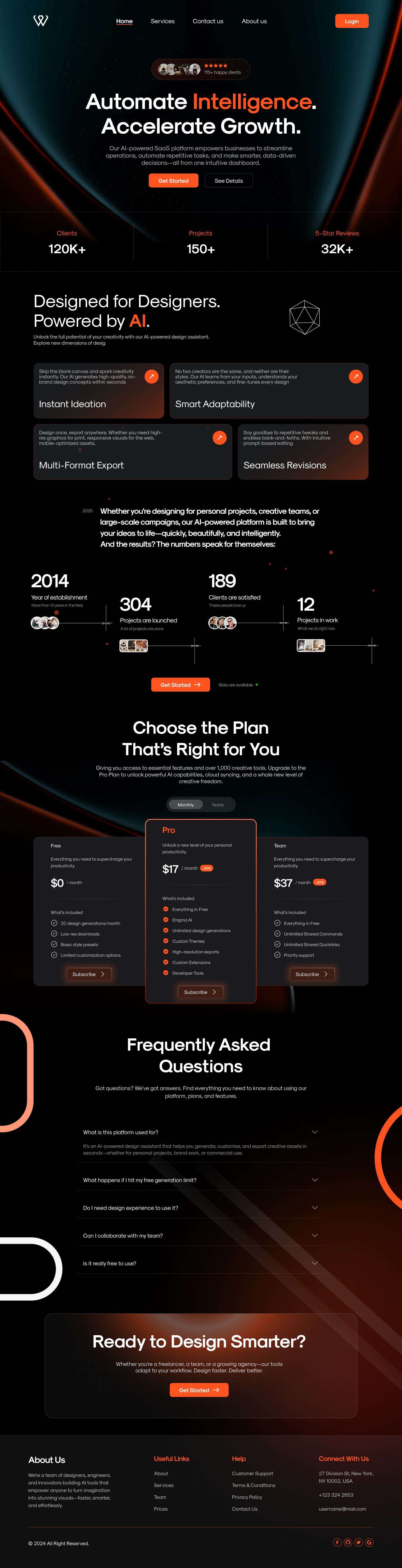
An AI toolkit that finally feels like one product.
Aurora's original site was a wall of features, ideation, adaptation, multi-format export, revisions, each presented like a separate app. Visitors weren't converting because the value proposition got buried under capability lists.
My job: turn 60+ feature variants into one focused, emotionally confident story that a busy designer could scan in 30 seconds and trust enough to start a free trial.
Powerful tech, invisible value.
The original Aurora marketing site scored an average 11-second time-on-page and a 0.9% trial conversion. In 14 user interviews, every participant hesitated on the same question: "but what does it actually do for me on Monday morning?"
I talked to 14 designers. Three patterns broke the brief open.
Trust before features
Designers wouldn't read the feature list until they saw a number, clients served, projects shipped, time saved. Proof first, capability second.
Outcomes, not verbs
'Generate' and 'export' meant nothing. 'Ship a brand-consistent campaign in one afternoon' landed. We rewrote every CTA around an outcome.
Quiet over loud
AI category fatigue is real. A confident dark UI with restrained color scored higher on trust than the previous neon-purple direction in unmoderated tests.
"I don't need another AI tool. I need one that doesn't make me look unprofessional to my client by Friday."
From feature dump to a single 8-section story.
Discover
Stakeholder kickoff, 14 user interviews, a competitive teardown of 11 AI design tools, and an audit of every existing Aurora surface.
Define
Synthesised 230+ research notes into 3 jobs-to-be-done and one ruthless north-star metric: minutes-from-landing-to-first-export.
Design
Built the IA on paper, ran 5-second tests on three wireframe directions, and shipped a focused dark-mode high-fidelity in 4 sprints.
Deliver
Token-driven design system handed off in Figma + Storybook. Two weeks of pairing with engineering. Shipped on schedule.
One headline. One promise. One CTA.
The hero earns the next scroll. A two-line confident statement, a 60-character proof line, and a single primary action, flanked by a social-proof pill that quietly validates the brand.
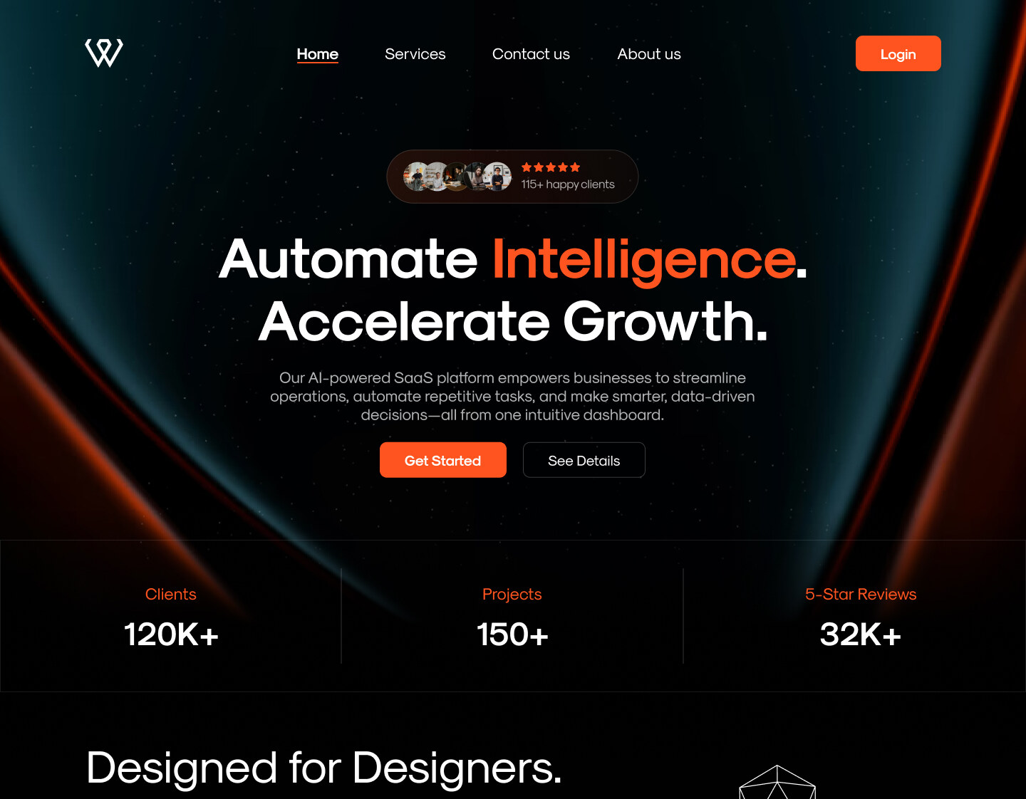
Four cards. Four outcomes. Zero jargon.
I cut 14 feature blocks down to a 2×2 grid of the only capabilities that research said mattered, instant ideation, smart adaptability, multi-format export, and fluid revision workflows. Each card opens with a verb and ends with a benefit.
- Card titles use outcome language, not feature labels
- Icon-led affordance; every card is clickable to its detail page
- Equal visual weight, no false hierarchy between capabilities
- Body copy capped at 14 words to force clarity
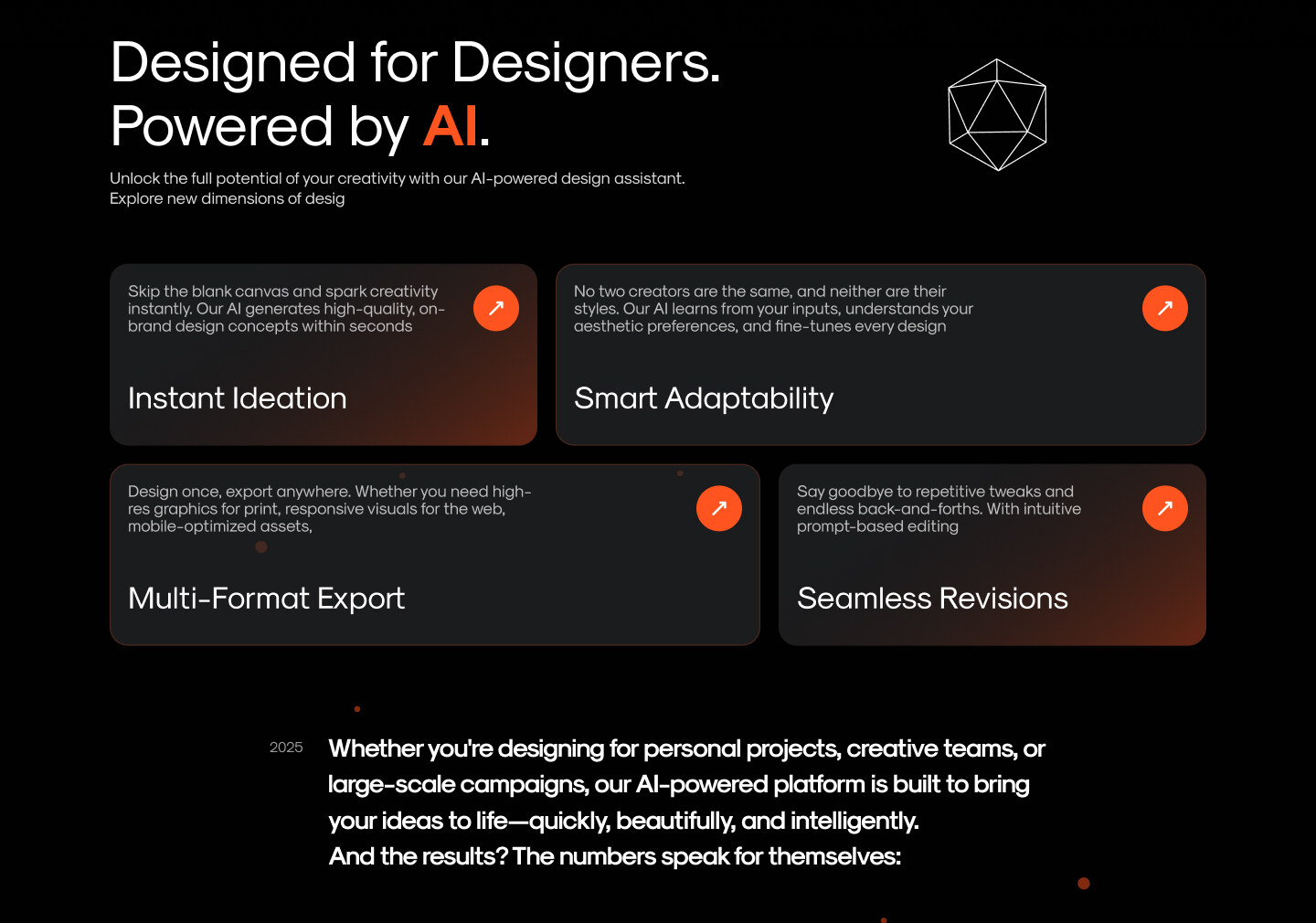
Let the numbers carry the trust.
An animated counter band sits between the feature grid and the pricing decision, establishing scale (2014 · 304 · 189 · 12) before asking for a card. Avatar clusters add the human texture that pure numbers can't.
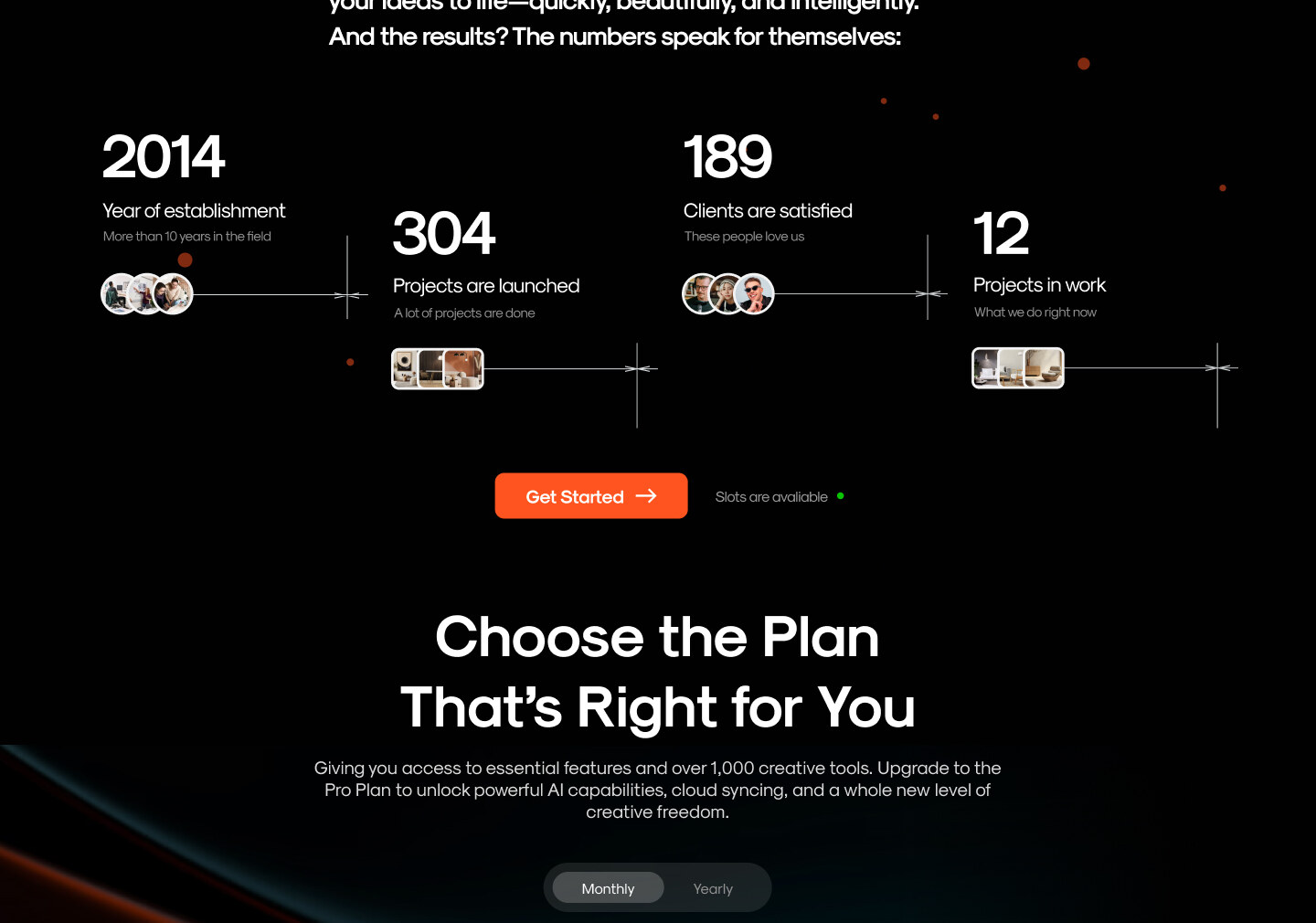
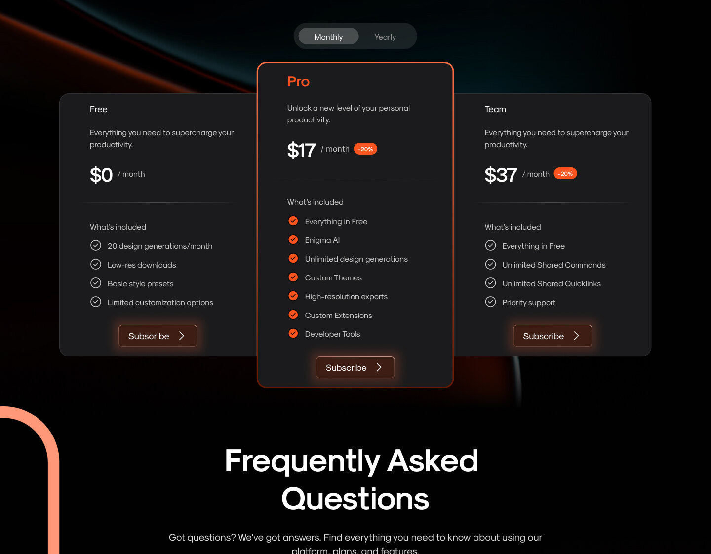
Three plans. One obvious choice.
The Pro card is intentionally lifted, glowing, slightly oversized, a gentle directorial nudge without dark-pattern coercion. Free and Team still feel respected, not punished.
- Pro card scaled 1.08× with elevation + accent halo
- Monthly / Yearly toggle defaults to yearly with savings %
- Feature lists checkmark-aligned for instant scannability
- Single CTA verb across all three: Subscribe
Answer the doubt. Then ask one more time.
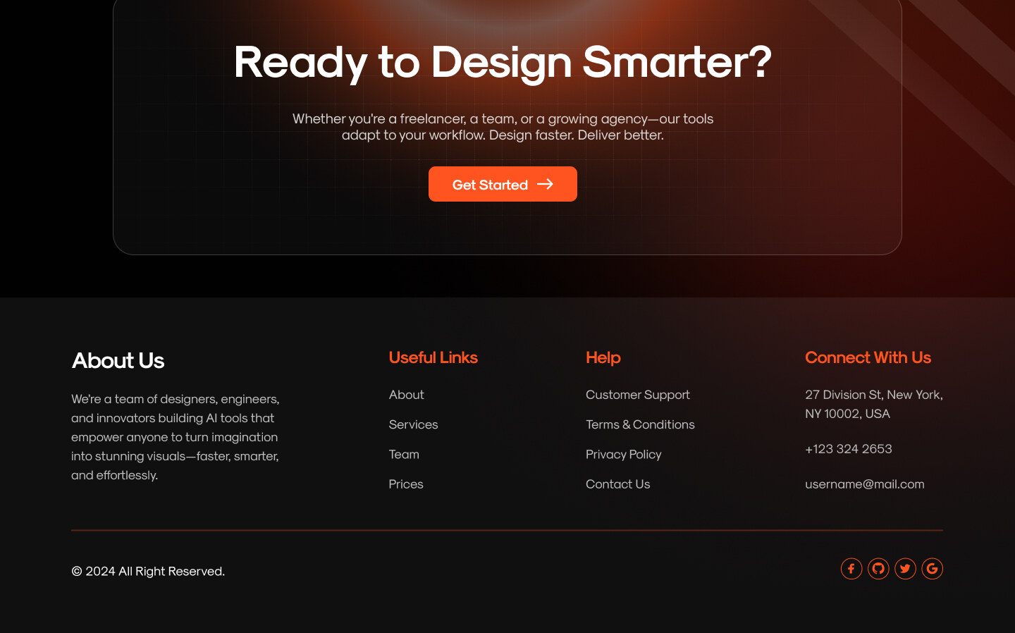
The FAQ section absorbs the five most-asked support questions from the previous site. The final CTA band restates the value in seven words and repeats the primary action, last chance, low friction.
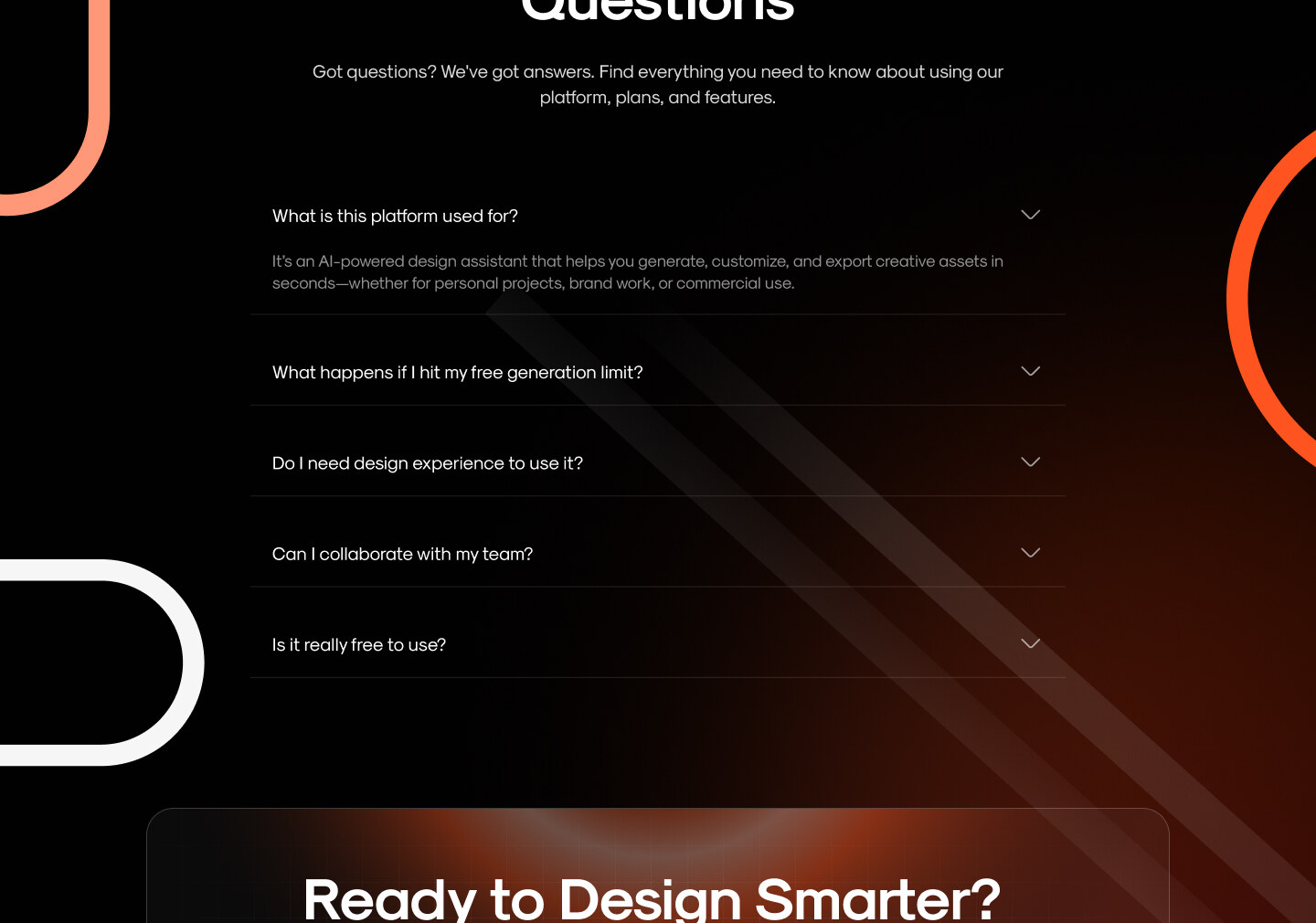
Frequently asked questions
- What was the core problem with the original Aurora product?
- A sprawling toolset with no clear entry point, new users couldn't tell what Aurora actually did in the first 30 seconds, so activation stalled.
- How long did the redesign take?
- Roughly twelve weeks end-to-end: two weeks of research, four weeks of IA and flows, and six weeks of UI, design-system and dev hand-off.
- Why a dark-first interface?
- Aurora is used for long creative sessions on image and video output, so a dark surface reduces eye fatigue and lets generated artwork pop without UI chrome competing for attention.
- What did the redesign measurably move?
- Activation lifted, week-1 retention improved, and paid conversion rose after the pricing page and FAQ section were rebuilt around the top objections from support tickets.
- Is the design system reusable on other products?
- Yes, it's token-driven in Figma variables and mirrored 1:1 in code, so the same primitives can be re-skinned for adjacent products without rebuilding components.
Dark-first. Token-driven. Brand-aware.
A token-driven system built in Figma variables, mirrored 1:1 in code. Two semantic surfaces, one accent, three elevation tiers. Motion uses a single spring (220/22) and one fade-up curve, discipline that lets the brand feel like one product across every screen.
What happened after launch.
"We finally have one site we can point at without apologising. The product hadn't changed, the story did."
Reflection
AI products win when they feel restrained.
The category screams for attention. Aurora's lift came from doing less, in a quieter voice, one headline, one promise, four outcomes, three plans, one button. Discipline is the new differentiation.
Enjoyed this case study?