One app. Five services. Zero friction.
Designing a multi-service on-demand platform, from customer mobile app to admin web panel and rider app, across Food Delivery, Errands, Shopping, Transport, and Pickup & Delivery.
- Product
- AirshipSend
- Role
- UI / UX Designer
- Modules
- 3 Platforms
- Screens
- 175+
- Services
- 5 Verticals
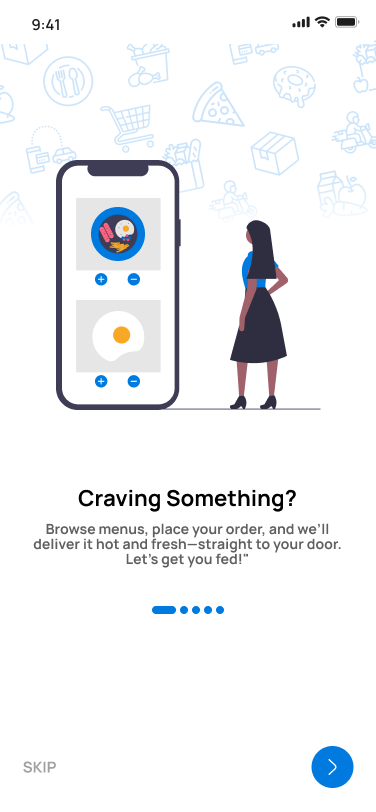
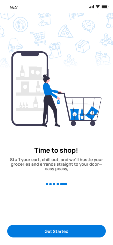
A platform that does it all, designed to feel effortless.
I designed AirshipSend as a comprehensive on-demand platform consolidating five distinct service categories into a single, unified experience, food, transport, parcels, errands and local shopping, all from one app.
Five service verticals, three distinct user types, one design system. My constraint: no single user group should feel overwhelmed. Every decision came back to reducing cognitive load while keeping the full platform accessible.
Serving everyone without confusing anyone.
Multi-service platforms share a well-known trap: trying to serve too many users leads to interfaces that serve none of them well. My brief was to avoid that while making the product feel cohesive, not cobbled together.
My goal: design a unified experience for customers, admins, and riders, each with radically different needs, that felt native to their context and scaled across five service categories.
Each service vertical has its own order flow, item types, and interaction patterns. My interface had to adapt to all of them without a context switch that jarred the user.
Core design principle: one visual language, five adaptive experiences. The service changes; the mental model stays constant.
How the work unfolded.
Discovery & IA
User flows, IA, service taxonomy across all five verticals.
Design System
Shared components, tokens, and adaptive patterns across mobile and web.
Customer App
Onboarding, home, service flows, checkout, and live order tracking.
Admin + Rider
Web dashboard with dispatch and routes, plus a mobile rider app.
A home screen that knows what you need.
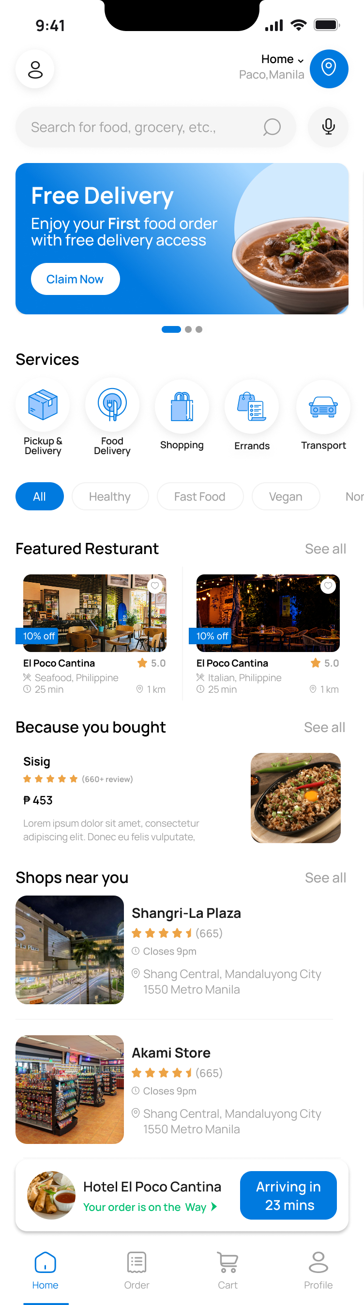
I designed the home screen to consolidate all five service entry points into a scannable icon row, with contextual content below, featured restaurants, nearby shops, personalised picks, without feeling chaotic.
Unified service hub
All five verticals accessible from a single persistent icon row, no deep navigation.
Contextual content
Home adapts: food shows restaurants, errands shows bill dues, shopping shows nearby stores.
Live order banner
Persistent bottom strip shows active order ETA without interrupting browsing.
Promotions & nudges
Carousel for active deals plus a “Because you bought” section for repeat ordering.
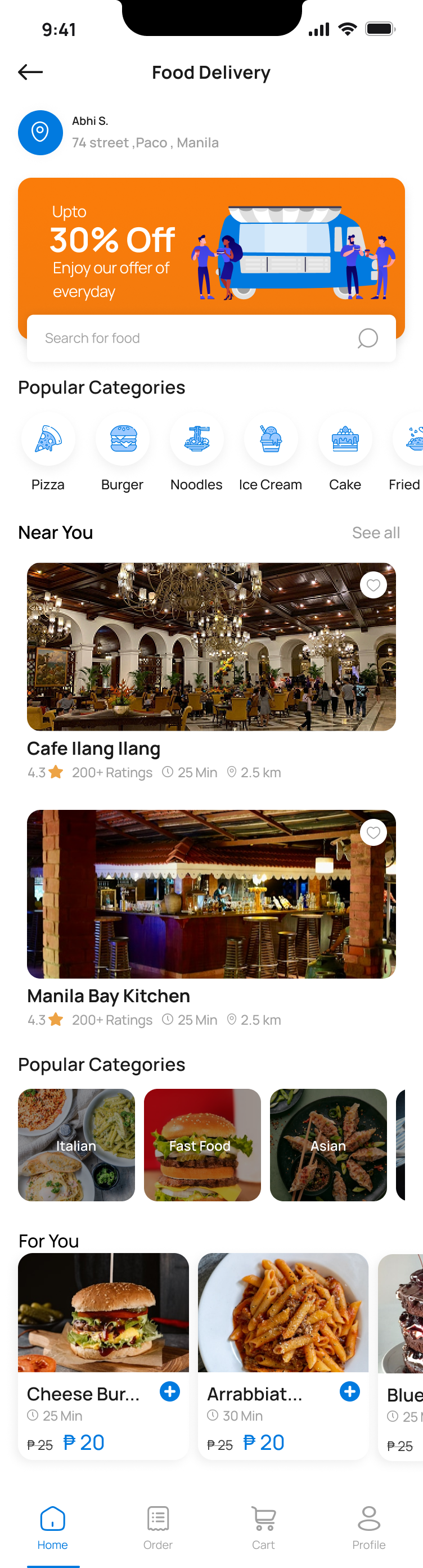
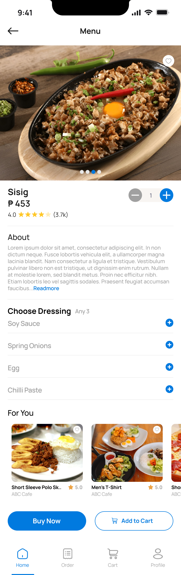
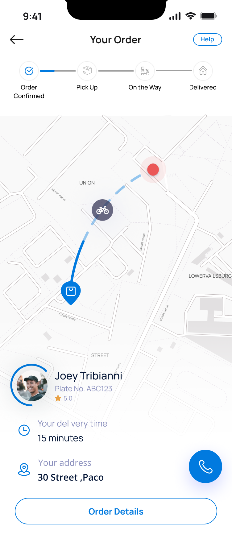
Restaurant discovery to doorstep delivery.
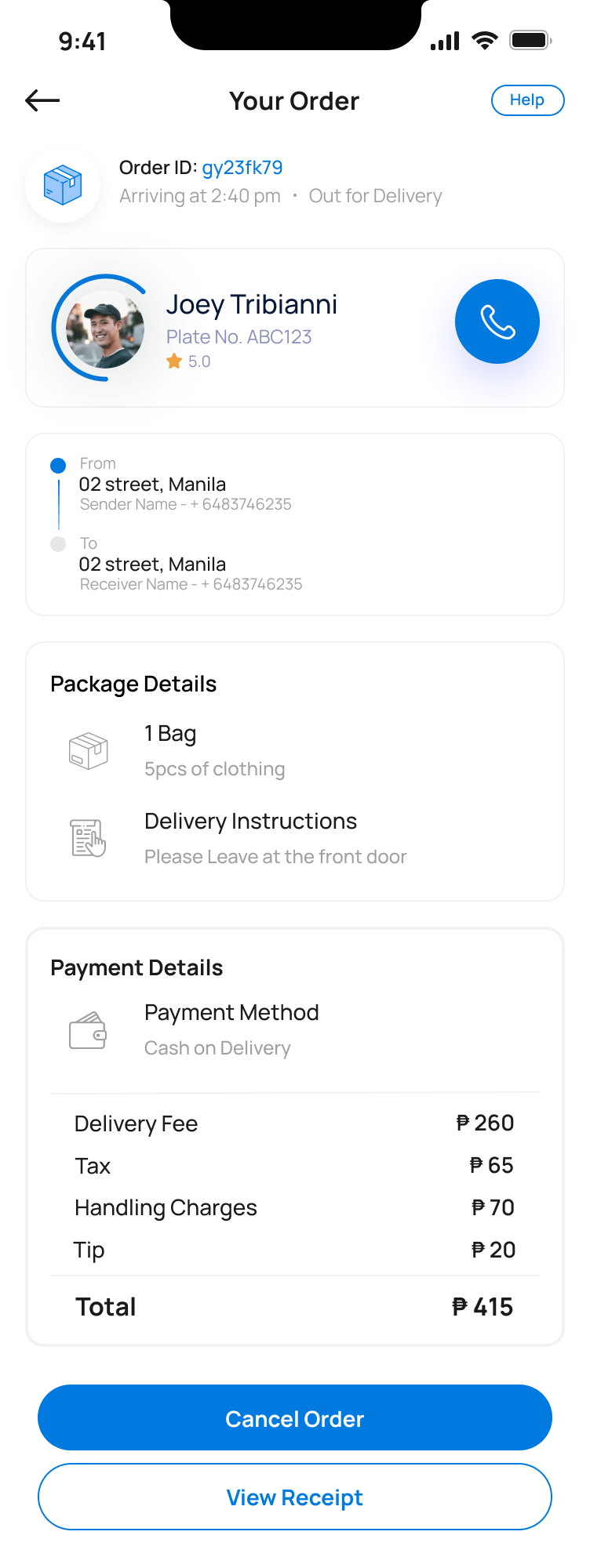
Familiar delivery patterns with a cleaner execution. Restaurant cards surface rating, ETA and distance without a tap. The order flow is linear and low-friction.
From bill payments to home repairs, on demand.
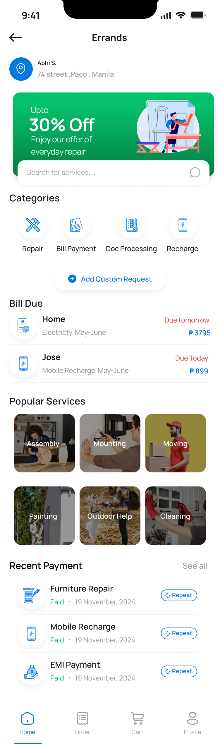
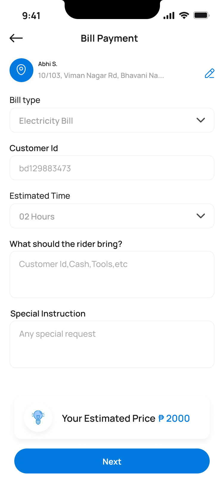
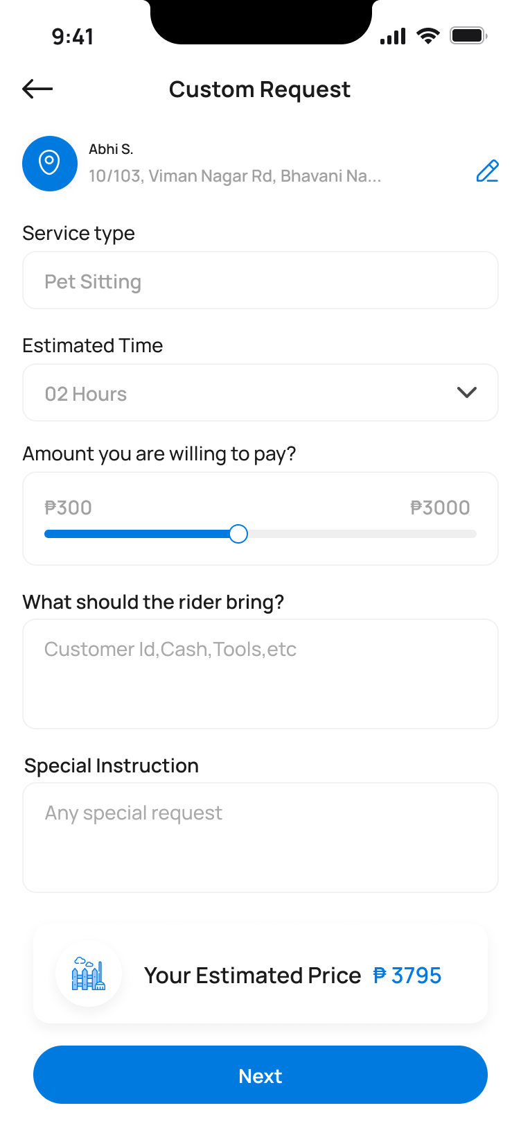
Errands was the most unique to design. It spans completely different task types, so the solution was a category-first layout with a smart Bill Due section and a custom request flow for tasks that don't fit a preset.
Smart Bill Due
Proactively surfaces upcoming payments with due dates and amounts.
Custom Request
Describe any task that doesn't fit a category, free from rigid forms.
Repeat payment
One-tap repeat for recent payments reduces friction for recurring tasks.
Local stores, delivered.
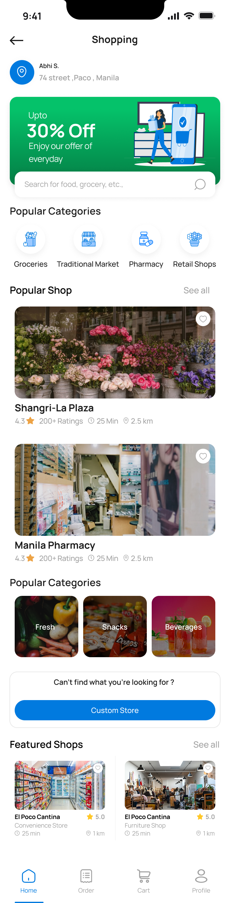
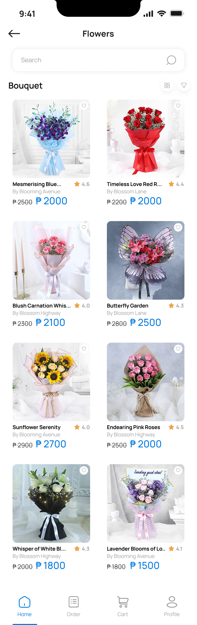
Shopping covers groceries, pharmacies, flower shops, retail and traditional markets. Discovery first, with rich category browsing, product detail, and a checkout adapted for physical goods, quantity, variants, and prescription uploads where needed.
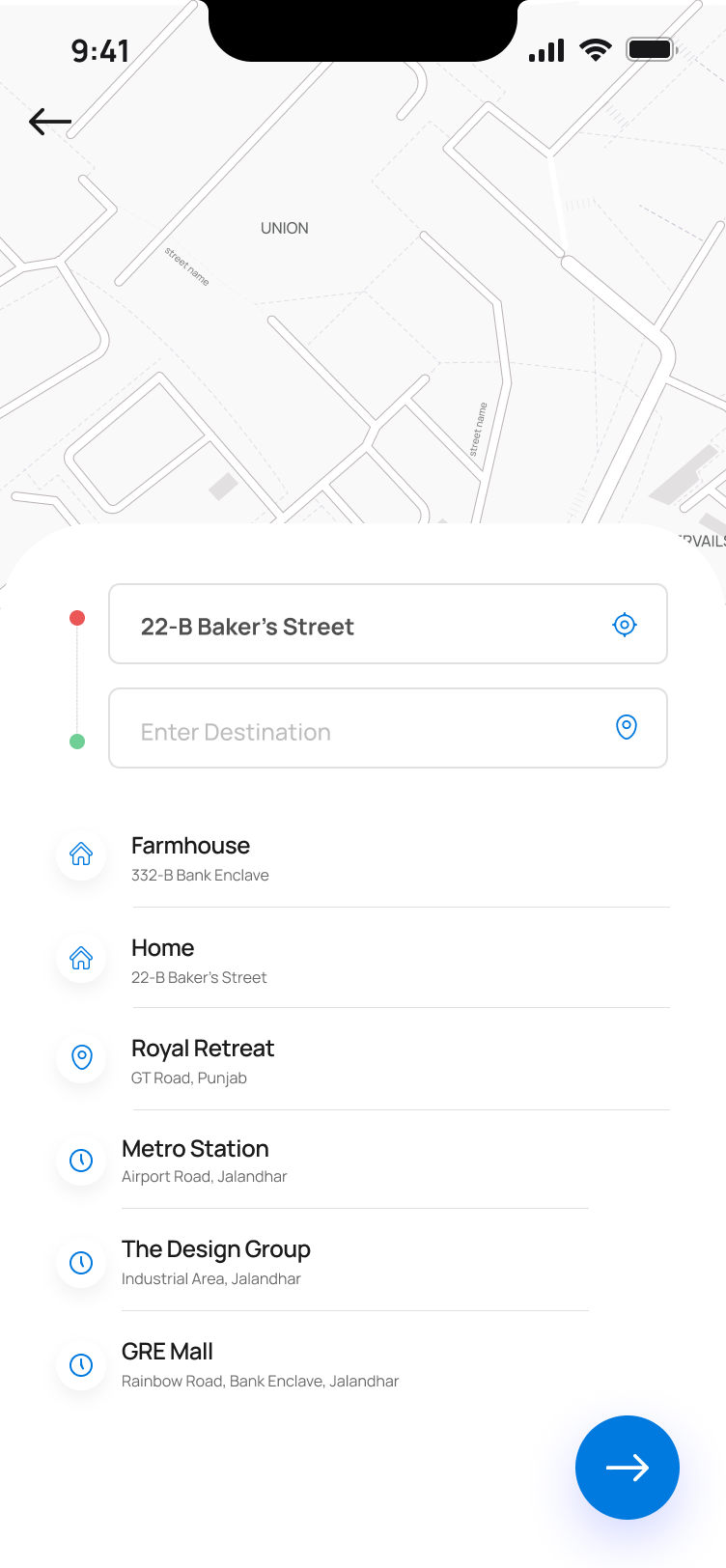
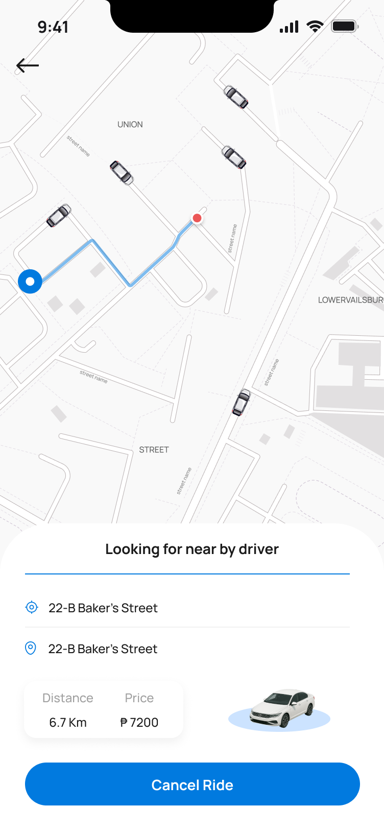
Book a ride in three taps.
The familiar ride-booking pattern, map, pins, vehicle selection, adapted into the AirshipSend visual language. The “looking for driver” state gives animated feedback so users know the system is working.
Control at a glance.
I built the operational backbone for business owners and dispatchers, manage orders, assign riders, monitor live dispatch, configure every aspect of the service, without getting lost in complexity.
Dashboard
Real-time business overview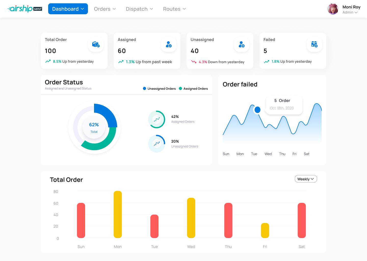
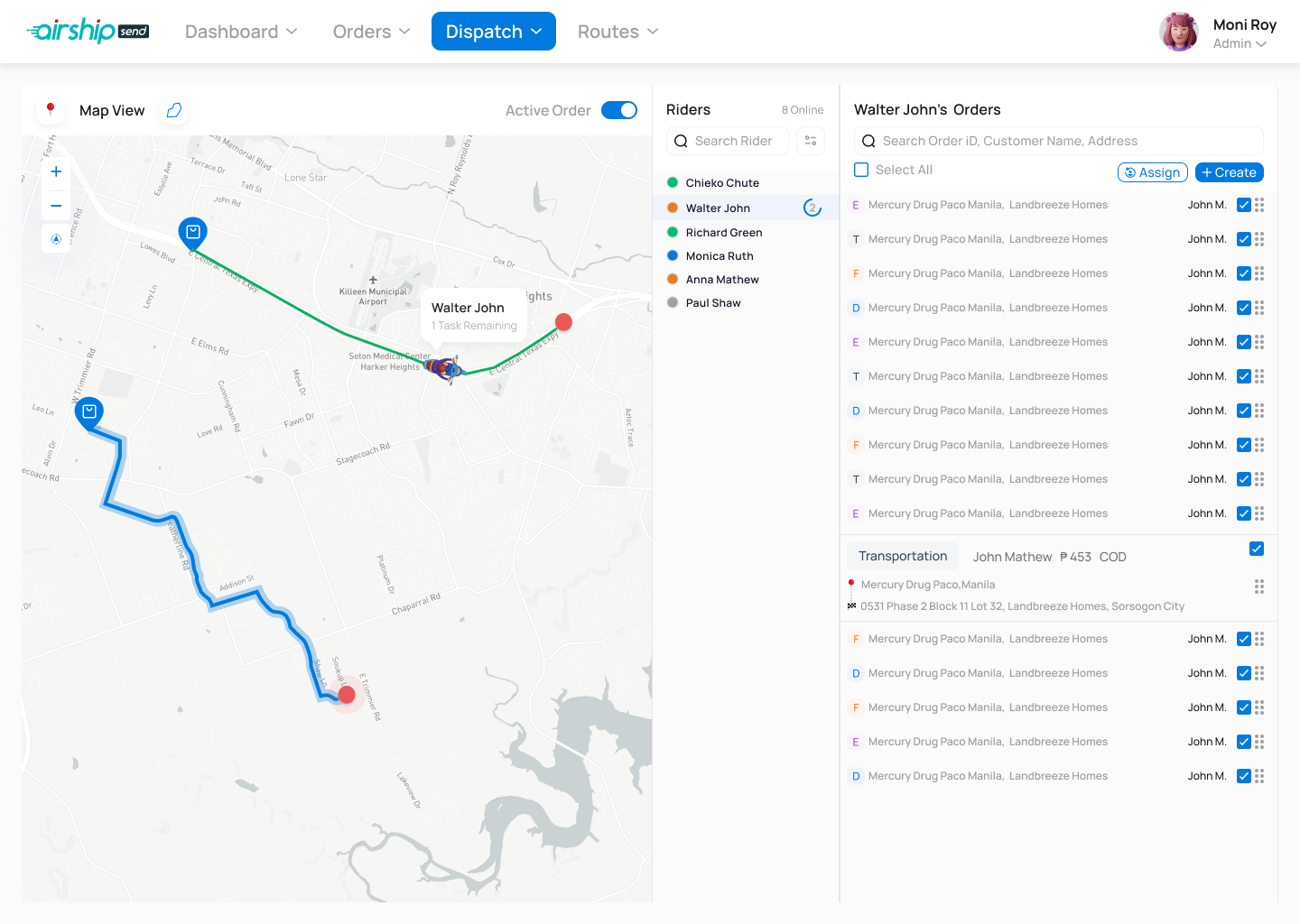
Dispatch, the hardest screen to design, and the most critical.
A three-panel layout: live map on the left, rider list in the middle, the selected rider's queue on the right. Admins can batch-assign with route paths overlaid in real time. v4 of four iterations.
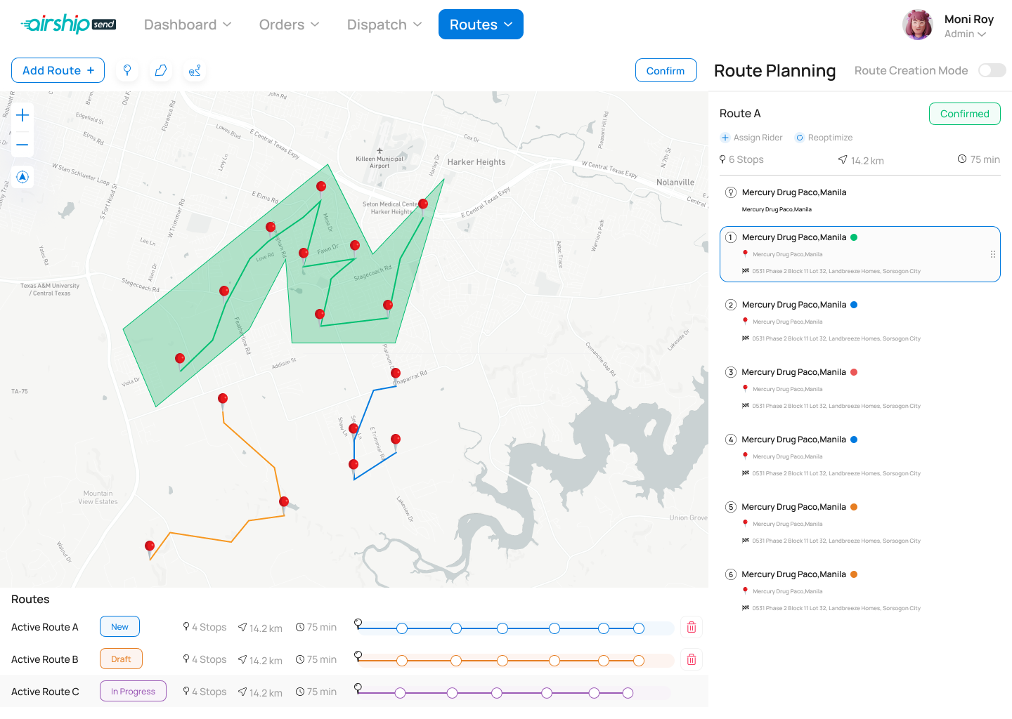
Routes
From chaos to optimised delivery corridors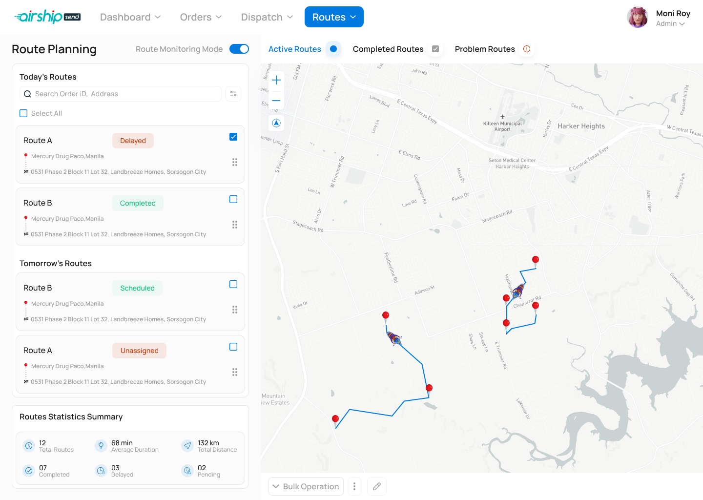
Per-service config
Food, Shopping and Transport each have their own modifiers, categories and pricing rules.
Role management
Create sub-roles with granular permission levels.
Branding controls
Color picker and logo upload for white-label deployments.
Billing & plans
Subscription plan overview with feature comparison and upgrade flow.
Designed for eyes on the road.
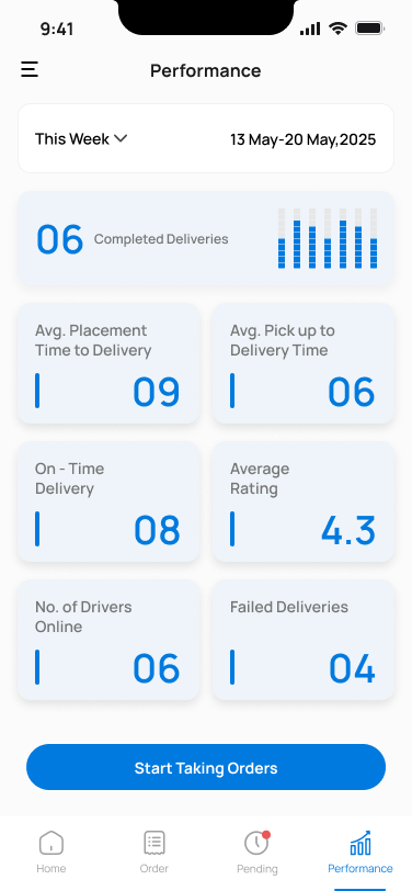
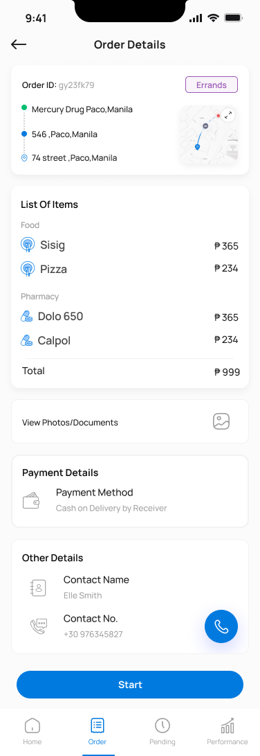
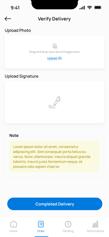
This was the most operationally critical module. Riders use it while moving, I designed every screen for glanceability: large touch targets, high-contrast text, a ruthlessly simplified flow.
Performance-first
Riders see weekly stats first, motivation through visibility.
Large touch targets
Primary actions are full-width buttons at minimum 56px height.
Proof of delivery
Photo or OTP confirms handoff, protecting rider and customer.
Pending orders tab
Separate view for orders awaiting acceptance lowers load on the main flow.
One system. Three surfaces.
175+ screens across mobile, admin web and rider app, held together by a core token set: a primary blue, a consistent spacing scale, a shared icon library, and adaptive typography that works at both mobile and desktop scales.
Visual language
Clean and minimal with brand blue as the dominant accent. White surfaces with subtle grey backgrounds create information hierarchy. Color is used sparingly , only for status, CTAs and navigation.
Component architecture
Shared card components, filter chips, and bottom-sheet patterns used consistently across all five verticals, reducing the learning curve when users switch between services.
What was delivered.
I delivered a complete, production-ready design covering every touchpoint of a multi-service on-demand platform, from first-time onboarding through complex multi-stop dispatch.
What I learned shipping AirshipSend.
Adaptive service patterns
Designing a service template early, a structure each vertical could inherit, meant adding a new service didn't require reinventing the wheel.
Dispatch view complexity
Redesigned four times. Too sparse and dispatchers miss things; too dense and they freeze. v4 solved this with a collapsible panel pattern.
The rider is the toughest user
Designing for someone moving, often outdoors, time-pressured, simplicity isn't a style preference, it's a safety requirement.
Earlier usability testing
More structured testing of the order flow for each vertical earlier, particularly the Errands custom request flow.
Got a multi-surface product that needs to feel like one thing?
Enjoyed this case study?